Interior Paint Colour Trends 2024: 14 influential shades to inspire our homes
The biggest interior paint colour trends to set the tone for all decorating projects in 2024
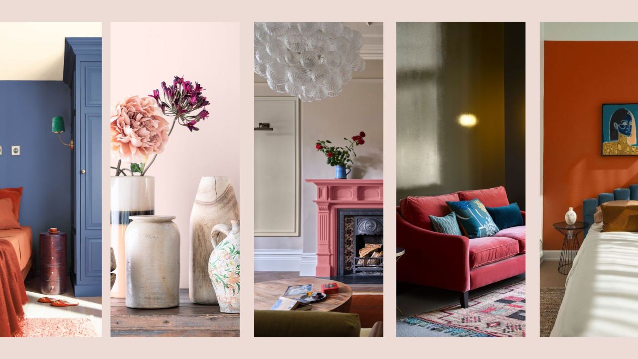

If you're planning on redecorating any time soon take note of the latest interior paint colour trends 2024 to find a shade to inspire your decorating journey.
To determine colours that offer longevity and relevance in equal measure for the year ahead our team of colour specialists have curated key paint colour trends to inspire the canvas of our homes, from the Dulux's Colour of the Year 'Sweet Embrace' to Benjamin Moore's 'Blue Nova' or Graham & Brown's 'Viridis' green.
Whether the best living room paint colour or a must-have hallway paint shade all the latest paint colour trends are determined by leading experts who explore the psychology of colour and how we use it in our homes to create a harmonious blend of style and comfort.
From rich plums and warm terracottas to soft greens and calming neutrals, discover the paint colours that are set to transform homes throughout the year ahead.
Interior paint colour trends 2024: 14 influential shades
These carefully considered paint shades are all heavily influenced by the must-have interior design trends for 2024 along with inspiration that filters down from the latest fashion trends to ensure they feel harmonious with every aspect of the world around us.
1. Sweet Embrace by Dulux
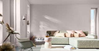
The Dulux Colour of the Year for 2024 is a beautifully soft neutral with a pinch of pink undertones to add warmth and subtle vibrance to any pared-back scheme.
The nuances of pink in 'Sweet Embrace' make it the ideal neutral to use in smaller rooms or those lacking natural light because the warm undertones help to lift the colour and give it more depth.
Sign up for the woman&home newsletter
Sign up to our free daily email for the latest royal and entertainment news, interesting opinion, expert advice on styling and beauty trends, and no-nonsense guides to the health and wellness questions you want answered.
Dulux's creative director Marianna Shillingford adds: “While being a beautiful standalone colour, Sweet Embrace is a hue that perfectly combines with so many other shades making it a cheerleader in colour form."
"It’s the perfect modern neutral that you can use with confidence, knowing it will unite each element from furnishings to artwork whilst creating a gently uplifting atmosphere."
2. Blue Nova by Benjamin Moore
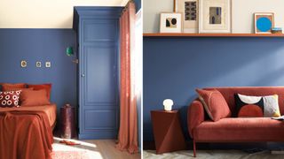
Blue Nova 825 has recently been named the Benjamin Moore 'Colour of the Year 2024'. This intriguing shade of blue is a deeper tone than the recommended shade of Starry Night Blue, a more vibrant hue of blue cited as a key colour for 2023.
Rather than use the word 'darker', which would imply that this blue doesn't feel as bright and uplifting, I would describe it as a deeper shade of blue, one that offers more depth. The blend of blue and violet is what gives the shade this full-bodied boldness.
Seen in a matt finish it's a suitably calming paint colour for bedrooms and living rooms alike. As demonstrated it pairs beautifully with earthier tones of rust and terracotta, which only makes the depth of blue feel more earthy and rustic.
“Blue Nova 825 is an alluring mid-tone that balances depth and intrigue with classic appeal and reassurance,” said Andrea Magno, colour marketing & development director at Benjamin Moore.
3. Viridis by Graham & Brown
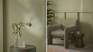
Graham & Brown has also revealed its Colour of the Year 2024...a beautifully muted green called 'Viridis', that feels like a slightly more saturated sage green.
The flexible hue is the shade of 2024 to blur the lines between the inside and outside, a natural and uplifting shade, providing an alternative to the greige interior schemes of recent years.
“When choosing our Colour of the Year 2024, we began looking into colour psychology and the hues that bring calm and peace," explains Maryanne Cartwright, Graham & Brown's head of design.
"Viridis, a soothing mid-green hue reflects harmony and stability, enabling those in its vicinity to relax and revitalise." Making this the ideal paint colour for a bedroom where the nature-inspired hue provides a restful and secure feeling.
4. Jitney by Farrow & Ball
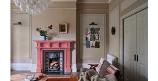
Unlike the other trending paint colours for 2024, Jitney is not a new shade, but it is one that Farrow & Ball's Colour Curator Joa Studholme predicts will hugely resonate with those decorating in the new year.
Along with Stirabout and Oxford Stone. What these key 'clay' shades, as Joa describes them, all have in common is a timeless neutral appeal that exudes warmth. This soothing colour palette is ideal for emulating chic Parisian decor.
"The warm tones of Jitney and Stirabout create an earthy, reassuring atmosphere. When used together, they create a harmonious space that’s easy on the eyes," says Joa. "The subtle balance of Jitney on the walls and lighter Stirabout on the panels, ceiling and trim, result in a beguiling room with an ethereal quality - a wonderful, warm scheme for those who prefer neutral spaces."
"Many of us are drawn to clay tones, however, we also want to make our homes feel as bright and spacious as possible. Using a lighter tone like Oxford Stone on the walls and the much stronger colour on trim instantly makes the walls feel lighter and the room feel bigger."
5. Night Owl by Benjamin Moore
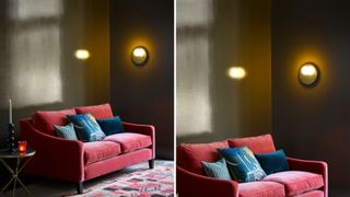
Earthy tones are still set to dominate our homes throughout 2024, no doubt given by an increasing desire to feel at one with nature to better our sense of wellness. Among them is brown, the literal shade of the earth beneath our feet, which has been growing wildly popular in recent months.
“We will continue to see the trend for warm and welcoming rich chestnut colours," says Helen Shaw, director of international marketing at Benjamin Moore.
'Night Owl' by Benjamin Moore is a deeply captivating shade of brown with green undertones that feels like a 2024 alternative to the charcoal greys of former years. There's a richness to a brooding shade of greeny brown that welcomes warmth and depth when decorating with dark paint colours.
"Use these dark brown hues in a gloss finish on the walls of a living room to create a cosy retreat with designer flair – the reflective sheen will constantly shift and evolve as light ebbs and flows during the day and through the seasons to bring a sense of characterful luxury."
6. Loving pink by YesColours
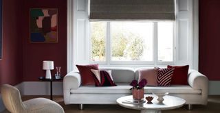
Rich and inviting, the gloriously warming shade of plum is set to be huge for home decor next year. “Offering elegance with comfort, the colour damson is poised to be a prominent and captivating hue," agrees Emma Bestley, creative director and co-founder of YesColours.
"With its rich and deep undertones, Damson exudes a sense of sophistication and allure that perfectly complements the seasons’ changing landscape."
"Our 'Loving Pink' paint is the perfect match for those seeking a similar hue that falls between the luxurious shades of burgundy and purple. Along with its warming tone, this colour holds the potential to add a touch of opulence and mystery to any aesthetic.”
7. Renew Blue by Valspar
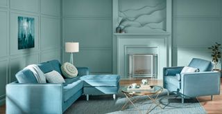
Valspar's 2024 Color of the Year has just been announced as 'Renew Blue'. Described by the experts as a 'balanced blue' this soothing shade instantly conjures up images of coastal living and a sense of stillness.
"Renew Blue is an incredibly versatile and all-season shade that anyone can envision in their space," said Sue Kim, Valspar's director of colour marketing. "Inspired by fleeting elements like fog, mist, clouds, and glacier lakes, Renew Blue elevates the everyday mood, encourages self-expression, and evokes a feeling of balance and calm, with a twist of unique spontaneity."
"Blue is a classic shade that has become the new neutral for today's home and can be mixed and matched to fit a variety of design styles and applications." Thanks to the lightness this shade would uplift any room, especially a north-facing room that feels dark and uninviting.
Pale blue is also a great way to use paint to make a room feel bigger because it recedes, as opposed to feeling encroaching on a space.
8. Limitless by Glidden
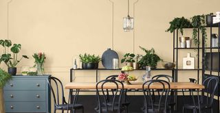
'Limitless' has just been announced as the 2024 Color of the Year by Glidden paint brand at PPG. More than just a neutral Glidden colour stylists see this shade as a “boujee beige” that works that little bit harder to welcome a depth of tone to walls and woodwork. Similar to the Dulux Colour of the year 2023 this uplifting colour feels fresh and invigorating while remaining hugely versatile.
“Think of 'Limitless' as a fresh and energising take on a neutral," says Ashley McCollum, Glidden’s leading colour expert. "Limitless can be your main room colour or act as an invigorating pop against warm or cool tones.”
Because this versatile shade pairs equally well with warm and cool tones it lends itself to be used anywhere to welcome a soft, and forgiving tone to act as a blank canvas to layer accent colours.
9. Woodsmoke by Fenwick & Tilbrook
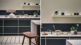
Earthy neutrals and shades of green will continue to be hugely popular in interiors for 2024, as people pursue their appreciation of biophilic design to gain a greater sense of wellness from nature – similar to the ethos behind the Japandi design trend.
"These colours take their inspiration from nature and can help evoke a sense of peace and tranquillity into the home," says Anna. "Woodsmoke is one such colour. This versatile shade can be used in a variety of different rooms."
Not too far from the popular shade of sage green, this timeless tone is a pale grey beige with green undertones. We would recommend this as a living room paint colour to welcome a sense of calm to a busy and often multifunctional space.
10. Loving Orange by YesColours

We've seen varying shades of orange dominating fashion colour trends and 70s-inspired home decor trends throughout 2023 but for 2024 it is set to be a key interior paint colour for all styles of decor.
"Orange often has a bad rap but use it wisely and orange really can bring style, joy and sophistication to any home interior," says Emma.
Suggesting how this shade can welcome positive energy into interior spaces Emma continues: "A vibrant, primary orange is fun, playful and bold and is great in nurseries, offices or as part of a creative mural due to boost mood and add cheer."
"On the other hand, shades of terracotta give a cocooning feeling that envelops you in a big warm hug. Its burnt, bronzy richness will immediately make you feel comforted and grounded. This colour would look incredible drenched in our most-used rooms of the home such as the living room, bedroom or kitchen."
11. Red 03 by Lick

Warming reds have been gaining popularity in recent years, with that set to be the case more so next year. But the celebrated red tones of 2024 have less of a blue pigment, instead, they are grounded by brown earthy undertones to prevent the red from feeling too bright.
The result is earthy red pigments of clay and terracotta, stunning shades derived from nature that feel more akin to the best pink paint colours.
“Red and orange are social colours. Red attracts the most physical attention. Orange is optimistic and friendly," says Lick’s Director of Interior Design and Colour Psychologist, Tash Bradley.
"Both colours have the ability to stimulate, energise, and spark conversation. When introduced as accent colours in a home, they create a focal talking point, lending themselves particularly well to ceiling paint colours."
"A deep, dusky red with warm pink and brown undertones, Red 03 is rich and full of character," explains Tash. "Equal parts grounding and physically stimulating, this earthy terracotta will lightly energise you.”
12. Hopscotch by Earthborn
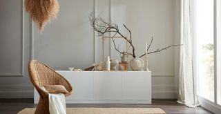
Eco-friendly paint company, Earthborn, has announced its Colour of the Year as Hopscotch – a sophisticated and calming neutral with a hint of warmth.
Moving away from the bold pigments that have dominated the interior industry in 2023, Hopscotch is a warm, chalky off-white that is incredibly adaptable to make it perfect for any room in the house. Combining subtle yellow and grey undertones it provides an intriguing neutral canvas for any room.
“With earthy, warm colours starting to dominate the interior space, chalky neutrals are an essential part of this palette," says Cathryn Saunders, head of creative at Earthborn.
"Extremely versatile and delicate, Hopscotch works with all room orientations, serving as the perfect subtle backdrop for brighter colours or working in harmony with similar neutral tones for a softer aesthetic."
"Whether used across walls, ceilings, woodwork or furniture, this warm and calming shade forms the foundation of various design styles, bringing longevity, timeless appeal and relaxation to all spaces."
13. White 05 by Lick
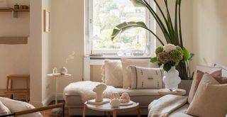
The best white paints of 2024 are those with an off-white undertone. “In 2024 we are going to see people celebrating colour in a more contemporary way. Grey-based neutrals are being swapped for warmer, yellow-based neutrals," says Tash.
"Enduring and timeless, and subtle and soothing, they pair beautifully with the fresher, more vibrant colours in our palette, creating a sense of balance and harmony."
White 05 is a creamy white with warm yellow undertones, that emulates the natural tones of stone walls. Tash adds: "White 05 is a comforting neutral that will create a nurturing space to relax in."
14. Smudgewand by Fenwick & Tilbrook
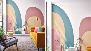
The new neutral that is already cementing its popularity in 2024 is one with pink undertones, such as the beautiful shade of 'Smudgewand'.
"Expect to see a lot more soft and muted pastels being used in interior design," says Anna Hill, brand director and colour consultant, at Fenwick & Tilbrook. "Lavender tones and pinky-neutrals are all set to be popular for the year ahead."
"These colours are perfect for creating a calming and serene atmosphere in the home, whilst bringing in subtle colour. They are all also very versatile, easily pairing with a variety of other colours."
Warming neutrals will continue to be the foundation for the 'quiet luxury' decor trend, which shows no signs of going away any time soon.
With a shade to suit all tastes, we hope these trend predictions help to influence all your pending decorating projects to ensure your home feels pleasingly on-trend yet timeless.

Tamara is a highly experienced homes and interiors journalist with a career spanning over 22 years. Now the Lifestyle Editor of womanandhome.com, she previously spent 18 years working with the style teams at Country Homes & Interiors and Ideal Home. With these award-winning interior teams, she gained a wealth of knowledge and honed her skills and passion for styling and writing about every aspect of lifestyle and interiors.
A true homes and interiors expert, Tamara has been an ambassador for leading interior brands on multiple occasions, including appearing on Matalan’s The Show and presenting at top interior trend forecasting events such as the Autumn Fair and Spring Fair.
-
 Let’s celebrate what unites us – it could help bring us together
We’ll be a happier society if we do, argues coach, consultant and podcast host Elizabeth Oldfield
By Elizabeth Oldfield Published
-
 Not sure what size blender you need? The Ninja Foodi covers single and supersized portions perfectly
The Ninja Foodi Power Nutri Blender 3-in-1 covers food processing, big batches of blending, and single servings too. It's a do-it-all model.
By Laura Honey Published