Lyle's Golden Syrup goes viral as fans realize the bizarre truth behind the brand's classic logo
Lyle's Golden Syrup is currently being questioned by fans who love the product but are completely baffled by the macabre logo


Lyle's Golden Syrup has found itself in the middle of a hilarious controversy as fans of the delicious product have only just realized what the brand's logo depicts.
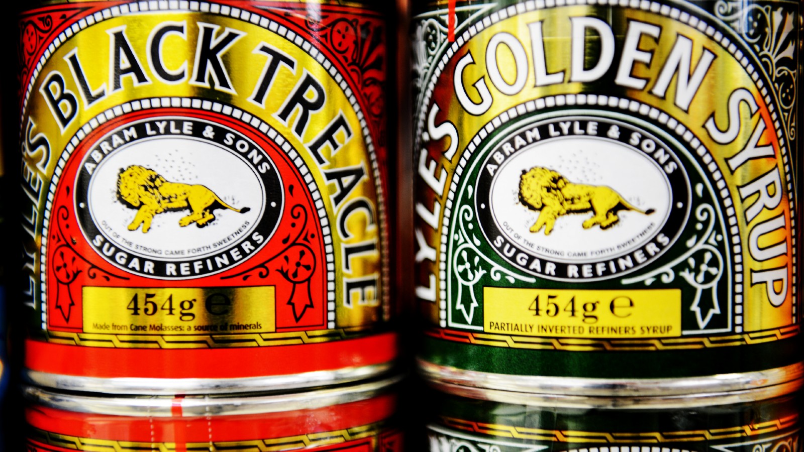
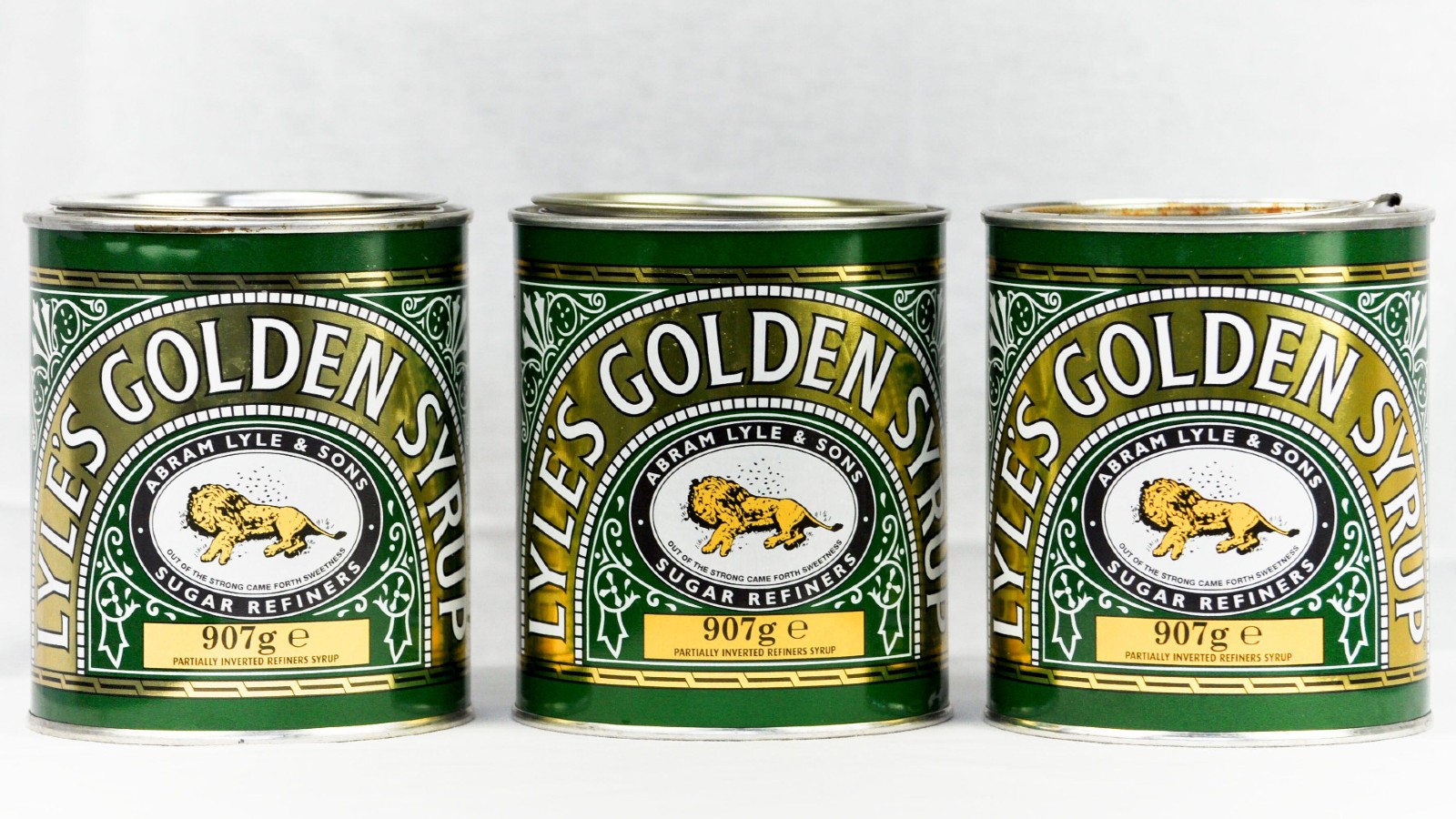
Lyle's Golden Syrup is a staple household item that can be found in cupboards across the UK. The product is undeniably delicious and the popular golden delight has been around since the 19th century. However, Lyle's has recently found itself in a sticky situation as people across Britain have just realized what the brand's logo is - and it's pretty gross.
The brand's logo features what appears to be a sleeping lion. But upon closer inspection, fans have actually realized that the lion is actually dead, with a hole in its torso, and bees pouring out from the hole, swarming the beast. Needless to say, fans are just a tad surprised.
The logo design has people scratching their heads, but not to worry - there's a reasonable(ish) explanation as to why the logo is so... unique.
A post shared by Lyle's Golden Syrup (@lylesgoldensyrup)
A photo posted by on
The creator of Lyle's Golden Syrup and Lyle's Black Treacle is Abram Lyle, who first began this business in 1881 at a sugar refinery in East London.
Lyle's website explains that the creator was a religious man, and the logo actually references a story that appears in the bible.
"Lyle had strong religious beliefs, which is why the tin's famous logo depicts strongman Samson's 'lion and bees' from the Bible's Old Testament, registered as Lyle's trademark," explains the website.
Sign up for the woman&home newsletter
Sign up to our free daily email for the latest royal and entertainment news, interesting opinion, expert advice on styling and beauty trends, and no-nonsense guides to the health and wellness questions you want answered.
"'Out of the strong came forth sweetness,' as the quote goes; where bees produce honey inside the lion's carcass, rich syrup pours from the well-loved tin...And the logo and design remained unchanged to this day (along with the delicious contents, of course)," it concludes.

The brand has retained its logo since the 19th century so perhaps the choice of design does actually have a logical explanation - as things were a little bit different in 1881. However, this hasn't stopped fans from sharing their disgust online.
"Tell me I’m not the only one who didn’t realize the lion on Lyle’s Golden Syrup packaging is depicted dead?!" said one fan on Twitter who then added, "Not me all this time thinking it was a happy sleeping lion."
Others were in denial and claimed that the lion was in fact just resting peacefully and not at all dead. "It's not dead, it is napping please don't be so morbid, love life," said the fan on Twitter.
Others were less impressed that it took some syrup fans this long to work this out - particularly as the logo has been the same for nearly 150 years!
"The first thing I saw when I looked at a tin 30-odd years ago was a dead lion surrounded by flies. Glad to see the world is catching up. :-D," joked one fan.
"Seriously, you only realized this now? I knew about 40 yrs ago," added another.
Laura is the Entertainment Editor for woman&home who primarily covers television, film, and celebrity news. Laura loves drinking and eating and can often be found trying to get reservations at London's trendiest restaurants. When she's not wining and dining, Laura can also be found travelling, baking, and hiking with her dog.
-
 We're in awe of Sienna Miller's easy-going and 'piece-y' hairstyle and how perfect it is for spring
This laid-back hairstyle is - quite literally - making waves this season
By Naomi Jamieson
-
 We never thought we'd see this 'dated' manicure make a chic comeback, but here it is - and we're on board
Clean and angular, short square French tips are a go-to this season for a practical but stylish manicure...
By Naomi Jamieson