Wondering where to hang pictures on a wall? Here are 5 essential placement tips from interior designers
Expert advice to avoid the most common mistakes when deciding where to hang artwork – for a balanced and curated display

Sign up to our free daily email for the latest royal and entertainment news, interesting opinion, expert advice on styling and beauty trends, and no-nonsense guides to the health and wellness questions you want answered.
You are now subscribed
Your newsletter sign-up was successful
Want to add more newsletters?
There's no better conversation starter than artwork inspired by our hobbies and holidays abroad – they never fail to add character and colour to our spaces. Whether thrifted or bought online, a few inexpensive prints can totally transform a living room on a budget. It's just that hanging them up can feel a little intimidating, or just a lot of effort, but anyone can do it with our rules of thumb below.
Frankly, if you have already chosen your artwork and framed it, you're onto a winner; the hanging part is simply the final flourish. You can always lean artwork on shelves, mantlepieces, or even on the floor for a super casual and bohemian vibe, but this seriously limits where your art can go.
There are no hard and fast 'dos and don'ts' but similar to choosing the right rug there are considerations to take into account when choosing where to hang pictures on a wall.
Article continues belowFor instance, you may want to avoid hanging artwork in a spot that receives lots of direct sunlight, potentially causing reflections or damage to the artwork, depending on what it's made of. Bear in mind too, that art can be exposed to moisture and heat in bathrooms and kitchens and avoid placing art too close to radiators and fireplaces.
Where to hang artwork: 5 interior design tips
Remember, you can always cut out frame-sized paper templates and arrange them on the wall, adjusting them over a few days to ensure you're happy with the arrangement.
Before you reach for the hammer, make sure you have the right hanging hardware and a spirit level, available at Amazon, because if a job's worth doing, it's worth doing properly.
1. Hang art a few inches lower than you think
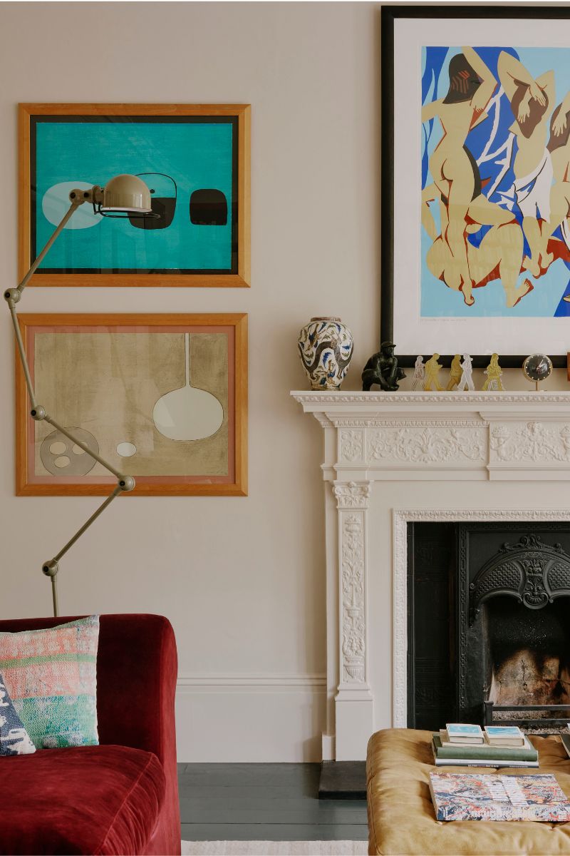
A common mistake interior designers see is hanging artwork too high. If you think about how art is hung in a museum or gallery, it's generally at a comfortable eye level.
Sign up to our free daily email for the latest royal and entertainment news, interesting opinion, expert advice on styling and beauty trends, and no-nonsense guides to the health and wellness questions you want answered.
"Hanging art too high (or low!) majorly disrupts the visual harmony and can make the piece feel disconnected from the rest of the room," says Floss Kelly, interior designer, artist, and co-founder of TileCloud.
Think about who will be enjoying the art most often and hang it at a comfortable height for them. "For those looking for a "rule" to follow, there is the 60" inch rule, which notes that art should be hung so that the midpoint is between 57-60 inches from the floor, and provides good guidance," adds Cathy Glazer, founder of online gallery Artfully Walls.

Floss Kelly is an interior designer and the co-founder of TileCloud, where she channels her passion for design and ceramics into helping clients create beautiful spaces. Beyond TileCloud, she also indulge in her love for art through a side business, painting on canvas.
2. Make sure it chimes with the room's design
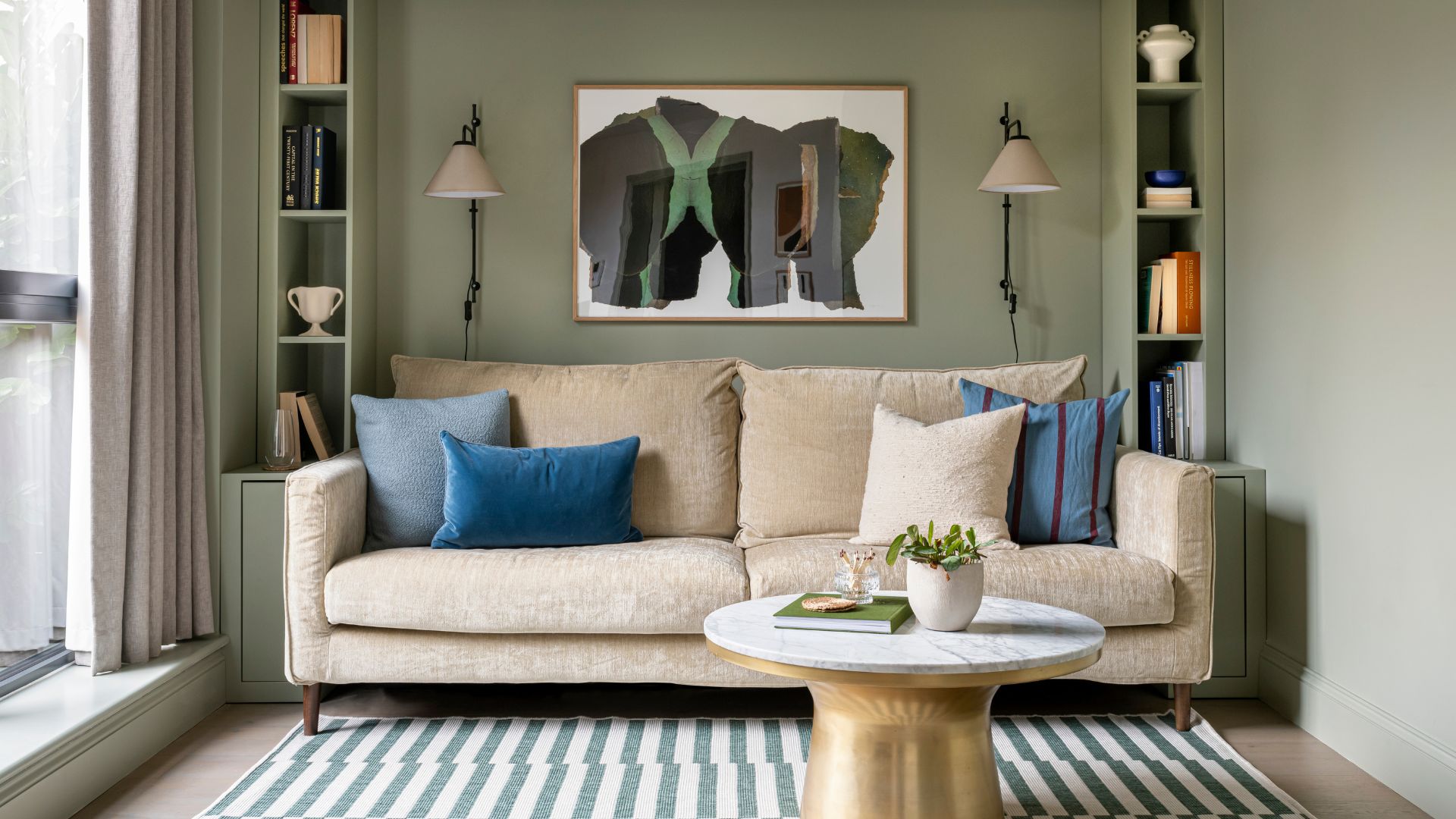
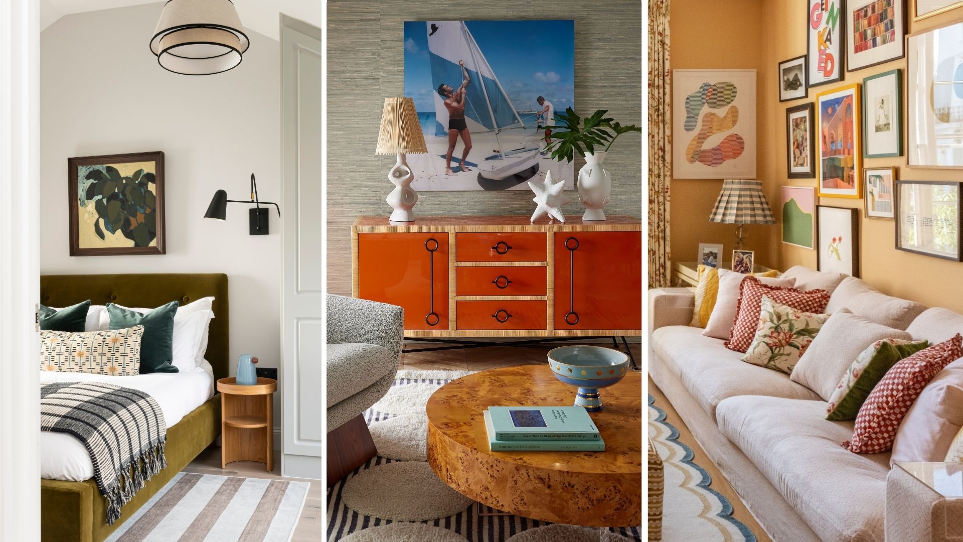
We can't all be art connoisseurs, but we can tell when a print doesn't tie in with the overall style or atmosphere of a room. It might just look a bit off, or make too much of a statement, so draw on the interior paint colour trends and style of the room, as in the living room above.
"When it comes to placing art, my biggest "do" is to ensure it resonates with the room’s overall design and vibe," advises Floss Kelly. "Art should enhance the space, not dominate or feel out of place."
Floss always recommends centring the art piece at eye level to create a natural focal point, which is the secret to making a small living room layout feel cohesive.
3. Try the 2/3 rule
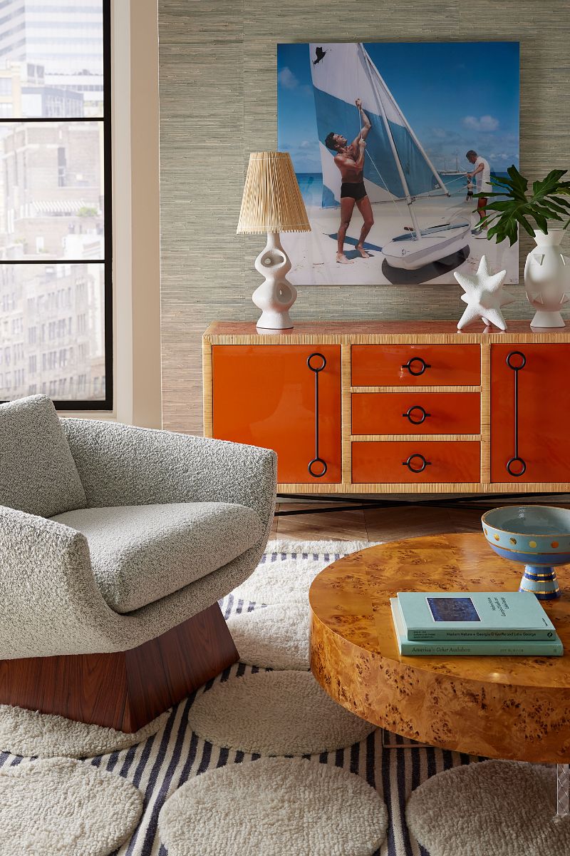
I recently discovered the 2/3 rule for hanging artwork, and I'm definitely going to be using it to make sure artwork feels visually balanced. The rule states that your collection of art should be around two-thirds of the size of the furniture underneath it.
Interior designer Floss Kelly is also a fan of the 2/3 rule as a practical guideline that helps maintain balance: "If you are mindful that your collection of artwork is roughly 2/3 the size of the furniture below it, you create a cohesive look that feels intentional and well-proportioned," says Floss.
"I think this rule is especially useful when arranging multiple pieces, as it keeps everything looking organised and stylish."
4. Don't over think it
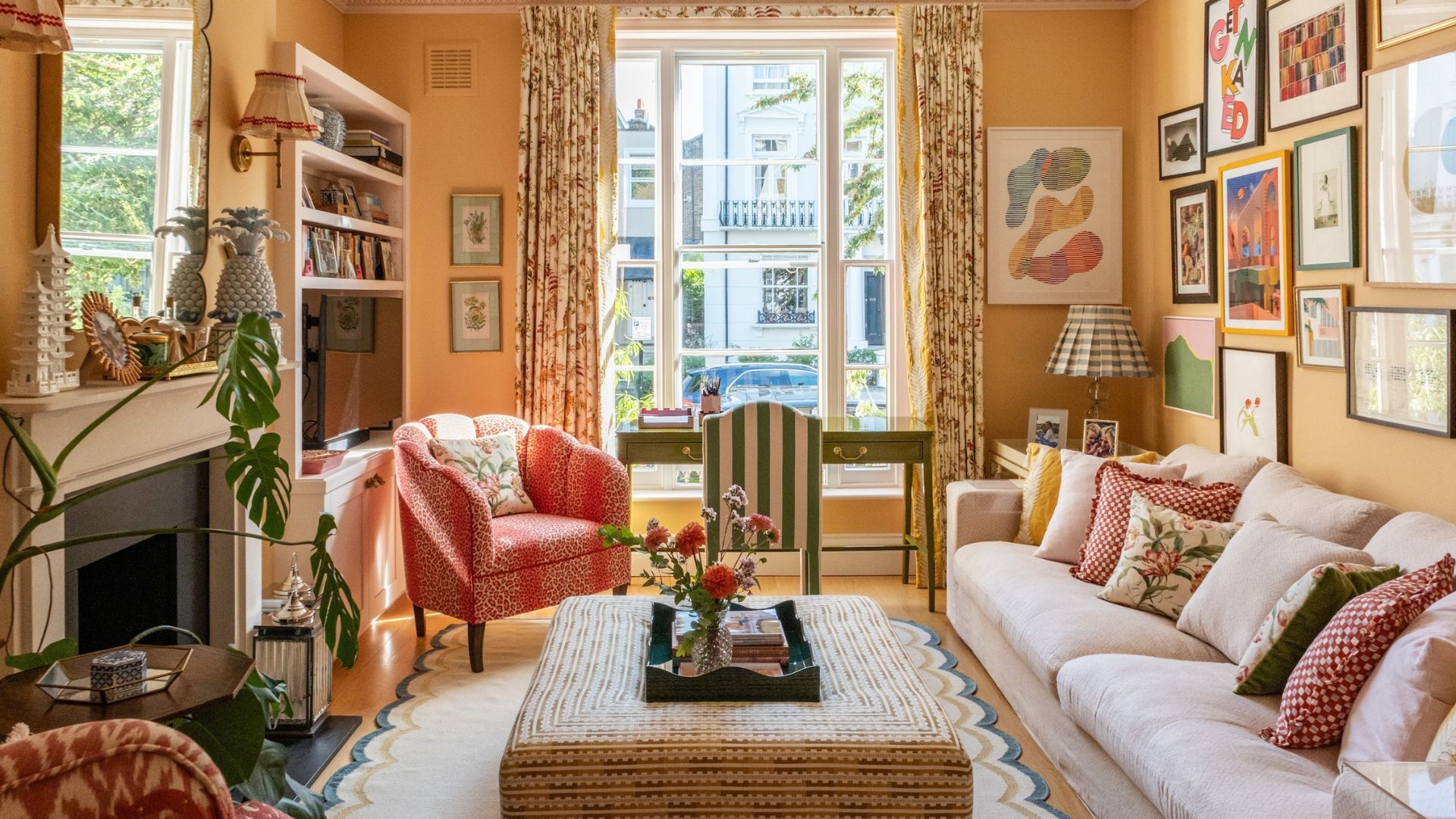
Trust your eye and work with the limitations of the room rather than against them – and don't be too worried about making mistakes. One great way to update your bedroom for spring is to 'shop your home' and simply move art around or finally hang up some prints, because who doesn't have a load of frames waiting to be put up on the walls?
"People tend to overthink the process and stress themselves out," agrees Cathy Glazer, the founder of the online gallery Artfully Walls. "Don't worry about how a wall 'should' look. At the end of the day, it's very easy to touch up a small nail hole in a wall, so go ahead and experiment to see what looks and feels right to you."
Don't be afraid to hang artwork in surprising places for a fun and playful feature, either: "Unexpected layouts, such as hanging a gallery wall on two corner walls, or leaning art on a shelf in an asymmetric fashion, can make for a stunning visual," says Cathy Glazer.
5. Consider sight lines
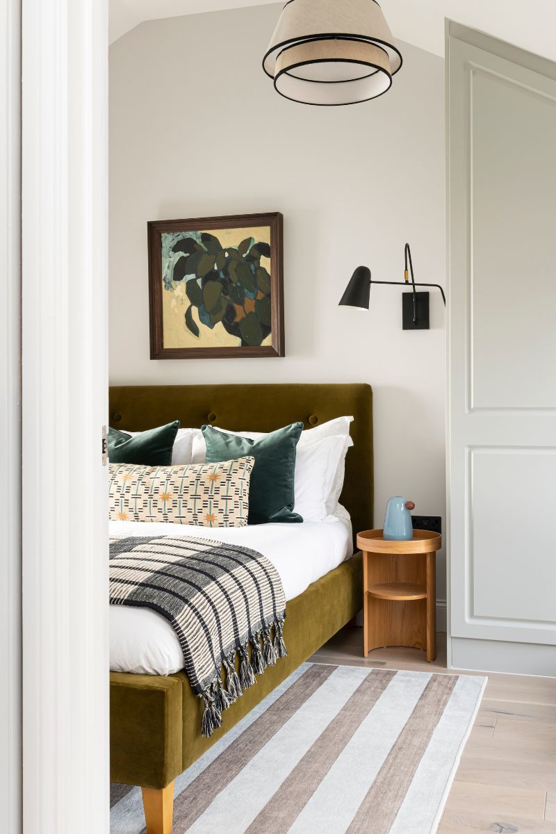
Before hanging artwork, Cathy Glazer recommends thinking about where your art will be seen from, and how that can add to your experience of moving about your space.
I totally agree with this one, as I have made the mistake in the past of filling blank walls with art but then realising that I barely ever get to enjoy looking at it, because it's tucked around a corner.
Prime spots for hanging art are opposite your sofa (a great way to update your living room for spring), or opposite your bed or desk if you work from home. The hallway or staircase always feels like an obvious place to hang artwork or family photos, but if you have a piece you really love, make sure it's hung somewhere you're not just passing through.
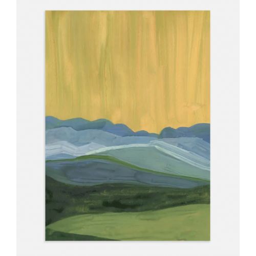
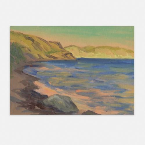
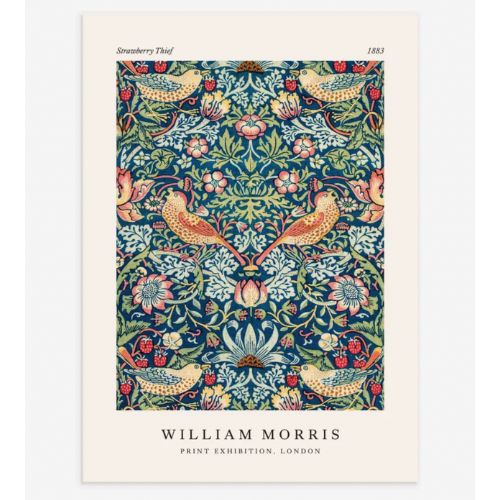
Folklore is one of the key interior design trends for 2024, so you might wish to embrace some woodland scene artwork or landscapes in a subtle nod to this trend. You can buy affordable artwork and prints for a seasonal refresh without a big commitment. We've rounded up a few above from H&M Home so you can make an on-trend gallery wall or 'salon wall'.
FAQs
Should artwork be central on the wall?
Interior designer Sophie Clemson says we often assume artwork should be central to the wall, but this isn't always the case. "If you have a piece of artwork central to the wall, it can look lost and like it is floating if there isn't anything directly below it.
Place the artwork centrally above the piece of furniture underneath, this will anchor the artwork and create balance. If it is a very large piece of statement artwork that is going to take up the majority of the space with nothing below, then centralise the art."
Sophie Clemson is the co-founder of The Living House, an affordable online interior design company that helps busy families transform their homes easily, online and within their budget.
How do you arrange three pieces of art on a wall?
"There are varied compositions and layouts which can be used to hang three pieces of art on a wall, and it depends on the art and the space," says Cathy Glazer.
'Layouts can include a symmetric horizontal line or vertical line if the three pieces are of a similar nature and size. Alternatively, they can be staggered. We also like creating small groupings of art and suggest mixing styles and mediums.
'For example, try pairing a line drawing with an oil portrait and a landscape, or combine a photo with an abstract painting and a piece of mixed media. The unexpected pairings create visual interest and make the art look like it was collected over time.'

Millie Hurst is a freelance writer and interior designer based in Sheffield, helping clients create homes that are characterful, curated, and highly functional. Interior design inspirations include Jake Arnold, Beata Heuman and Abigail Ahern. Her personal style is a 'liveable maximalism' with boho, nature-inspired designs.
She has seven years of experience in the world of digital journalism, most recently working as Head of Solved at Homes & Gardens, where she wrote and edited countless features on home organisation, decluttering and interior design. Before that, she was Senior Content Editor at Ideal Home.
