5 stylish ways to decorate an empty corner in any room, according to interior designers
Small, under-used corners of the home can be the most fun to decorate – take inspiration to carve out a new functional area
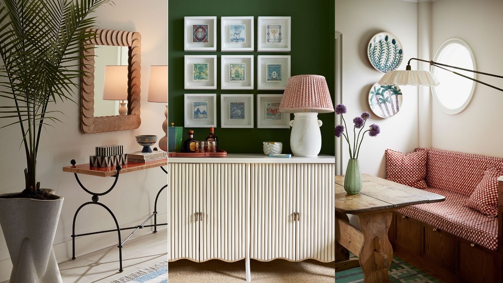

We've all got a neglected corner or two in our homes crying out for a revamp. Compared to redoing a whole room, decorating empty corners has a seriously low effort-to-reward ratio. It's a fun way to flex your decorating muscles and experiment, expressing your style and creating a brand-new space out of nothing.
Honing in on a corner is a good way to transform a living room on a budget, especially if you make use of existing furniture from elsewhere in the home – for tips on making everything 'go' together, follow expert advice on combining heirlooms with a contemporary style.
Below, we have gathered some simple ways to transform bland corners of your home into a space that makes you smile every time you walk past it.
5 ways to decorate empty corners: interior design tips
When deciding how to zhuzh up your space, first think about how much natural light it gets. If it gets a lot, you might decide to add easy maintenance houseplants and a mirror, if it's dark, embrace it and make it into a cosy reading nook with a lamp and blanket.
Here are five ways to make use of empty corners and make your space feel like new.
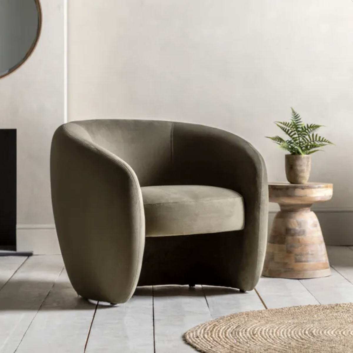
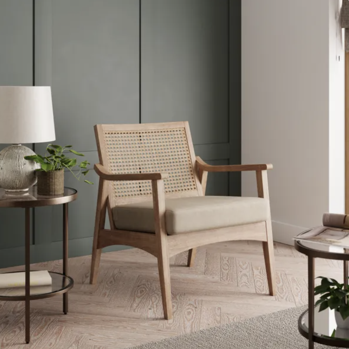
1. Add an accent chair
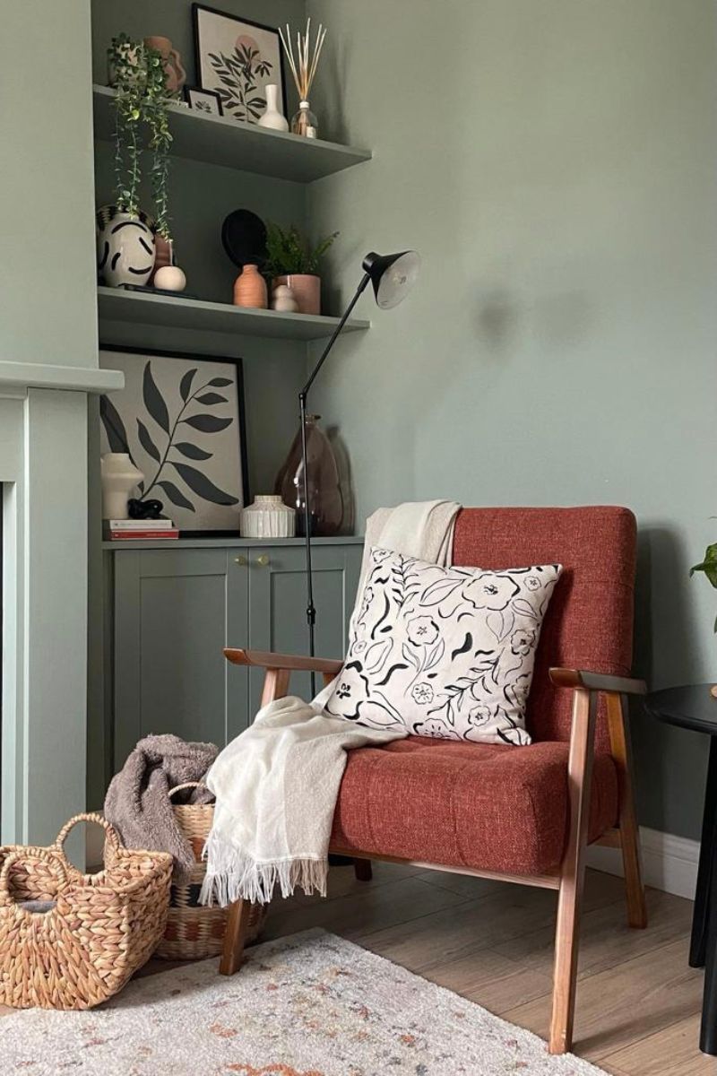
Create an extra place in your home where you can pause and take a seat by adding a chair and a little side table. An accent chair is also a great opportunity to introduce a bolder colour or pattern into your scheme – although in a bedroom layout, you will need to resist the urge to let it become the 'clothes chair'.
"An armchair is a brilliant way to decorate an empty corner in your room, whether this is a living room or bedroom," agrees Sophie Clemson, an interior designer at The Living House, an online design company. "You can set the scene by choosing a rug to go with it. Then add a floor lamp and side table to create a cosy corner, the perfect reading spot!"
Sign up for the woman&home newsletter
Sign up to our free daily email for the latest royal and entertainment news, interesting opinion, expert advice on styling and beauty trends, and no-nonsense guides to the health and wellness questions you want answered.
Tom Yates, an interior stylist at Wreaths comments that your armchair tucked in a corner may end up becoming a favourite for someone to sit and observe what’s going on in the room without being close and involved.

Sophie Clemson is the co-founder of The Living House, an affordable online interior design company that helps busy families transform their homes easily, online and within their budget.
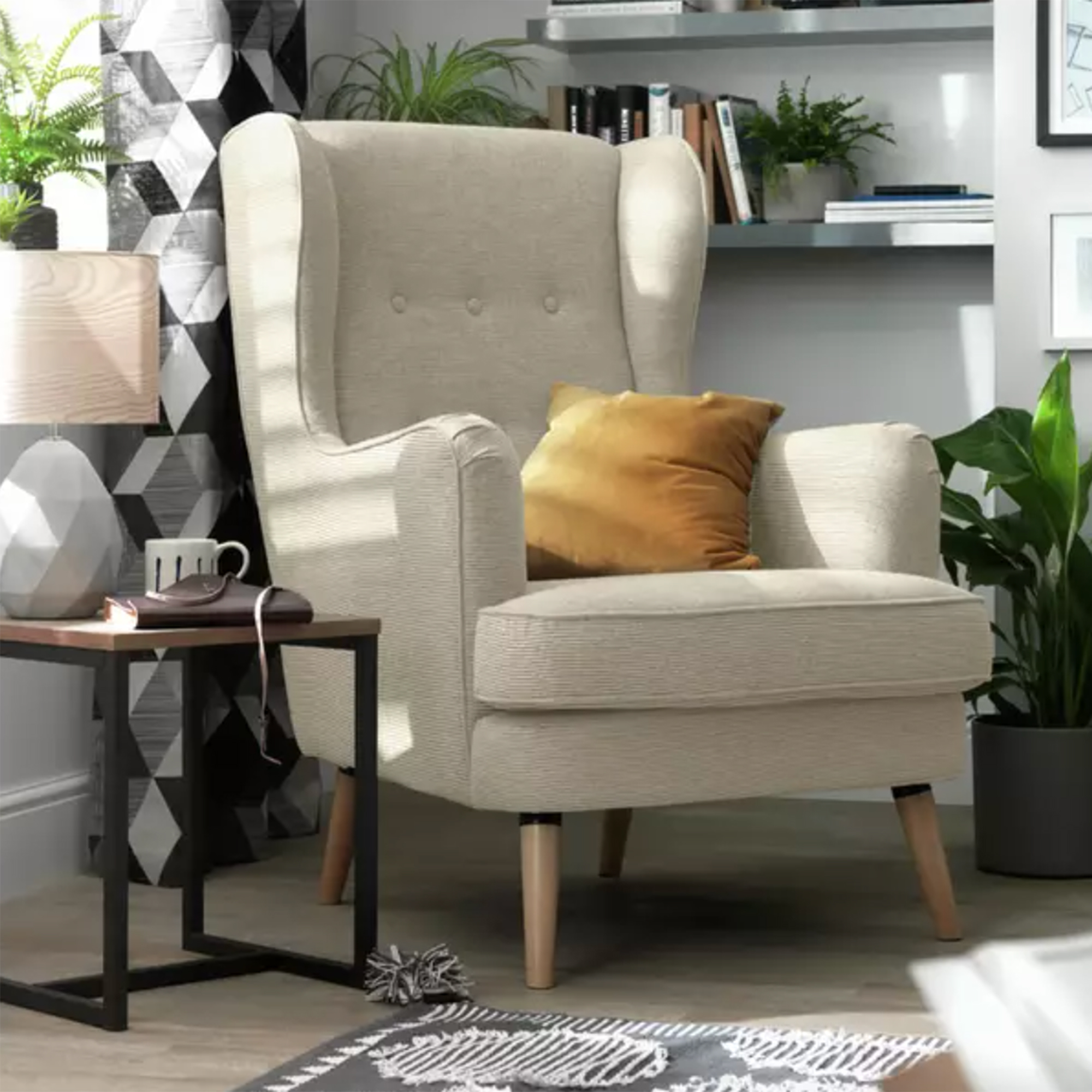
RRP: £230 | Every home needs a classic armchair, and we love this traditional wingback option from Habitat. With its high, slender frame and smart wooden legs, it adds a touch of modern country charm to a corner.
2. Draw the eye up with houseplants
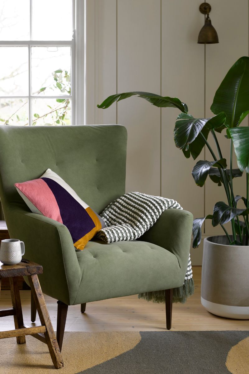
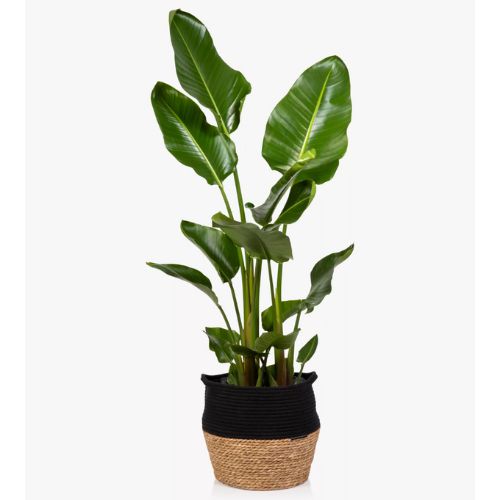
Decorate your corner with some of the best indoor plants, which will instantly bring texture, shape, and life into your space. Plants are an easy way to brighten up bland spaces, from home offices to landings.
"Adding plants is a great way to add greenery to an empty corner," says Sophie Clemson. "It doesn't always need to be a piece of furniture. A plant can be a great addition and a way to add height to the room."
To enhance the sense of height, Sophie recommends going for a tall plant while making sure the pot you use is fairly large. The best places to buy plants online specify how tall each plant tends to grow, so you can plan accordingly for your space. This is key to making the plant look balanced.
Opt for a textural, like an aged terracotta pot or a woven basket, and consider displaying the plant on a small stool or plant stand to increase its height.
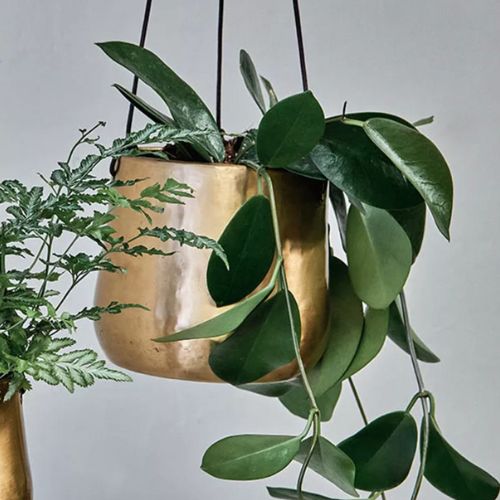
"You could also consider the ceiling," Sophie adds, "and instead go for a hanging plant that will draw your eye up and fill the corner space."
If you have a corner with ample natural light, use interior designer and architect Paul Cuschieri's top tip and add a full-length mirror behind your indoor plant. This will add depth, light, and movement, creating a striking focal point, as well as making a small living room look bigger.
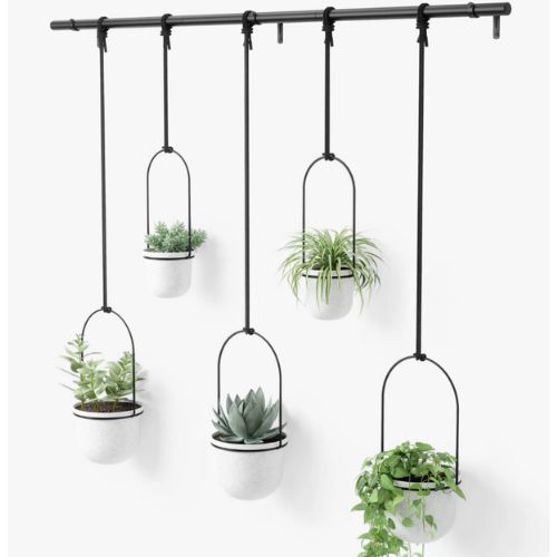
RRP: £90 | Make the most of wall space with this hanging planter, which has a contemporary design and comes in white, white gold, and black. You can adjust the height of the ropes and slide them along the metal rod to suit your display and space.

Paul is a designer and architect at Rebirth Design Studio, which he set up in 2019 and runs with co-founding partner Malcolm Abela Sciberras. The company has bases in London and Malta. Paul is passionate about finding the best design solutions to bridge functionality, practicality, efficiency and sustainability with comfort, artistry and beauty.
3. Display artwork
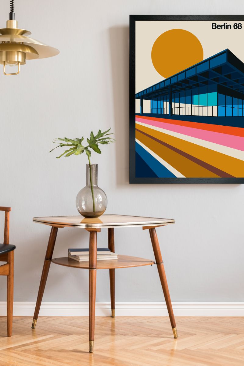
Kelly Cahn, an art advisor based in New York recommends using empty corners to install artwork. She says hanging artwork can transform those under-used areas into captivating focal points.
"Consider installing a hanging sculpture to add an unexpected element of interest," Kelly suggests. "Pieces like Alexander Calder’s mobiles or Jeppe Hein’s balloon sculptures introduce movement and colour, naturally drawing the eye upward and making the space feel more dynamic and vibrant.
"I also particularly love the salon-style approach, where works of different sizes and styles are arranged together," Kelly shares. "This method creates a dynamic and visually engaging corner that feels both curated and personal."
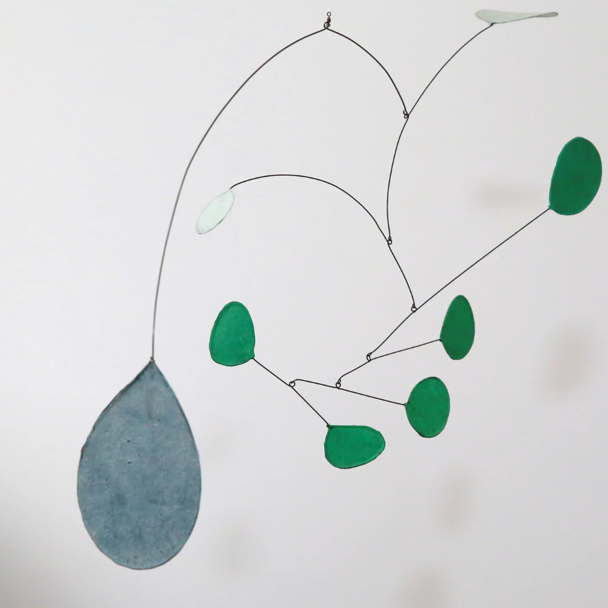
RRP: £116 | Add interest to corners with a kinetic art style sculpture, like this one made of wire and tissue, in green and blue. It swings and rotates 360° on itself and has a contemporary aesthetic.
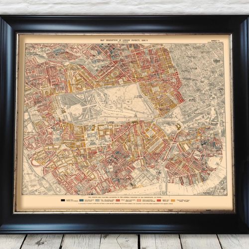
RRP: £25.49 | Charles Booth poverty maps identified the social character of every street in London through colour coding, and are a fascinating look at Victorian London. Hang a map of an area of London that is special to you and it'll always be a conversation piece and personal touch.

Kelly Cahn has two decades of experience in the art world. She is the founder of Kelly Cahn LLC: Art Advisory and Appraisals. Kelly holds a Bachelor of Arts in Art History from Tulane University in New Orleans and a Master of Arts in Modern Art, Connoisseurship, and the History of the Art Market from Christie’s Auction House in New York.
4. Add storage
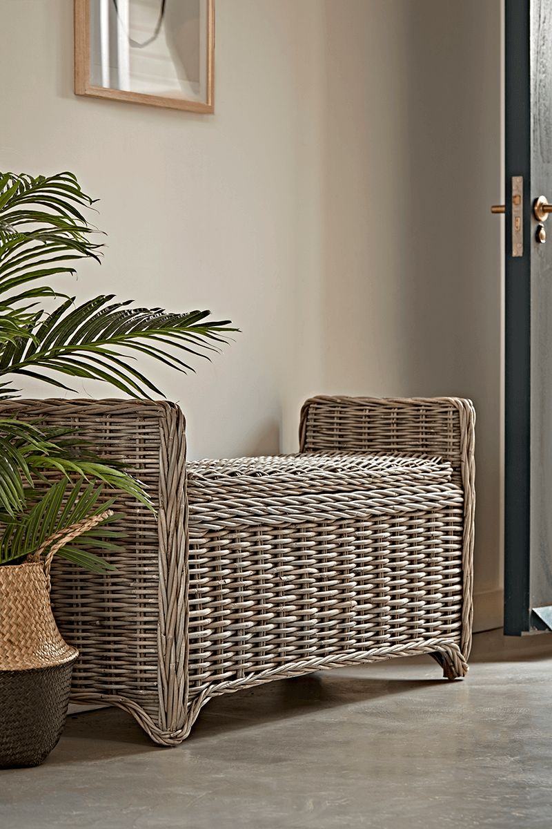
Your empty corner could be a perfect opportunity for some storage, be it a bar cart in a living room alcove, corner shelving in a bedroom, or a storage bench in the hallway, like the one pictured above.
"In an entrance area, incorporating a corner desk or a built-in bench with concealed storage can be both practical and stylish, especially when adorned with decorative items and a cushion in coordinating colours," says Paul Cuschieri.
Sophie Clemson agrees and says extra storage is always a bonus, especially when you have little ones. "Baskets work well in empty corners. We recommend grouping a couple of medium or large baskets together. Opt for seagrass baskets to bring in some natural texture," she says.
I love these La Redoute wicker baskets and have used them in interior design projects as a stylish way to conceal items you need but don't want out on show, from toys to phone chargers.
5. A statement wall light
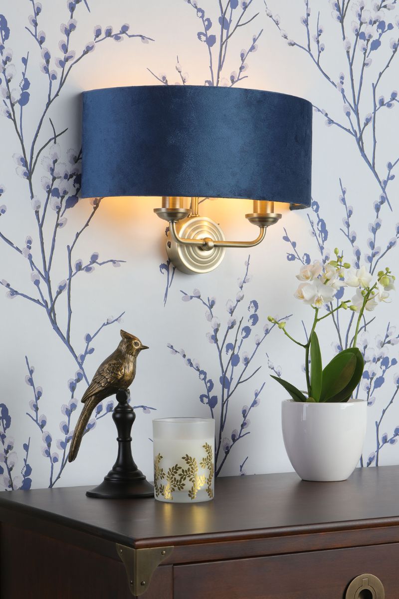
We often overlook lighting, but interior designer Tracy Metro encourages us to think about adding statement lighting when decorating empty corners, because it can make a big impact.
"While there are lots of elements one can put in a room corner such as a vibrant fiddle fig tree in a gorgeous textured pot, or a large, graphic handwoven African basket billowing with knitted throw blankets, or even an industrial sculpture floating atop of a lucite pedestal – the trick to elevating those pieces and making it feel like a hotel is to add an uplight behind," says Tracy.
Tracy says the shadows will create drama in the corner. If you want to score bonus points, put the light on a timer and have it go on at dusk and off at bedtime. "Every night, your space will have fleeting wallpaper."
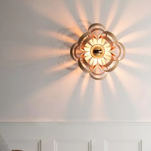
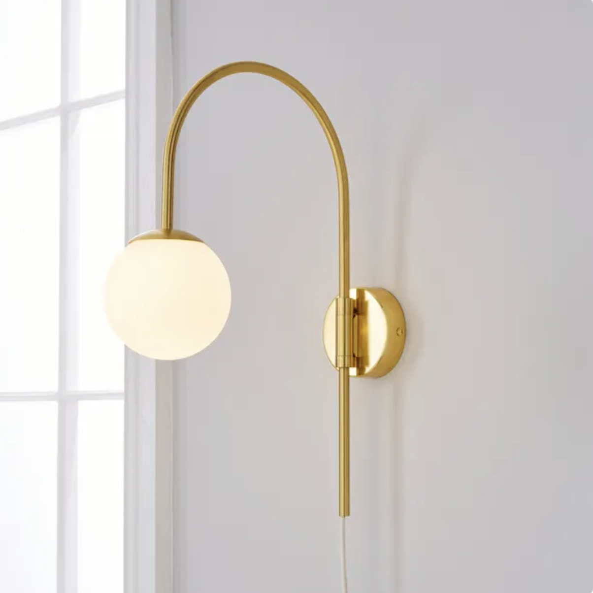
RRP: £225 | This unique wall light design by Tom Raffield celebrates natural materials and handcrafted skill. It's created from sixteen individual, sustainably sourced wood petals and designed to produce golden light and eye-catching shadow effects in equal measure.
FAQs
How can I make a cosy corner?
Lighting is always key when looking to make a home feel cosy. "To make a corner feel cosier, I usually consider adding warm lighting with a floor or table lamp to create a soft, inviting glow," says interior designer Paul. "I love including rugs in warm colours or calming patterns. I also believe in personalisation, so hanging artwork or a favourite photo will make the space feel more inviting.
Where possible, I try to integrate a music speaker linked with the rest of the house to manage music seamlessly, adding to the cosy ambience."
When is it best to leave a corner empty?
Interior designer Paul Cuschieri says that in 'minimaluxe' or contemporary interiors, empty spaces emphasise simplicity, reduce visual clutter, and create a sense of calm and openness.
There are practical reasons why it might be better to keep the space empty too, for example, in high-traffic areas or smaller rooms, an empty corner ensures easy movement and prevents the space from feeling cramped.
It also depends on what the primary points of interest are in a room, Paul says because if there is already a dominant focal point, such as a fireplace or a statement piece of furniture, leaving a corner empty helps maintain focus on that feature without creating distractions.
Finally, where maximalism is the design of choice, in rooms with heavy furnishings or dense decor, Paul says an empty corner can provide visual relief and help balance the room's proportions.

Millie Hurst is a freelance writer and interior designer based in Sheffield, helping clients create homes that are characterful, curated, and highly functional. Interior design inspirations include Jake Arnold, Beata Heuman and Abigail Ahern. Her personal style is a 'liveable maximalism' with boho, nature-inspired designs.
She has seven years of experience in the world of digital journalism, most recently working as Head of Solved at Homes & Gardens, where she wrote and edited countless features on home organisation, decluttering and interior design. Before that, she was Senior Content Editor at Ideal Home.
-
 We're in awe of Sienna Miller's easy-going and 'piece-y' hairstyle and how perfect it is for spring
This laid-back hairstyle is - quite literally - making waves this season
By Naomi Jamieson
-
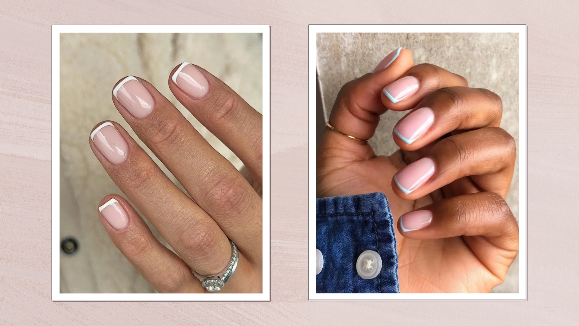 We never thought we'd see this 'dated' manicure make a chic comeback, but here it is - and we're on board
Clean and angular, short square French tips are a go-to this season for a practical but stylish manicure...
By Naomi Jamieson
