Small living room layout rules I always follow, as an interior designer
5 ways to maximise space and create cohesion in a small living room
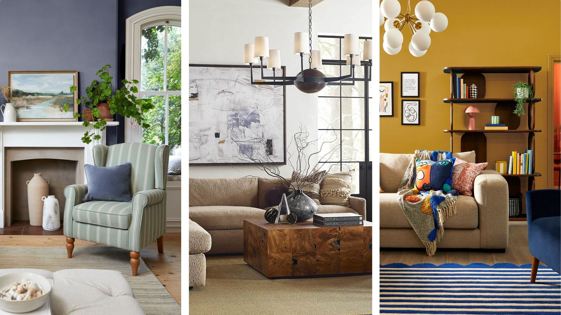

Small living rooms have certain limitations – they require us to be more imaginative and more emphatic with our furniture choices, decor and layout. But there is no reason why a smaller space can't be just as stylish, cosy and characterful as a living room with a larger footprint.
Below, are the small living room layout rules I always follow in my own living room and those of clients. I have found that these rules of thumb can make a small living room look bigger and also make a living room look more expensive on a budget.
From thoughtful furniture placement to the best accessories to adding a professional level of styling, these tips are super easy to follow and yet can be highly effective at enhancing a small space.
Small living room layout rules
When space is at a premium it is vital to explore the simple styling tricks and rules interior designers use to make it easier to provide enough seating without making the room feel overcrowded or compromising the flow of the space.
1. Use a large rug
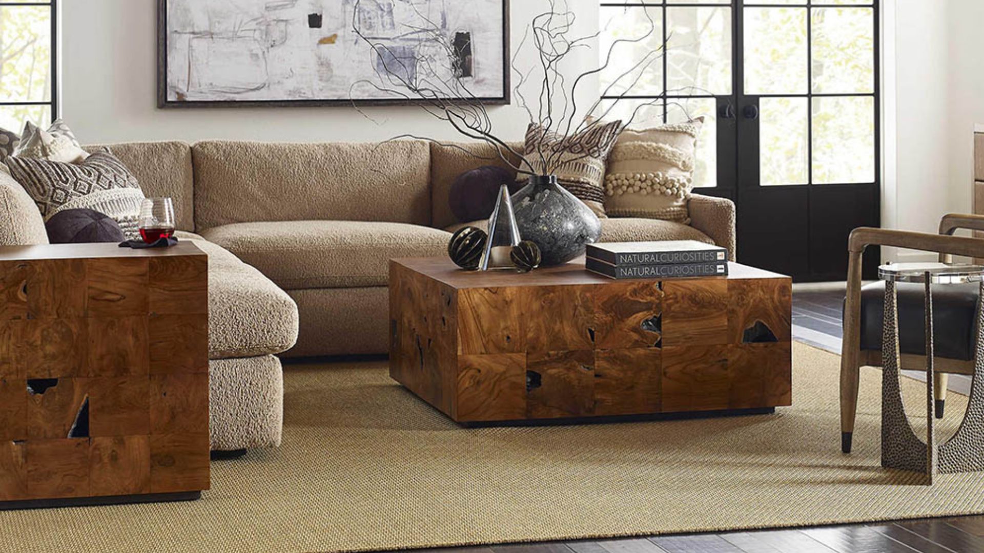
A rug should be an anchor, not an island. Of course, rugs are an investment, and because of the high price tag, it's incredibly tempting to choose a slightly smaller size than what will actually fit our space.
But going big will always pay off. Interior designer Sophie Clemson agrees, and says that one of the most common living room design mistakes she sees is a small rug placed in the middle of the room, not touching anything else. "This makes the rug look like it is going to float away and draws your eye into the centre of the room, making it feel smaller!" Sophie says.
As a rule, the front two feet of your sofa and armchairs should fit onto the rug. Opting for a bigger rug is an easy way to enhance the sense of space because the large expanse of the rug pulls the eye to the perimeter of the room, creating the illusion of a larger space. "It also helps to link everything in the room together and adds to the cosiness factor," says Sophie.
Sign up for the woman&home newsletter
Sign up to our free daily email for the latest royal and entertainment news, interesting opinion, expert advice on styling and beauty trends, and no-nonsense guides to the health and wellness questions you want answered.
In a small living room I'm redesigning at the moment, we are using a large area rug (the jute LOHALS rug, at IKEA) to cover most of the floor. This is an inexpensive option that brings texture and warmth, as well as creating a foundation on which to layer furniture.

Sophie Clemson is the co-founder of The Living House, an affordable online interior design company that helps busy families transform their homes easily, online and within their budget.
2. Pull furniture away from the walls
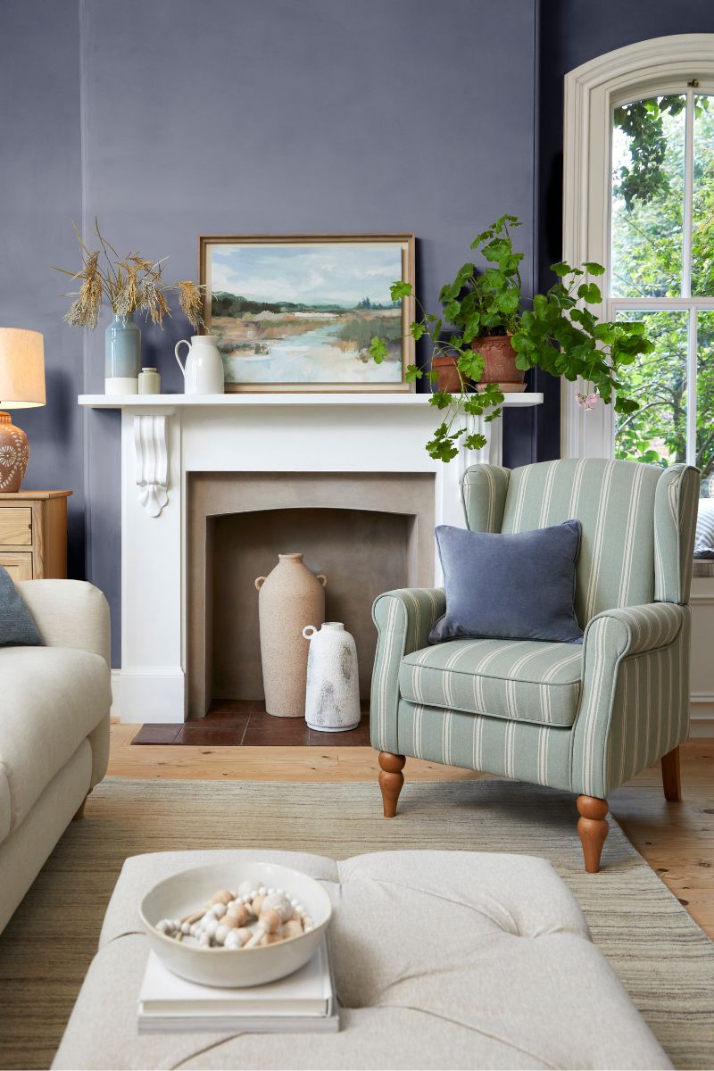
In a small living room, our default mode is to put furniture up against the walls, because we're wary of taking up too much space. Placing your sofa in the middle of the room might sound a little out-there, but being bold and giving furniture breathing space will totally transform your living room on a budget.
You might have a corner sofa or an L-shaped sofa that tucks into a corner, but you can still pull armchairs closer towards the centre of the room to create a layout that feels more sociable. A large area rug will keep things anchored and intentional.
Sophie Clemson recommends pulling your sofa and chairs just 15 cm away from the walls to create a cosier and more intimate seating arrangement. On a practical, money-saving note, if you have a sofa or armchair in front of a radiator, always make a gap so warm air can circulate more easily.
3. Use the walls
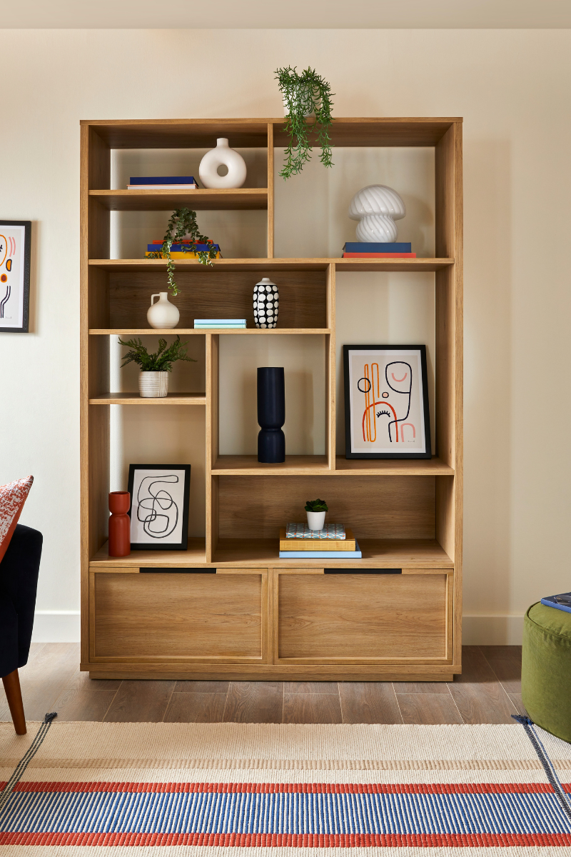
Think about decorating your living room like an architect building a skyscraper in New York and go upwards to unlock your room's potential. Shelving, artwork, LED-powered wall sconces, and mirrors will all give your space more design points, so banish blank walls and inject more personality into your living room.
"If your ceilings aren’t particularly tall, add bookcases, large plants, shelving, or floor lamps to draw your eye up and give the illusion of more height," suggests Sophie Clemson.
Sophie also recommends playing with height by having furniture at different levels, such as a low-slung sofa with a high-backed armchair. This brings interest and rhythm to the small space and stops it from feeling one-dimensional and bland.
4. Always create a focal point
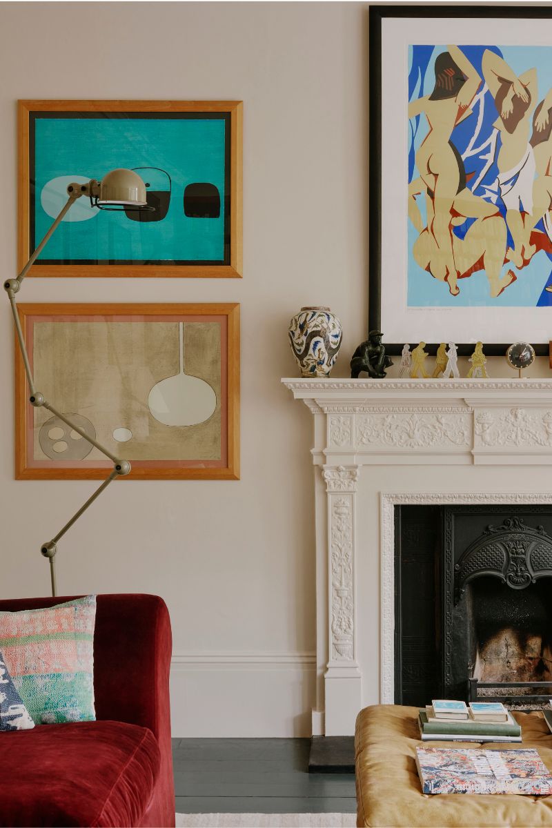
For a living room that feels well-designed, you always need a clear focal point, which is an area that draws the eye and grounds the space. Without one, the room will be left looking disjointed and unfinished, so think about what feels like the natural focal point of your space.
The architecture of your room may decide this for you – it could be a fireplace, a wall of bookshelves, a large bay window, or a gallery wall behind the sofa. Emphasise the focal point with furniture placement, paint, or lighting, which will all direct the eye.
In a living room design project I'm working on currently, we have exposed the original brick fireplace and are installing shelves on either side to fill with books and decor, making the entire wall and fireplace the focal point of the room – hopefully drawing the eye away from the TV, too.
This dark brown console table from IKEA is a good "no fireplace" idea, mimicking a mantlepiece and giving you somewhere to style a vase, clock, artwork, candles, and so on.
5. A rounded mirror is a must
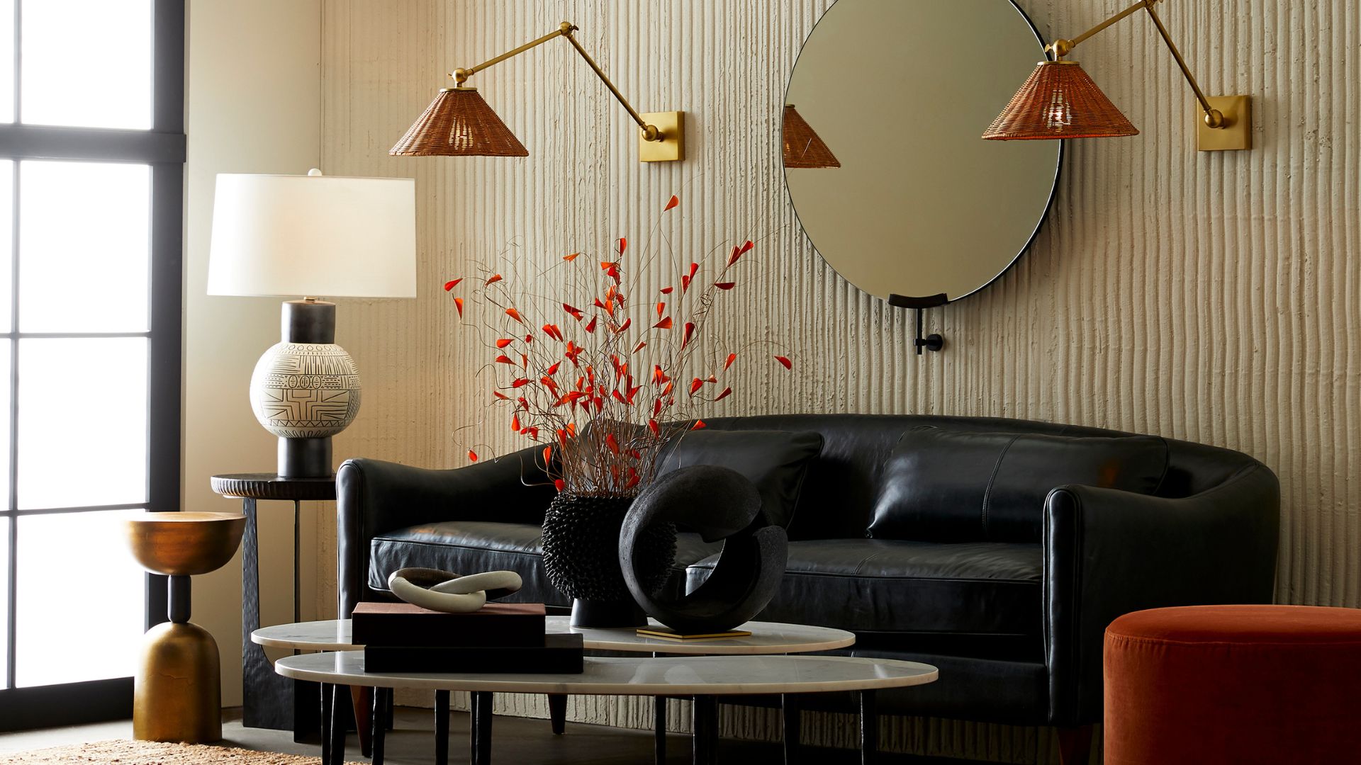
Every small living room needs a mirror, ideally one with soft edges to counter the many harsh angles of our living spaces (think door frames, windows, radiators, and the corners of the room itself). Place a curvaceous mirror, like this large circular mirror, at Argos or this organic freeform mirror from John Lewis, above a fireplace or on the wall opposite so that it's perpendicular to the window to open up the space, bounce light around, and create a sense of depth. There is always space for a mirror and they're also an opportunity to use shape as an interior design tool to soften the space.
How do you arrange two sofas in a small living room?
How you position two sofas in a small living room depends on the shape and size of the room, but the first and ideal option would be to have them facing each other. This creates a lovely conversational area, as well as symmetry, which can give a living room a slightly more formal feel.
Otherwise, you are best off positioning them perpendicular to each other, ensuring there is enough clearance around the arms so that they don't look squashed together. Positioning a sofa in the window can work, but I have found this can block natural light coming in. Plus, chilly draughts and a sense of being seen by people passing by can make it feel less comfortable. Consider replacing one sofa with a love seat if you need more flexibility, and use floor cushions and pouffes for extra, casual seating.
Of course, rules are made to be broken, and we would never want anyone to feel worried about making some kind of disastrous interior design mistakes and faux pas, so while these tips work for some, there's a chance they might not work for your space. That said, the rules above can be used to varying degrees to improve the layout and furniture placement to significantly improve a compact living room.

Millie Hurst is a freelance writer and interior designer based in Sheffield, helping clients create homes that are characterful, curated, and highly functional. Interior design inspirations include Jake Arnold, Beata Heuman and Abigail Ahern. Her personal style is a 'liveable maximalism' with boho, nature-inspired designs.
She has seven years of experience in the world of digital journalism, most recently working as Head of Solved at Homes & Gardens, where she wrote and edited countless features on home organisation, decluttering and interior design. Before that, she was Senior Content Editor at Ideal Home.
-
 Princess Beatrice just wore the maxi dress I've got my eye on for summer occasions - and she styled it with comfy Zara flats
She took style tips from Kate Middleton, choosing chic French brand Sezane
By Caroline Parr Published
-
 Royal style made casual - Zara Tindall's one-shoulder dress, denim jacket and Aspinal bag are the epitome of chic summer comfort
Zara Tindall's outfit in Bahrain was a more relaxed take on her signature style and was made up of timeless staples.
By Emma Shacklock Published