The biggest living room design mistakes interior designers always notice - and how to fix them
These are the most common living room design mistakes that interior design experts recognise straight away. Luckily, they're easy to fix


Tamara Kelly
One of the most-used rooms in the house, the living room needs to be a hard-working space, but also needs to look stylish and feel comfortable too, so avoiding living room design mistakes can be a challenge.
Whether we’re using our living rooms for relaxing and watching television, or socialising and entertaining, there’s often a lot going on in a fairly limited amount of space, so balancing functionality with good looks and a stylish aesthetic can be tricky and result in avoidable interior design mistakes.
But the good news is that many of these common living room design mistakes, unlike more costly kitchen design mistakes or bathroom design mistakes, are easy to put right. We asked interior design experts to give us the lowdown...
Living room design mistakes - and how to fix them
From overfilling the living room with too much furniture, or a crowded layout that ruins the sense of flow, to hanging wall art incorrectly - it doesn’t take much to throw a living room scheme completely off-balance.
1. Pushing sofas against the walls
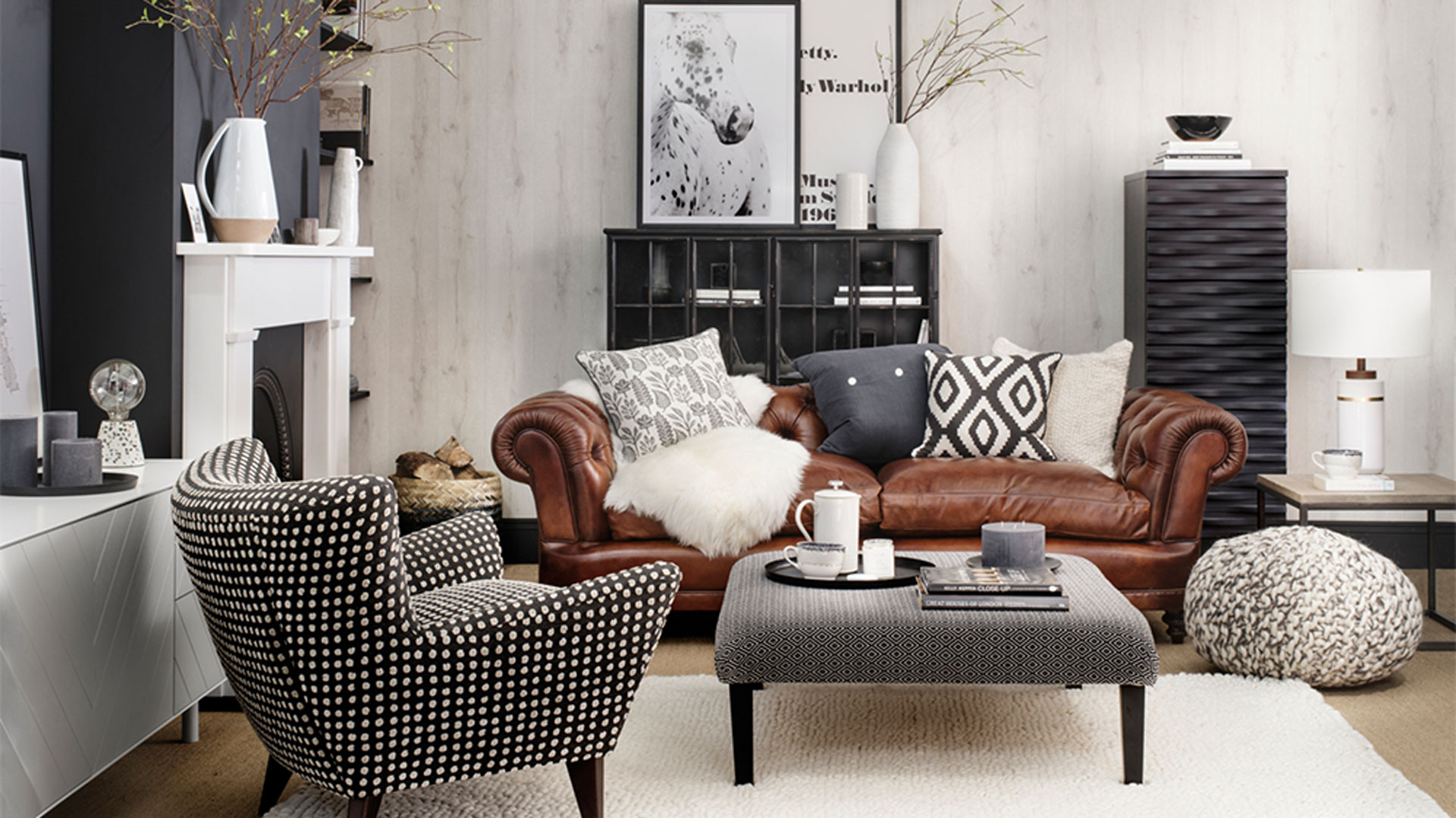
A common mistake that is a major bugbear of interior designers, is a living room that has all the furniture pushed up against the walls. While it might seem a logical way of making a small living room feel bigger by creating more space in the centre of the room, it can actually have the reverse effect.
When all the furniture is pushed to the perimeter of a room, it has the effect of limiting the sense of space and horizon - so can in fact make the room feel much smaller. Just pulling the sofa and chairs away from the wall, even if it's only a few inches, will leave breathing space between the furniture and wall and give the whole living room a better sense of flow.
"When it comes to the layout, most people make the mistake of putting all the furniture around the perimeter of the room," says Emma Deterding, Founder and Creative Director of Kelling Designs and KDLoves. "Rather than pushing all your sofas and furniture up against the walls, why not consider floating them to help create an open and airy feel?"
Sign up for the woman&home newsletter
Sign up to our free daily email for the latest royal and entertainment news, interesting opinion, expert advice on styling and beauty trends, and no-nonsense guides to the health and wellness questions you want answered.
"Playing with the layout in this way will allow you to open up the space available and make the room feel much bigger than it is, whereas pushing everything against the wall can make it feel as though the room is closing in on you."
2. Investing in the wrong sized rug
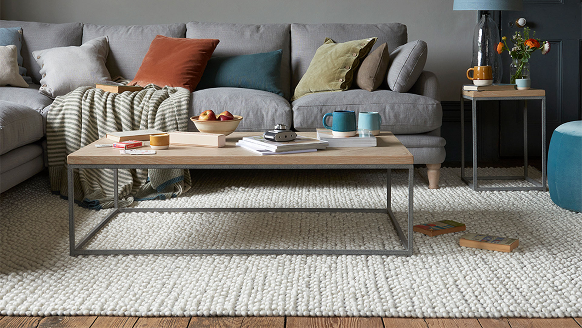
Area rugs can be a great way of anchoring a living room scheme, providing a visual resting place and a point around which furniture can be arranged. But one of the biggest mistakes that people make when choosing a living room rug, is opting for one that is too small.
“A living room with a grouping of furniture can seem to float in a room, but add a rug and you’ll visually anchor the furniture, changing the whole look of the room," says Jodie Hatton, Design Manager at Brintons.
"Whether anchoring a sofa and chairs, beneath a dining room table, or strategically placed in a bedroom, a large rug can have a big impact. It can change the focal point of a room and add a visual divider that makes a space feel cosier and more comfortable.”
“The size of each rug is completely down to personal preference, however, we would generally advise the rug placed underneath a furniture arrangement to be visible enough so that its weave and pattern are still beautifully represented. Whether you’re looking to create a dramatic statement by pairing two colourful rugs together or make a subtle effect with lighter hues, each rug should be just visible enough to make its own design statement in the room.”
3. Hanging curtains too low
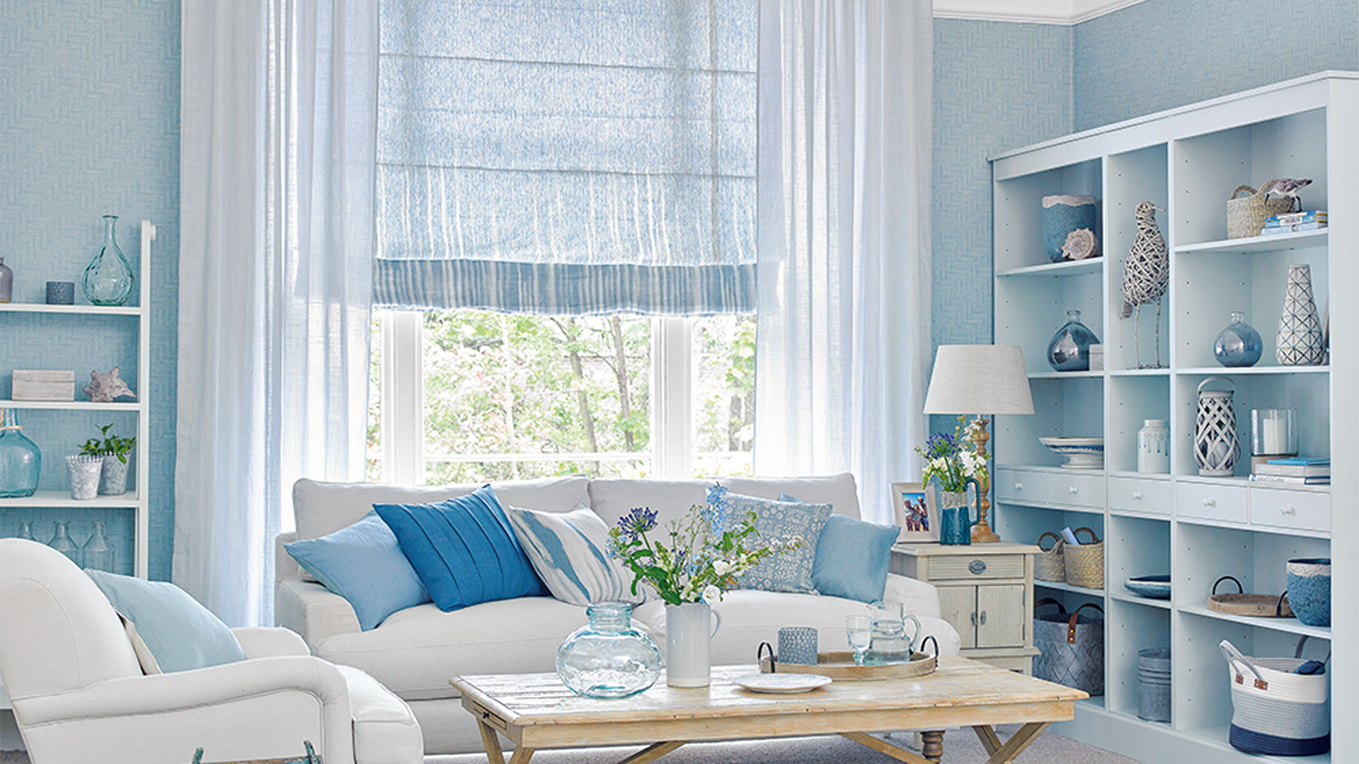
A common living room design mistake, but one that’s easy to correct, is the height at which we hang our curtains. There’s a tendency to mount the curtain rail just above the window frame, which can have the effect of making the ceiling seem lower and the windows appear smaller – fixing this is a budget solution to making a small room look bigger in an instant.
But fixing the curtain rail slightly above the window frame (anywhere between 4-8 inches higher), has the effect of drawing the eye upwards and making ceilings appear higher and the living room feel loftier.
“To add to your room’s sense of height, have your curtains fixed several inches above the top of the window frame," says Yvonne Keal, senior product manager at Hillarys. “You may also need to consider what surrounds your window, for instance, if there is a radiator near the window the curtain length may need to be altered.”
“And if it’s a small living room window, try fitting a track or pole that is considerably wider than the window, which will allow you to draw the curtains to the very borders of the window frame so that maximum light comes in,” adds Yvonne.
4. Having too much furniture
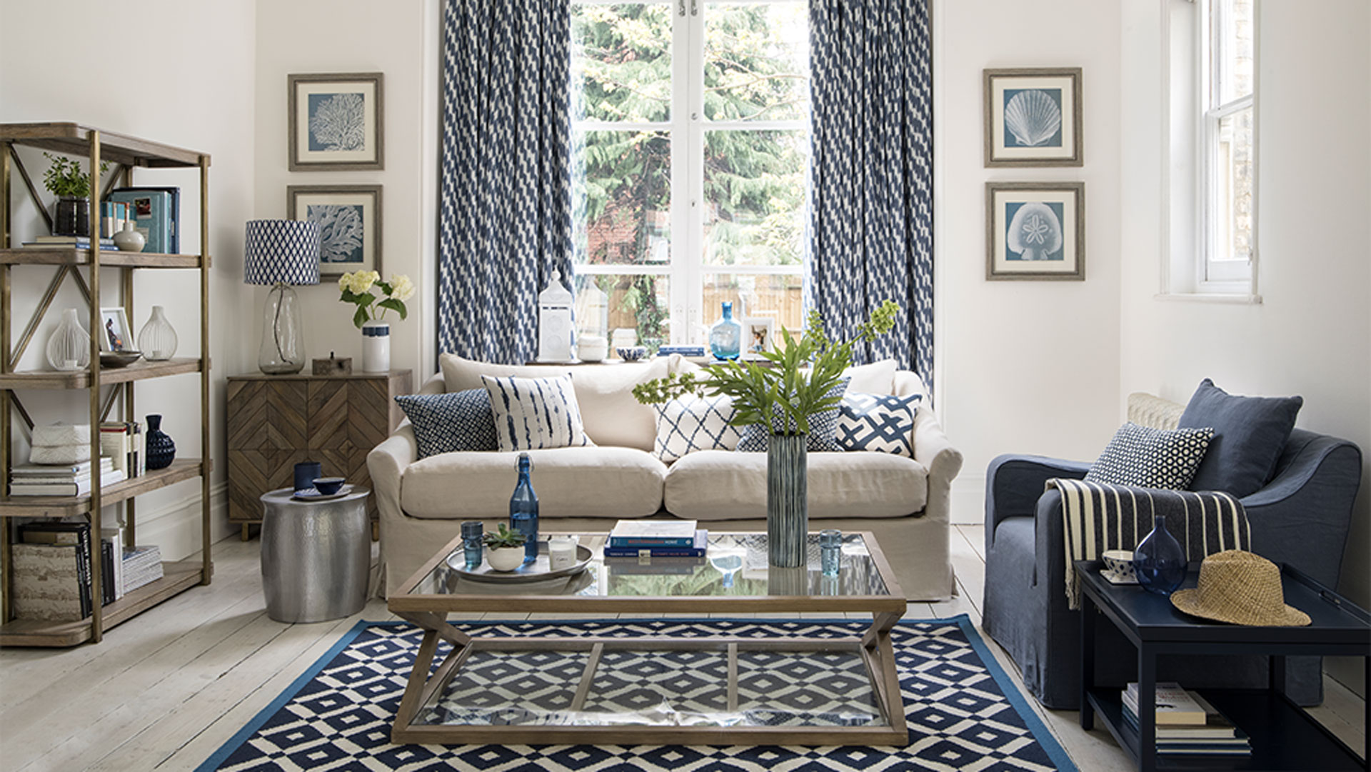
A crowded living room is not conducive to relaxation. But one of the most common mistakes we make is choosing pieces of furniture that are too large for the space - or overfilling the living room with too many pieces of furniture.
Having too much furniture can easily overwhelm a small living room and make it feel cramped and difficult to navigate. While the traditional three-piece suite and matching coffee table were once standard, opting for individual pieces that can be mixed and matched to suit the space gives much more freedom and is more practical in the average-sized living room these days.
“A key mistake often made when it comes to living rooms is choosing the wrong sofa,” says Emma. “Most people think that a large, chunky corner unit is the way to go as it'll provide enough seats for everyone, however, these often have a large footprint and will take up a lot of space.
“It's important to consider the option of multiple sofas, maybe opting for a three seater and two seater combination that may suit the space better and opt for designs with slimmer arms to provide enough seating space. Not only will this help to create a better layout and flow, but they'll also provide enough seats where necessary and help make the room feel more spacious.
“Make sure you can seat the optimum number of people in your room and utilize clever seating such as stools, ottomans, and fire fenders. Your sofas and armchairs are an investment that will be with you for years to come, so make sure you pick designs you truly love that are super comfortable and suit your needs (and can easily travel with you should you move home).”
5. Mixing too many patterns
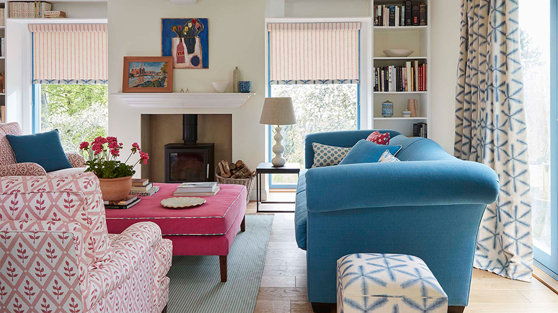
Introducing patterns into a living room scheme is a great way of adding extra colour and personality, but getting the balance right can be tricky and it’s easy to get it wrong – especially when inspired by the latest interior design trends and wallpaper trends.
Not enough patterns and the living room can feel flat and one-dimensional, but too many patterns and the space can feel busy and chaotic, which is not ideal in a space where you want to feel calm and relaxed.
“It is possible to choose too many patterned fabrics when putting together a living room scheme,” says fabric designer, Vanessa Arbuthnott, “so it’s good to choose a balance of designs. If you choose a pattern for the sofa, balance it up with a plain cushion or two, and vice versa.
“Also, if you are covering sofas and chairs in the same space, don’t choose for all of them to be patterned. A plain sofa and patterned chairs would be a good choice - and again, vice versa. It is also a good idea to choose a larger pattern for the sofa and a smaller coordinating pattern for the armchairs or footstool.
“Mistakes made when upholstering furniture are not that common as so many fabrics look great on sofas, chairs, and footstools,” adds Vanessa. “But the quality of upholstery fabrics is key and there are some that are too thin and not strong enough - so these should be avoided. Areas of frequent use, like the arms, will wear through in time and the longevity of cotton, silks, and thin woven fabrics will be disappointing.”
6. Not creating a natural focal point
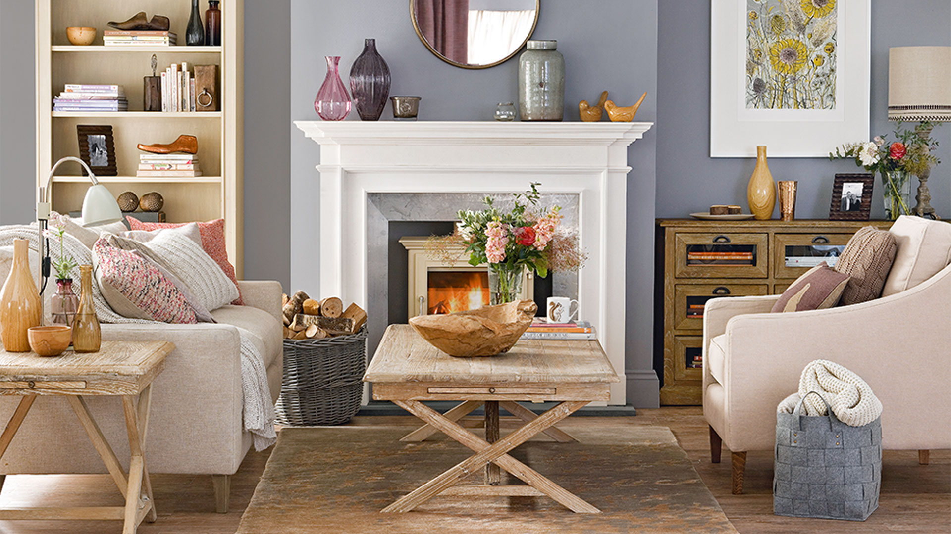
Most rooms work better if they have a focal point, but none more so than the living room. A focal point is a place that your eyes land on when first entering a room, drawing you in for further investigation. It can also help with the placement of furniture, providing a natural anchor point around which to build a scheme.
Not having a focal point is a common living room design mistake and one that can leave a room feeling off-balance. It can also create the problem of lots of smaller items fighting for attention to be the focal point, which confuses the eye and can make a living room feel busy and chaotic, rather than calming and relaxed.
A fireplace makes a natural living room focal point, with furniture arranged sociably around it so that the room feels welcoming and inviting. In a living room without a fireplace, a picture window with a lovely view works as an alternative focal point, as can a feature wall with a standout wallpaper or paint finish or an eye-catching gallery of artwork.
7. Making the television too prominent
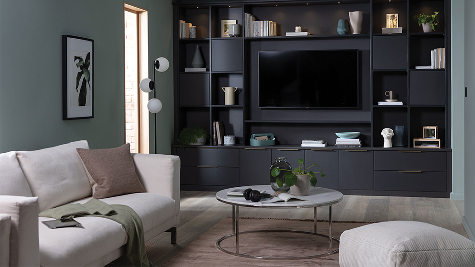
While a super-sized TV might provide a great viewing experience, having the television as the focal point of the living room isn’t ideal, but it’s a mistake that lots of us are guilty of making.
Although a large TV is unavoidably going to take up a hefty amount of space, there are ways of disguising its presence so that it doesn’t dominate the entire living room. Blending the television into the background is an easy way of making it appear less prominent.
A TV screen is black when it is switched off, so opting for a black or very dark wall behind it is a clever way of blending it into the room – handy given that broodingly dark shades are key interior paint colour trends and therefore some of the best living room paint colours right now.
Disguising a TV within a wall of built-in storage is another option that will make it feel less dominant. Or consider disguising a wall-hung TV within a gallery wall of artwork, with a mix of pictures and prints around it to lessen its prominence.
8. Hanging artwork at the wrong height
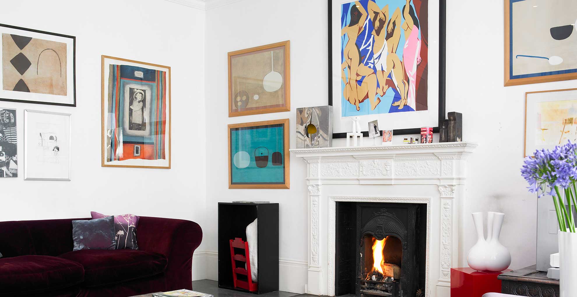
Having pictures, paintings, and artwork on display in the living room is a wonderful way of welcoming colour, character, and personality into the space. However, a major niggle that interior designers always pick up on, is when the artwork is hung incorrectly. It can be a fabulous piece of art, but hanging it too low or too high can completely ruin the aesthetic.
Selecting artwork of the correct size and scale is a great starting point when choosing pictures for the living room. If a single piece is to be hung above a sofa or sideboard, make sure that it measures at least two-thirds the width of the piece of furniture, to create a more balanced look. Or aim for a similar-sized composition if arranged with a group of pictures.
Then aim to hang the artwork roughly at eye level and with 10 inches or so between the bottom of the picture frames and the piece of furniture - any higher and it can tend to look as if the picture is floating away.
“Unless it's a very large statement art piece, avoid hanging your framed picture in an empty space,” say the experts at King & McGaw. “The best position is usually above a piece of furniture or feature, such as a table, sofa, or fireplace. Art prints look great at eye level, it's the reason art galleries and museums display works like this. So hang your artwork approximately 1.4m (or 56-57 inches) from the floor to the centre of the art print.”
9. Only having one light source
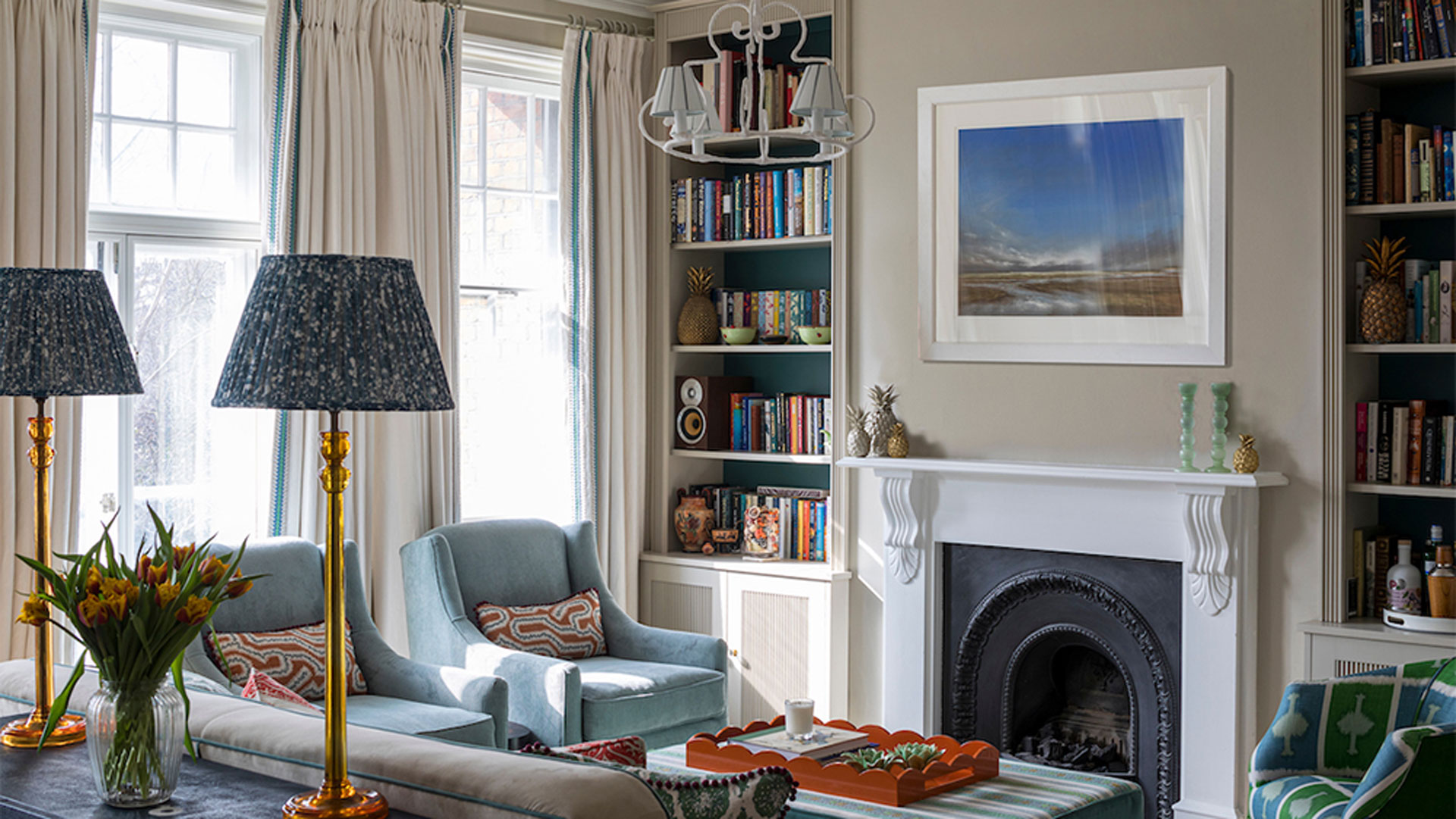
“Lighting is another key element that people tend to get wrong,” says Emma. "There is seldom any need for a huge chandelier or pendant light in the living room as it's all about creating a cosy home with a relaxed atmosphere.
“Where possible, try and use lighting that you can layer to allow you to have the right light sources, and enough light, for various tasks. We prefer lamps and subtle downlights that light something specific, your curtains for instance, or pinning the centre of an ottoman."
Make sure you supplement any ceiling lights with a mix of wall, floor, and table lamps. Not only will this allow you to change the mood and atmosphere with the flick of a few switches, but you'll also be able to put lighting where it's needed most.
“I always also recommend fitting everything to dimmer controls so you can change up the mood and try and wire lamps on a 5 amp circuit so all your lighting can be controlled from one main panel.”
10. Insufficient storage
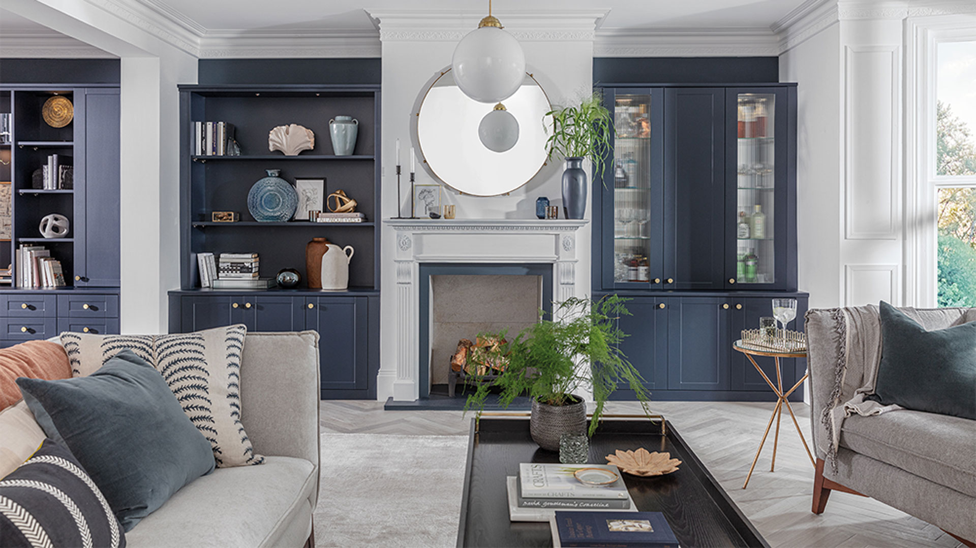
“With storage pieces, freestanding designs tend to be the go-to as opposed to built-ins, and this is something that I find is always problematic,” says Emma. “The beauty of opting for bespoke, built-in joinery is that it is designed to suit the space available whilst making the best use of angled walls, alcoves, and other awkward spaces.
“As well as creating beautiful storage and shelving to organize all your belongings and display your favourite pieces, it's also a great opportunity to bring in colour and pattern. Consider choosing a beautiful paint for the joinery and add wallpaper to the backs of shelving to add eye-catching detail and an unexpected hit of pattern.”
Good storage is the key to functional space, especially key when organizing a small space, so all the more important for living rooms on the smaller side.
11. Uniformed furniture choices
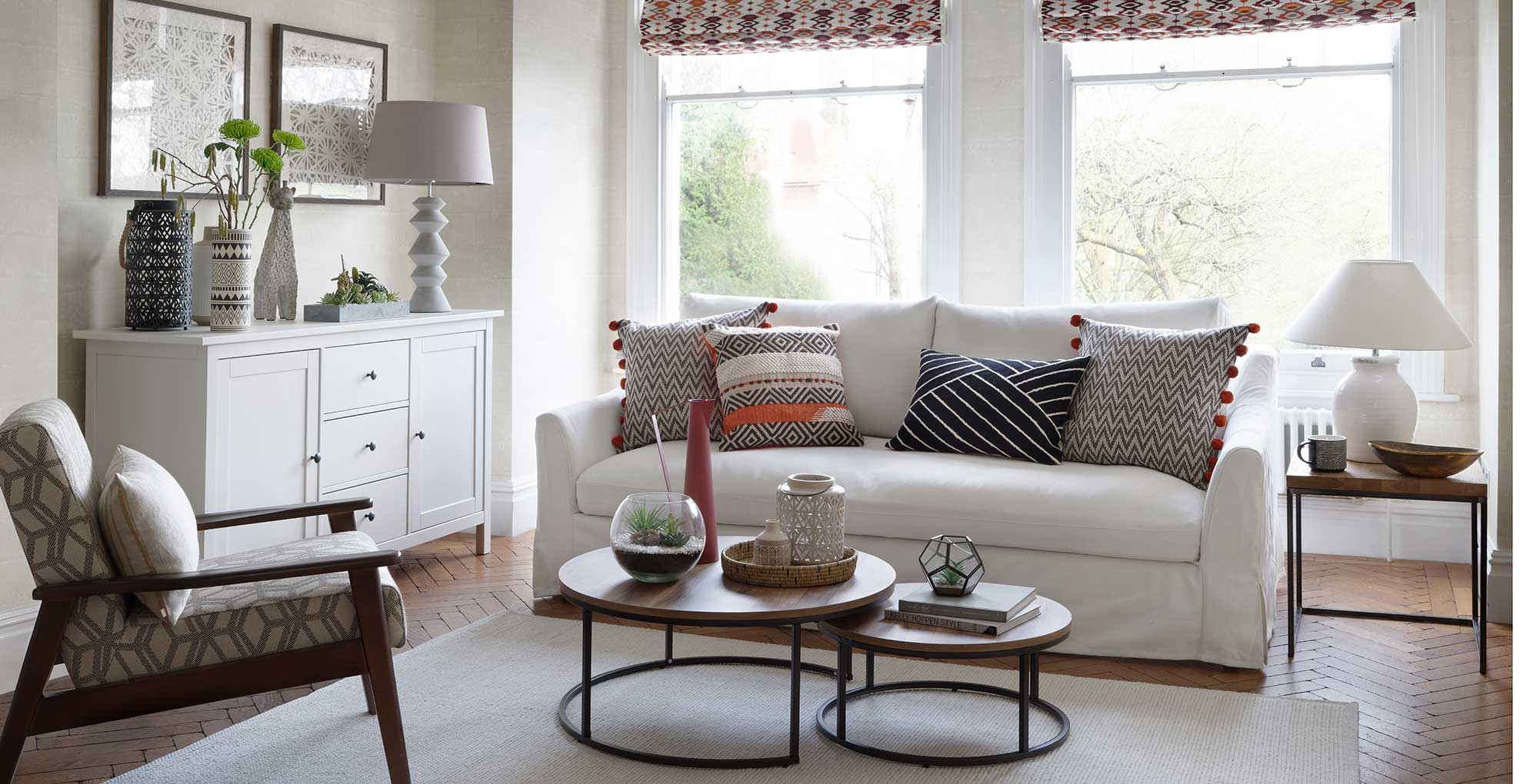
Don't be afraid to mix and match furniture choices. Being too restrictive with 'everything matching' is a common interior design mistake. You can break the uniform look and still create a cohesive scheme by introducing complimentary styles to sit alongside each other.
"Boldly mixing a range of design styles can have just as much impact as a carefully selected mix of stylish mid-century sofas," says Kelly Collins, in-house interior designer at Swyft.
"Why not have a modern sofa and a traditional armchair, this can be a match made in heaven. Mixing design styles can also mean mixing materials. Whether it's linen and leather or velvet and cotton, mixing materials is a great way to add character to the room."
Using soft furnishings such as cushions and throws is an easy way to help tie the different styles together so the overall look flows effortlessly.
12. Being too rigid with the layout
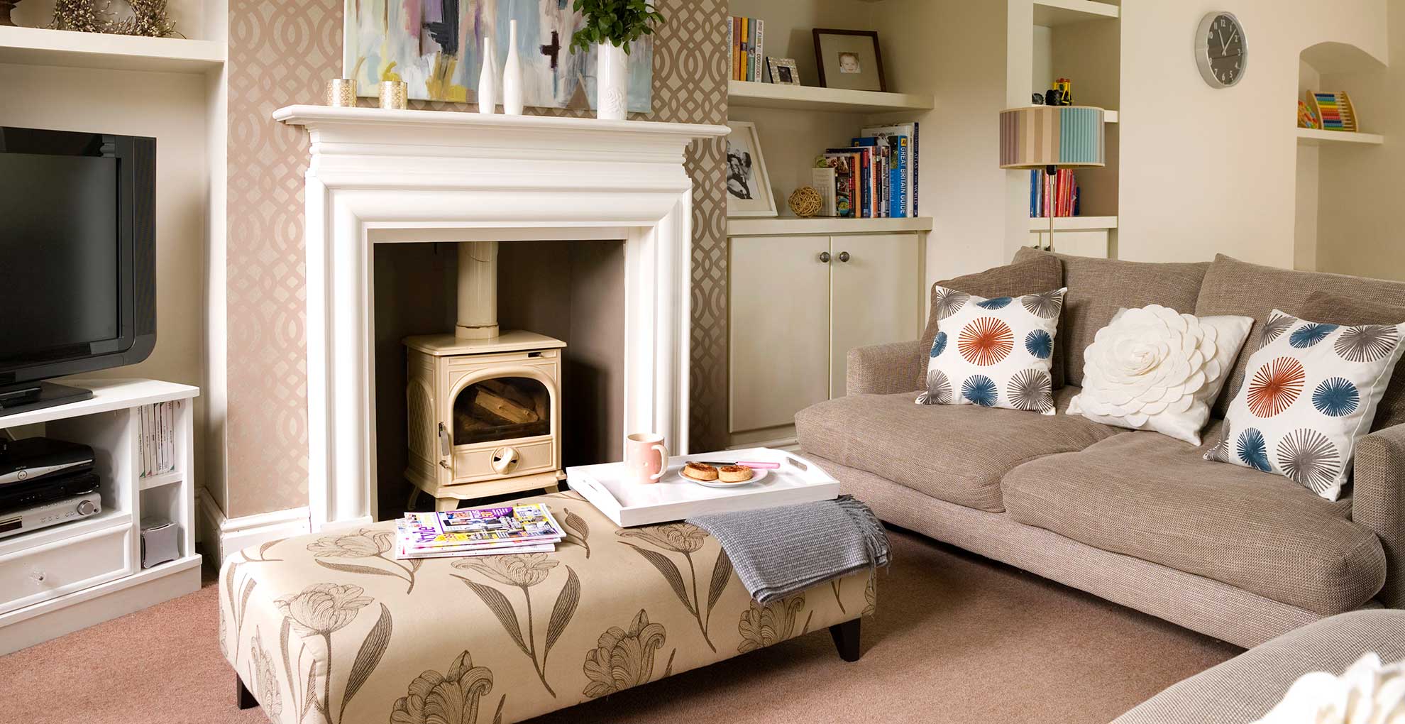
Experimenting with the positioning of the sofas and other key furniture pieces allows you to transform a living room without spending any money.
"Being open to alternative layouts can help emphasise the contrast you've chosen to go for with your furniture," says Kelly. "Drawing a floor plan is useful in deciding on your desired seating arrangement. Choose a focal point such as a TV, a fireplace or even a painting."
"Orient the largest part of your seating arrangement towards the room's focal point. You can then place the smaller seating opposite or adjacent to the first piece. Accent furniture, like ottomans and side tables, can be used to fill in space between the different seating pieces."
"The three-piece suite is an icon of interior design. But like with all things, it may come to a point when it’s time to try something new and spice up your decor," suggests Kelly.
What to consider when designing a living room?
When designing a living room always consider the layout first and foremost to create a space that feels comfortable but practical. Consider pulling furniture away from the walls to help create an open and airy feel that flows more fluidly. Avoid overcrowding the room with furniture simply because tradition dictates that you need more seating, design the space around your own needs - if you don't require extra seating don't allocate unnecessary space. In honesty, intentionally decluttering your home is a great place to start when designing any room.
Another major consideration is the lighting to ensure the room has a balanced offering of practical task lighting, directional overhead lights and a source of ambient light to create a cosy atmosphere in the evening.
Consider adding an accent colour to refresh your decorating scheme from time to time. "Accent colours bring added interest and emphasis to certain areas of the room," says Kelly. "This colour should be complementary to the original colour scheme and can be bright and vibrant or neutral and toned down."

Lisa is a freelance journalist who has written about interiors for more than 25 years and has worked on all the major homes titles, primarily Ideal Home, but also including Homes & Gardens, Country Homes & Interiors, Style at Home, Livingetc, Woman & Home, Easy Gardens and Good Homes magazines. Homes and interiors have always been a passion and she never tires of nosying around gorgeous homes, whether on TV, online, in print or in person, as well as being a serial shopper/bargain hunter.
- Tamara KellyLifestyle Editor
-
 Clodagh McKenna's lemon-yellow apron makes this overlooked essential a key part of her outfit - and it matches her kitchen
We’ve all heard of matching your shoes to your handbag, but Clodagh McKenna has taken colour-coordination to another level.
By Emma Shacklock Published
-
 What self-tan does Kate Middleton use to achieve her natural-looking golden glow?
The Princess of Wales is never seen without an effortlessly radiant, golden complexion
By Sennen Prickett Published