

Are you looking for a new statement colour to take centre stage in your home? Why not peruse this year's biggest interior paint colour trends, there's a shade for everyone.
Don't worry if you missed last year's interior paint colour trends. 2025's offerings might be the most diverse yet, with colours that will inspire and elevate your home's style. Whether you're looking for one of the best living room paint colours or need a colour idea for your kitchen, there is something for every room.
We have spoken to leading colour experts to share their predictions on what colours we will be seeing everywhere this year, to inspire any decorating projects.
Interior paint colour trends 2025: 10 new hues to inspire
When it comes to the biggest interior design trends, an often overlooked step of the styles is the colours of the walls. As one of the largest surface areas in every room, getting the right paint colour is crucial to not only the cohesiveness of the space but also the overall look you want it to have.
So, while we'll always have a place for the best white paint in our lives, these vibrant, moody colours have us far more excited to get decorating.
1. Reduced green by Farrow & Ball

A real standout from the launch of Farrow & Ball's new colours is Reduced Green. This shade is very different from the greens that have dominated the trends in recent years. While decorating with sage green has been popular in the past, there's been a shift to deeper greens that add depth to a space.
Reduced Green is a unique shade that appears slightly different depending on the light it's in. The brand says that 'the green pigment in the shade has been reduced so much that it's barely there'—some see brown, while others see green. This not only makes it interesting to the eye, but also an incredibly versatile shade to play around with in different rooms in your home.
2. True Joy by Dulux

Unlike the soothing, safe shade of Dulux's Colour of the Year 2024 'Sweet Embrace', the Dulux Colour of the Year 2025 is bright and unapologetically bold. The uplisting shade of sunshine yellow is certainly not for the faint hearted.
“Whether you prefer to add a quick zing of colour or are looking to embrace a brighter feature wall with True Joy, yellow offers endless possibilities for creating a living space that feels joyful and fresh,” suggests Stephanie King, creative lead at Dulux.
“True Joy is the perfect pop of colour – one of my favourite ways to use them is in window surrounds," she says "where it catches the sunlight beautifully, bathing your living room in a gorgeous glow even on the chilliest of winter days."
3. Elderton by Graham & Brown

Earth tones are a huge trend within the home decor space this year, whether in furniture designs or paint colours like this shade from Graham & Brown.
Elderton, the brand's Colour of the Year 2025, is not only a grounding shade but one that adds a quiet luxury feel to any space.
"When choosing our Colour of the Year 2025, we wanted to mimic the natural elements with a grounding shade, Elderton has a huge amount of depth, reconnecting us with nature and enhancing our relation to the earth," explains Paula Taylor, Head Stylist and Trend Specialist at Graham & Brown.
Going on to describe the shade's versatility she says, "Elderton is a chameleon colour that can be sophisticated yet cosy depending on the mood of the space it is in. It will add drama to contemporary colours by creating a theatrical backdrop, allowing them to shine through. Our homes are spaces where we can be our most honest and creative selves, and Elderton is the perfect hue to unleash the potential of any room."
4. Crocky Road by Earthborn

Although creative bold colours are always fun to fill your home with personality, there's something about a grounding classic neutral shade that you'll never regret using – neutrals are the main reason the Quiet Luxury trend adds value to homes. If you're particularly worried about avoiding paint colours that devalue homes, neutrals are a safe bet.
"The perfect warm beige, Crocky Road will add a touch of sophistication to any space," explains Cathryn Sanders, head of creative at Earthborn. "Creating a wonderful sense of balance and cohesiveness, the warming tones of the quintessential buff will enhance a neutral scheme without overpowering it, whether used in isolation or alongside a complementary palette,"
"Whilst chalky neutrals are always a classic choice that will never age, Crocky Road offers an edge to a classic shade that works with all room orientations, thanks to its subtle green undertones," she adds.
Thanks to its grounding quality, Cathryn says this shade can act as an anchor in bolder schemes or sit beautifully with complementary subtle colours.
5. Nostalgic Yellow by Yes Colours

This year's colour trends have shown a clear redirection to more vivid, playful colour palettes and this shade from YesColours is proof of that.
“We saw yellow surge last year, and it's expected to remain a standout shade for spring 2025," says Emma Bestley, Creative Director and Co-Founder at YesColours.
She adds, "Our newly launched, Nostalgic Yellow is a warm, tanned contemporary twist on magnolia, ready to grace walls and ceilings everywhere. Inspired by 1950s fashion, this warm tan yellow is an ideal paint choice for kitchens, dining rooms and naturally dark spaces where a more cocooning, cosy feel is desired."
If you're looking to bring this buttery yellow into your home, Emma recommends pairing it with deep, saturated colours for a bold and contrasting finish. However, if you want a softer look, she advises going for complementary pastels like peach and green.
6. Nocturne N438 by Tikkurila

Painting with dark colours can sometimes feel intimidating, especially if your space is on the smaller side. However, with the right shade and styling, darker colours can make a small room look bigger and more expensive.
"Nocturne N348 is ideal for spaces where you want to promote relaxation, such as bedrooms, living rooms, and dining areas," explains Catriona James, colour expert and commercial director at Tikkurila UK.
She continues, "As a deep blue, Nocturne N348 thrives in south-facing rooms, where natural light enhances its richness and keeps the space feeling balanced. Its bold, moody tone is perfect for a feature wall or to envelop an entire space. Pair with warm neutrals to create contrast and let the colour shine."
7. Cinnamon Slate by Benjamin Moore

If you've always wanted to decorate with brown but have never been quite sure where to start, finding a hue that offers other undertones can help you still the earth tone in different ways.
“Cinnamon Slate, our Colour of the Year for 2025, encapsulates the idea of ‘in-between hues’ that allow us to embrace colour but with a beautiful, muted quality," explains Helen Shaw, Director of Marketing at Benjamin Moore. "This nuanced hue has a delicate mix of heathered plum and velvety brown that brings a smooth familiarity to any design."
If you're looking to make a style statement, Helen recommends combining Cinnamon Slate with a lustrous, high-gloss finish in smaller spaces like the bathroom. She says, "This not only looks ultra-sophisticated but choosing a finish that reflects the lightest, can deceive the eye and make the room seem larger."
8. Polenta by Neptune

There's no denying that yellow is a happy paint colour for any room, but when you are trying to avoid the primary colour look, opting for a muted version like this one can make all the difference.
"Neptune’s new seasonal colour, Polenta, is named after the traditional Italian dish of ground corn," explains Fred Horlock, design director at Neptune. "This creamy, pale-yellow hue is subtly enriched with a hint of black for depth and sophistication."
We recommend pairing the Italian yellow with dark rustic wooden furniture and pops of similarly warm olive and orange tones.
9. Vintage Peony by Fenwick & Tilbrook

When you think of pink paint colours you might automatically envision Barbie-pink tones, but modern trends offer something a little more subdued.
"Warm tones, especially plaster pinks and mid-dark neutrals are expected to continue to be very popular throughout 2025 and beyond," says Anna Hill, brand director and colour consultant, Fenwick & Tilbrook. "Our most popular is ‘Vintage Peony’ – a warm, earthy plaster pink that has been topping the best-seller list for a few years now."
"It works fantastically well as an alternative to a neutral. We’ve seen people colour drenching with it or just using it alongside a classic off-white as feature cabinetry," she adds.
10. Marmelo by Farrow & Ball

Looking to warm things up a little? This terracotta orange shade from Farrow & Ball's newest colour range is perfect for bringing a touch of the Mediterranean to your home.
"Marmelo, named after the quince that inspired marmalade, is one of my favourite new colours. Who could fail to be comforted by that familiar orange reminiscent of warm, buttered toast and conversations around the breakfast table?" says Joa Studholme.
The colour really looks its best when it has the chance to shine on its own, so pairing it with a neutral palette and dark wooden elements will ensure it pops.
FAQs
What is the most popular paint colour for interiors?
From this year's wallpaper trends to the various ways to decorate with jewel tones, there can be so many decor decisions the whole thing gets a little too confusing. And whilst we're big advocates for choosing your home decor for yourself, knowing what's popular can help you make the best decision.
Interior design expert Ryan McDonough at MyJobQuote, "Whites and off-whites are very popular due to their versatility. They create a clean, bright and airy feel and can help to make spaces appear larger. Whites and off-whites serve as a blank canvas, allowing for flexibility with furniture and décor."
Which colour is best for interior walls?
Whether you're into the dopamine decor trend or prefer the Minimaluxe colour scheme, opting for a paint colour that will look good no matter where it is can save you money and effort in the long run.
"There is no single best colour for interior walls, as the ideal choice depends heavily on individual preferences, the purpose of the room, or the desired atmosphere. Whites and off-whites are a great choice, as outlined above. Light greys also work very well as these offer a sophisticated alternative to white," explains Ryan.
"They provide a neutral yet slightly warmer feel and go well in various design styles. Earthy tones also work very well. These include lighter browns, light blues or muted greens. These can provide a very comforting and grounding feeling," he continues.
There truly is something for everyone in the paint colour trends this year, so we have no doubt that you'll find a shade for you that will breathe a new lease of life into your home.

-
 Midsomer Murders Wild Harvest spoiler: Who was the killer and why did they commit such grisly crimes?
I’ve been a huge Midsomer Murders fan for so many years I’ve lost count and Wild Harvest is an episode that still stands out to me.
-
 Let’s celebrate what unites us – it could help bring us together
We’ll be a happier society if we do, argues coach, consultant and podcast host Elizabeth Oldfield


-
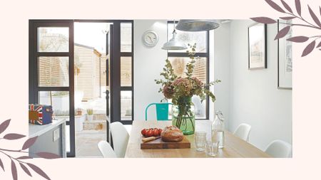
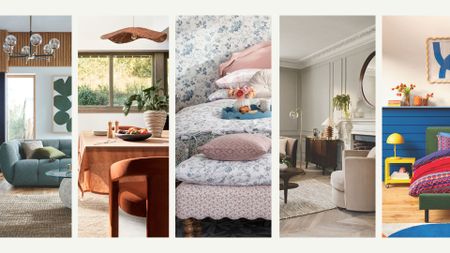 Interior Design Trends 2025 – 7 key looks for spring, to give your decor a seasonal refresh
From elegant neutrals to uplifting brights, welcome the new season with our round-up of the key trends for your home
-
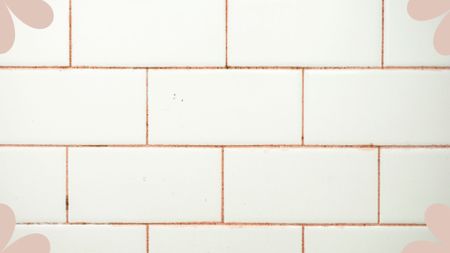 What is pink mould and how can you get rid of it safely? Experts share advice
While you may not have even heard of pink mould, it's relatively common and important to know how to tackle it quickly
-
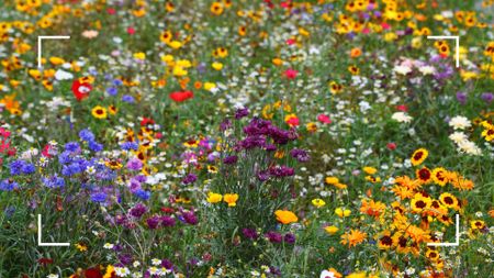 'Meadowscaping' is the charming low-effort, low-cost garden trend that attracts wildlife in abundance
Turn your garden into an endearing low-maintenance meadow with these expert tips and tricks
-
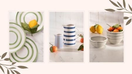
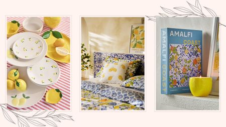 Welcome Italy into your home with the Amalfi decor trend – think lemons, ceramic patterns and bold colours
Dreaming of an Italian-style summer? The new Amalfi interiors trend will provide all the dreamy Mediterranean vibes you need
-
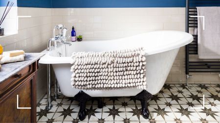 How often should you wash your bath mat? Cleaning experts share their advice
Are you cleaning your bath mat frequently enough? You might be surprised by the recommended regularity
-
 Mary Berry’s new Mediterranean-inspired kitchenware is a masterclass in timeless tablescaping
What better way to celebrate Mary Berry's 90th birthday than serving her new tableware collection
-
 Kelly Hoppen shares her interior expertise to refresh homes accordingly now it's spring
It is time to say goodbye to the winter blankets and welcome the new season into your home
-
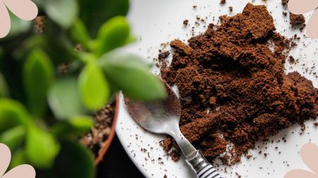 Are coffee grounds good for houseplants? Here's what horticulture experts say
Could your morning caffeinated pick-me-up be as beneficial to your beloved indoor plants as it is in the garden?


