How to make a small kitchen look bigger with paint: 5 space-expanding methods
From painting stripes to choosing the right level of sheen, here's how paint can help create a larger sense of space


Many of us have a smaller kitchen than we'd like, and while this might be a source of frustration, it's worth remembering that the bigger the kitchen, the more there is to clean. And besides, there are lots of clever ways to make a small room look bigger, giving you the best of both worlds.
Paint is, of course, the quickest and most budget-friendly way to transform any room, and when you know what you're doing, it can be a useful tool to create an illusion of more space to help make a small kitchen look bigger.
We spoke to interior designers about how to make a room look bigger with paint, and have gathered their pro tips below to help you take your cooking area from cramped and cluttered to airy and spacious.
How to make a small kitchen look bigger with paint
Whether you want to take inspiration from this year's interior paint colour trends or follow your intuition, here are the tones and techniques you need for a more spacious feel.
1. Be sensitive to tone
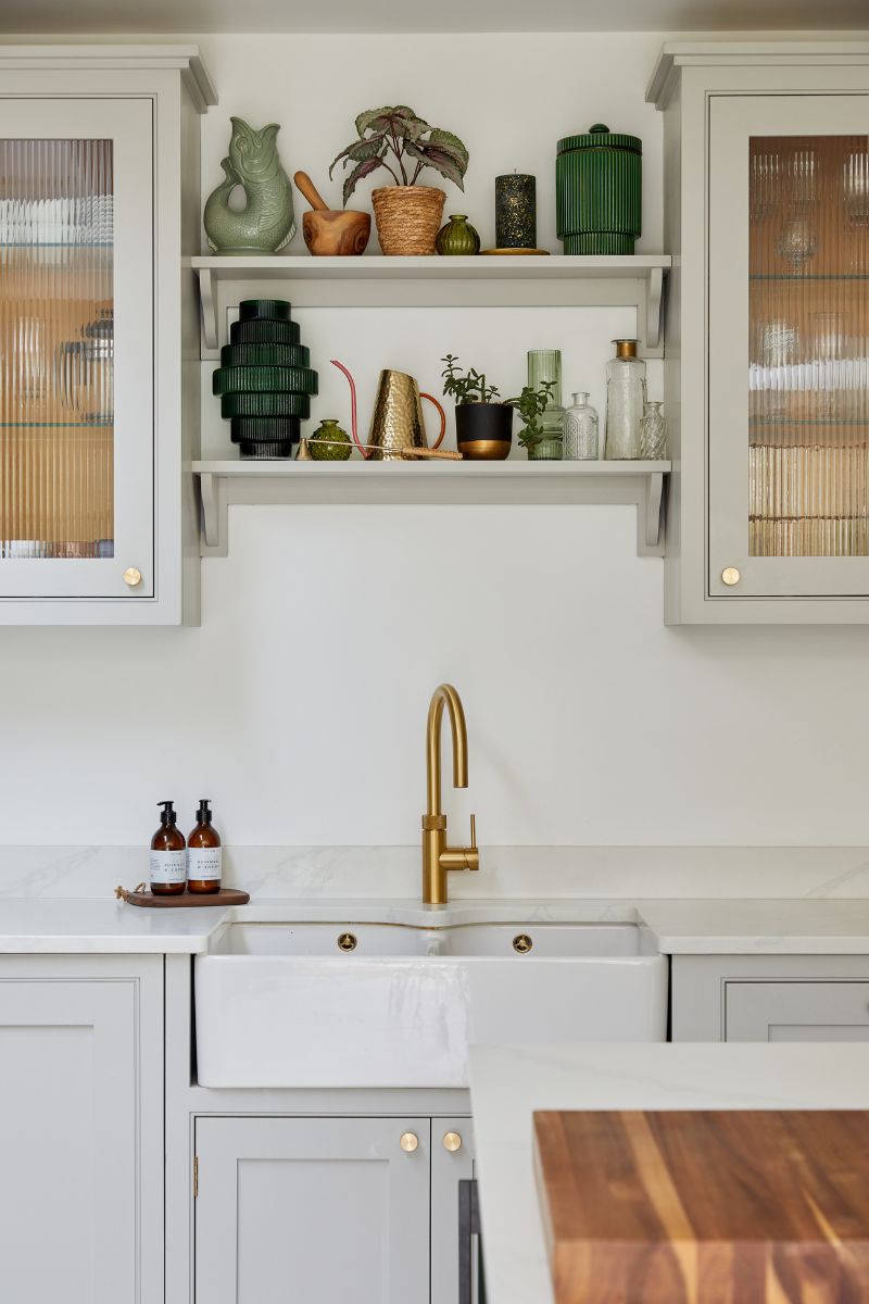
Interior designers say that if you want your kitchen to feel roomy and restful, it's less about the colour you use and more about being consistent with both colour and tone.
Sophie Wells, an interior designer at Decorbuddi, says, "Similar colours on walls, units, floors and ceilings will ensure that changes in surfaces are as seamless on the eye as possible," she says. "If you are painting the walls a very close shade to white, then paint the ceiling in the same shade." Sophie adds that it's best to paint the skirting boards the same colour as the walls, and to paint the architraves the same colour, which will create the illusion of higher ceilings.
If your kitchen is south-facing, Sophie recommends avoiding bright white as this may be too bright in the sun and create a clinical, harsh atmosphere – for more guidance, you can head to our guide on the best white paint colours.
Sign up for the woman&home newsletter
Sign up to our free daily email for the latest royal and entertainment news, interesting opinion, expert advice on styling and beauty trends, and no-nonsense guides to the health and wellness questions you want answered.
"Neutral colours on the units such as off-white, cream, beige, light green and light grey, will mean you can have neutral colours on the walls, and this will help the space feel larger," Sophie continues. "All colours must be of the same tone. Use one tone of colour on all units, and keep walls and floors of the same tone."

Wimbledon interior designer Sophie has always had a passion for interiors. Growing up in a family who were constantly renovating and refurbishing properties, and with grand-parents who were antique dealers, a career in design was always on the horizon.
2. Choose a gloss paint
Mirrors are the oldest space-enhancing trick in the book, and in fact, any reflective surfaces are your friend in a smaller space, from tiles and stainless steel to a paint with a higher sheen. "You can use a satin or semi-gloss finish, which reflects light better than matte surfaces. I find this contributes to a more spacious feeling," says Bree Steele, an interior designer at RJ Living.
One practical and effective paint trick for high-traffic spaces like the kitchen or hallway is to use hard-wearing gloss paint on the bottom half of the wall, and matte paint above, in the same colour. This creates different textures and light play, and can mean the walls are less likely to be scuffed by furniture, bags and coats.
3. Add a decorative stripe
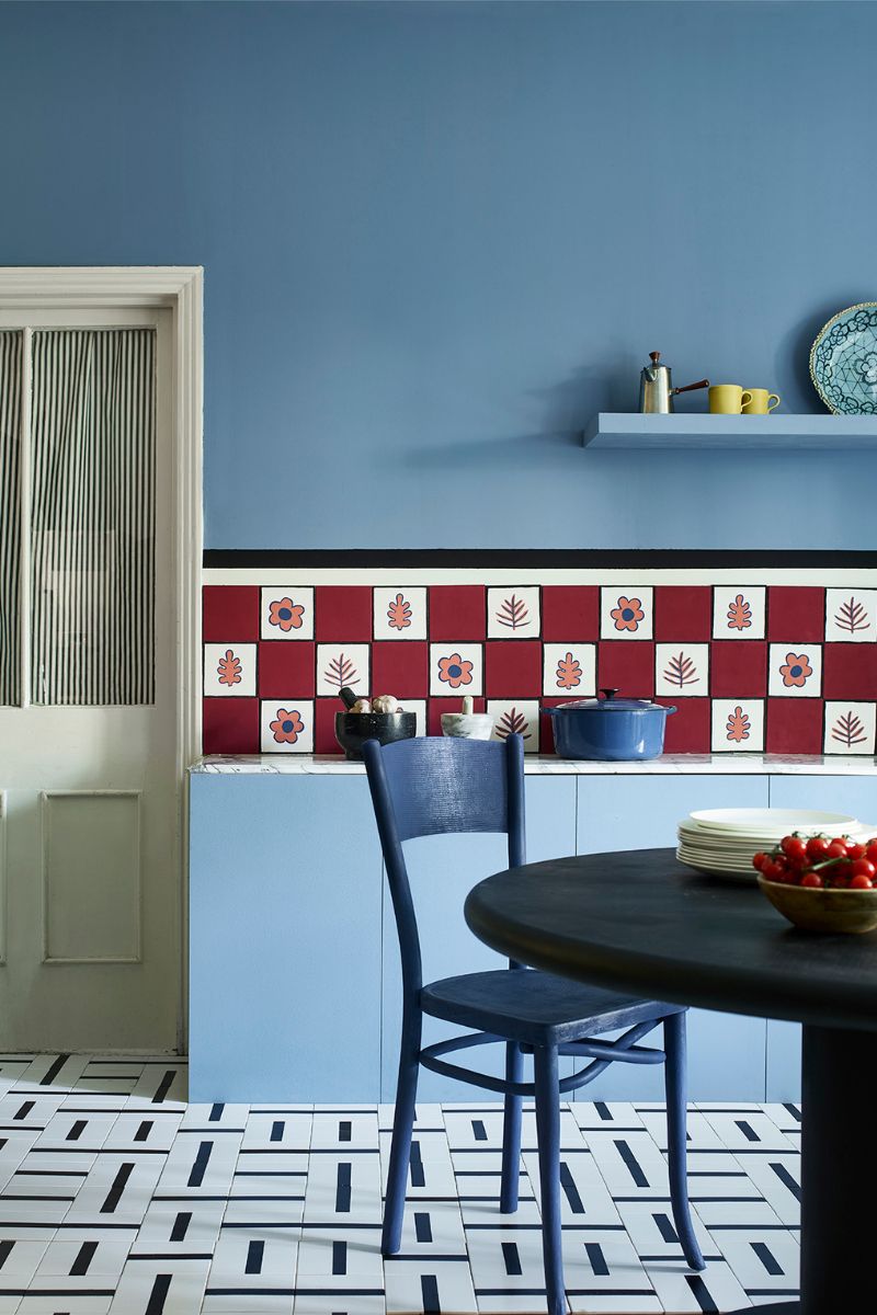
To make your kitchen appear wider, you could paint a horizontal stripe or two on the walls, provided there aren't upper cabinets in the way. This could be in black or a bright colour, and will lead the eye around the space. If there isn't much room, you could paint a stripe at the top of the walls, or just paint the coving to add a splash of colour.
To create height in a low-ceilinged space, paint vertical stripes to pull the eye upwards and create a feeling of formality. Whether you go vertical or horizontal, painted stripes are an inexpensive and reversible way to refresh your kitchen. What's more, they're a good way to create a focal point, adding unique visual interest and pattern, too – all for the price of a couple of sample pots and painter's tape.
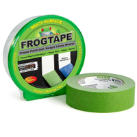
Frog Tape Green Multi-Surface Painters Masking Tape, £6.99 at Amazon
Keep lines sharp and prevent any paint bleeding with Frog Tape from Amazon. This painter's tape can be used on cured paint, wood, glass, and metal.
4. Go for cool greens and blues
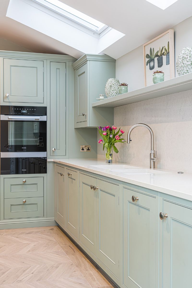
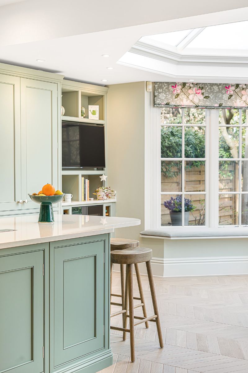
The kitchen paint colour ideas we choose can impact how big or small it feels. "If the goal is to enhance the amount of space you are working with visually, go with colours from a cooler palette, including hues that land on the cooler side of the colour wheel, like greens or blues," suggests Amber Dunford of Amber Dunford Design.
Amber makes an interesting point about choosing naturally occurring tones, too: "While you can also consider greys, I avoid those colours in the kitchen as you don’t often find them naturally occurring in food colours, which can leave the space feeling sterile. The kitchen is typically an area that should feel more lively and include colours derived from food and nature."
Jen and Mar from Interior Fox remind us to focus on the colours we love, above all else: "You can always enhance the space by incorporating patterns, strategic lighting placement, and considering the scale of furniture and decor elements. These techniques can create a visually dynamic environment that feels airy and inviting with any colour you decide for your kitchen."

Jen and Mar are the founders of interior design studio Interior Fox. Jen, a former New Yorker with Texas roots, has an eye for "Cali-cool" spaces, and draws design inspiration from her favourite cities: Amsterdam, Brooklyn and Miami. Mar grew up in the Philippines surrounded by interiors full of rattan, natural materials and organic textiles, which have shaped her design style today.
5. Embrace the dark
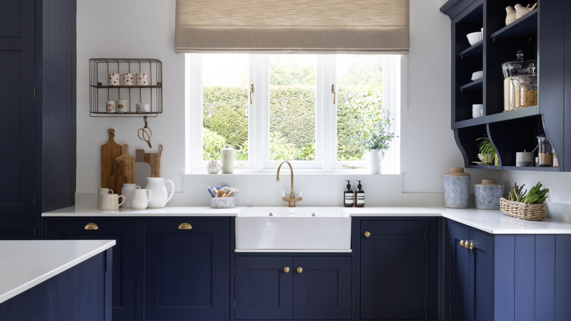
It's a myth that a small space always has to be painted in a light and bright shade – particularly if it's not a space that gets a lot of natural light. Interior designer Sophie Clemson from The Living House says we should always consider the room's aspect, whether we are painting our walls or our cabinets.
'If you have a kitchen with little natural light, sometimes embracing the darkness can work brilliantly because even if you opt for neutral kitchen units, it will never be a light and bright space due to the way the room faces.'
Down Pipe and Railings by Farrow & Ball are popular options. To make sure you have considered all factors before going to the dark side, you can read our guide on mistakes to avoid when decorating with dark colours.

Sophie Clemson is the co-founder of The Living House, an affordable online interior design company that helps busy families transform their homes easily, online and within their budget.
Do white appliances make a small kitchen look bigger?
'White appliances can stand out for the wrong reasons. This is why I recommend looking at integrating your appliances so they disappear into the kitchen,' says interior designer Sophie Clemson. 'Especially if you have dark kitchen units, such as charcoal, a white fridge next to this would contrast, but for the wrong reasons.'

Millie Hurst is a freelance writer and interior designer based in Sheffield, helping clients create homes that are characterful, curated, and highly functional. Interior design inspirations include Jake Arnold, Beata Heuman and Abigail Ahern. Her personal style is a 'liveable maximalism' with boho, nature-inspired designs.
She has seven years of experience in the world of digital journalism, most recently working as Head of Solved at Homes & Gardens, where she wrote and edited countless features on home organisation, decluttering and interior design. Before that, she was Senior Content Editor at Ideal Home.
-
 Pistachio green colour trend: 11 ways to use this trending hue in your home
This delicious soft shade is everywhere right now
By Jayne Cherrington-Cook
-
 The Handmaid's Tale: Does June get Hannah back at the end of season 6?
It's been June's endgame from the very first moments of The Handmaid's Tale, but will she be reunited with her daughter Hannah at the end of season 6?
By Lucy Wigley
