How to make a small kitchen look bigger – 4 simple styling tricks designers use
Space-enhancing secrets from interior designers that will distract from a smaller footprint
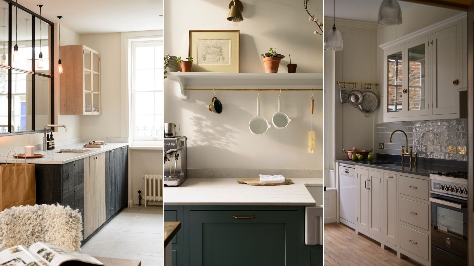

Many of us are blessed with a kitchen that feels slightly too small for us. A space that quickly feels cramped and overwhelming, where two people equal 'too many cooks'. Thankfully mastering how to make a small kitchen look bigger is easier than you think.
There are many techniques interior designers use to enhance the sense of space in kitchens of a smaller size. Here, we'll be talking about simple styling tweaks to try right away, without spending a lot of money. From using paint to make a room look bigger to reconfiguring layouts, it's often the smallest of changes that make a huge impact.
The key to avoiding a cluttered, stressful kitchen is to keep your small kitchen well organised, letting go of seldom-used rice cookers and pasta makers by following a professional decluttering method. Coming from someone with plenty of experience cooking in the tiniest of kitchens, I understand how hard it can be.
How to make a small kitchen look bigger
It's all about having less clutter and more light, while drawing the eye up and across with tricks of the eye. Here are four basic things I do to make a small kitchen look bigger.
1. Hang artwork
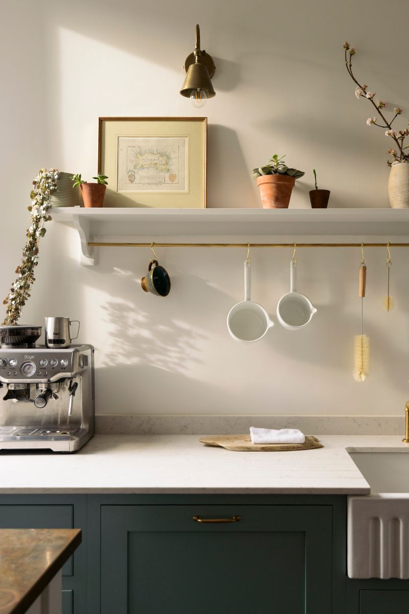
Distraction techniques are my first port of call because when you have a beautiful, ideally large, piece of artwork visible as you walk in, the kitchen's small size becomes less noticeable.
We often don't think that art belongs in the kitchen, but prop an oil-painted still life of a bowl of fruit in a corner and see how more soulful the space instantly feels. Between you and me, it also makes your kitchen look more expensive on a budget.
Interior designer Kerrie Kelly of Kerrie Kelly Design Studio agrees and recommends selecting a few statement artwork pieces as these add personality to your kitchen without overwhelming the space.
Sign up for the woman&home newsletter
Sign up to our free daily email for the latest royal and entertainment news, interesting opinion, expert advice on styling and beauty trends, and no-nonsense guides to the health and wellness questions you want answered.
It's all about being intentional, and remember that you can swap items in and out as the seasons change. Display one or two large pieces of artwork together rather than having lots of small ones dotted around, as this can tip over into looking too busy.
2. Fix any dark corners
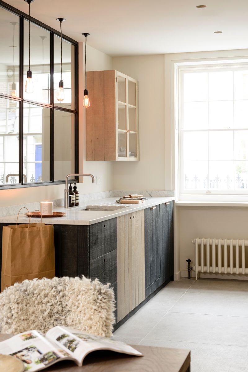
Next, think about the light levels. Do everything you possibly can to welcome natural light and substitute it in the evening with excellent artificial lighting.
For an airy feel, interior designer Breegan Jane recommends rattan lighting elements, which are one of 2024's key lighting trends.
Make the space the opposite of dark and dingy by cleaning the windows and windowsills until they shine, pulling back curtains fully and removing any home decor blocking out light.
If you do want decor or plants on your windowsill, perhaps you're growing herbs indoors, follow Breegan Jane's advice: "Plants and herbs (daisies are a good one!) and even pieces like tied garlic can contribute to an organic and airy vibe."
If you fancy some DIY, you can frame the window with yellow paint to create the effect of letting the sunshine in. Alternatively, place LED strips, available at Amazon underneath cabinets to illuminate the countertops and create the illusion of more space. You can also add an adhesive mirror to your kickbacks (the space between your lower cabinets and the floor) or behind open shelving.

Breegan Jane is a TV host, designer, entrepreneur and philanthropist in Los Angeles. Breegan’s signature style meshes the artistic and elegant with livable comfort. She achieves a stunning, modern aesthetic with decor that maximizes elegance and fosters simplicity, serenity, and supreme comfort.
3. Use pattern to trick the eye
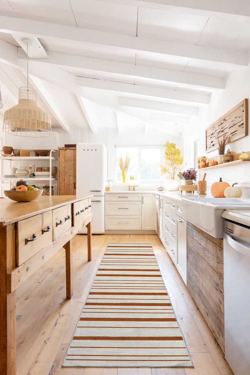
Line and pattern are two of the key elements of interior design, and they can be employed to visually expand your kitchen space. Vertical lines create a sense of height and grandeur making a room feel taller.
You could use vertical lines by having a striped window treatment: "A simple stacked Roman blind can be effective, with a texture or pattern that creates the illusion of height," says Laura Nicolson, interior designer at Decorbuddi. "If using a pattern, choose something with a half drop, so the pattern appears to dance up the fabric."
Or, if you have glass-fronted cabinets, you could add a fluted glass-effect film, available at Amazon. This gives you vertical lines and makes the visual clutter less obvious, blurring the edges.
Horizontal lines, on the other hand, can make narrow spaces appear wider. A striped kitchen rug like the one below could make a small galley kitchen feel roomier, and a checkerboard patterned lino, at Amazon, laid at an angle so that the squares are a diamond shape will pull the eye to the edges of the space.
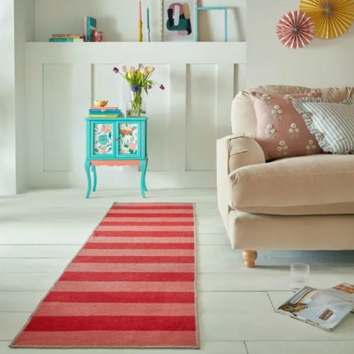
RRP: £28 | Red and pink, washable, and a way to try out the unexpected red theory at home. We love this affordable runner from Dunelm, which will expand narrow spaces while adding colour, pattern and texture to update homes for spring.
Kent interior designer Laura Nicolson, enjoys the variety of projects that Decorbuddi clients offer. Recent projects have included a complete new-build contemporary home, an eighteenth-century farmhouse and a substantial Georgian property in a small country estate in Kent.
4. Keep counters clear
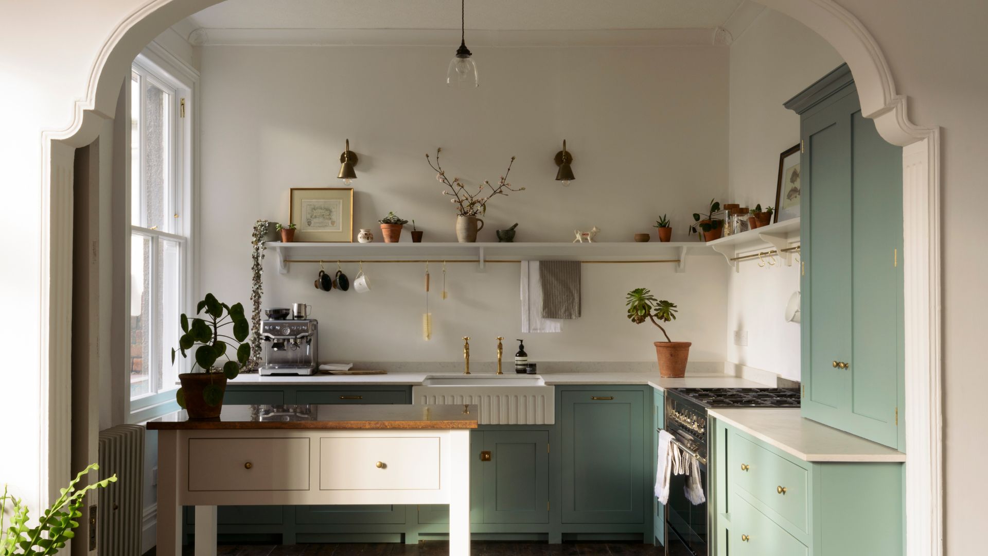
Making an effort to keep counters clear in a small kitchen is a daily habit that can make a huge difference. Interior designer Sophie Clemson agrees: "If you fill your worktops with kitchen accessories or just our daily life necessities like post, bottles, plastic containers, etc. it will make your small kitchen look cluttered and busy. Try to be super organised to steer clear of any worktop clutter."
Over time, we become utterly clutter-blind, so if you want to see results, I recommend taking everything off your kitchen counters. Lay it all out on the dining table, using the opportunity to clean your kitchen while you're at it, and then put items back intentionally. Err on the side of extreme minimalism and ask yourself whether you truly need each item out on the counter and where they should logically go. The toaster can go in the cupboard below the counter where you use it to free up valuable prep space.
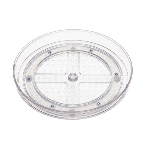
When you're done, you should be able to stand back and see a kitchen that looks more open and airy. As you scan the room, the space will feel bigger because there is less for the eye to land on. Keeping counters clear means you have to be more disciplined when organising your kitchen cupboards, but that's where clever kitchen organising products come in. Head to our guide on kitchen organisation methods and organise kitchen countertops for inspiration.
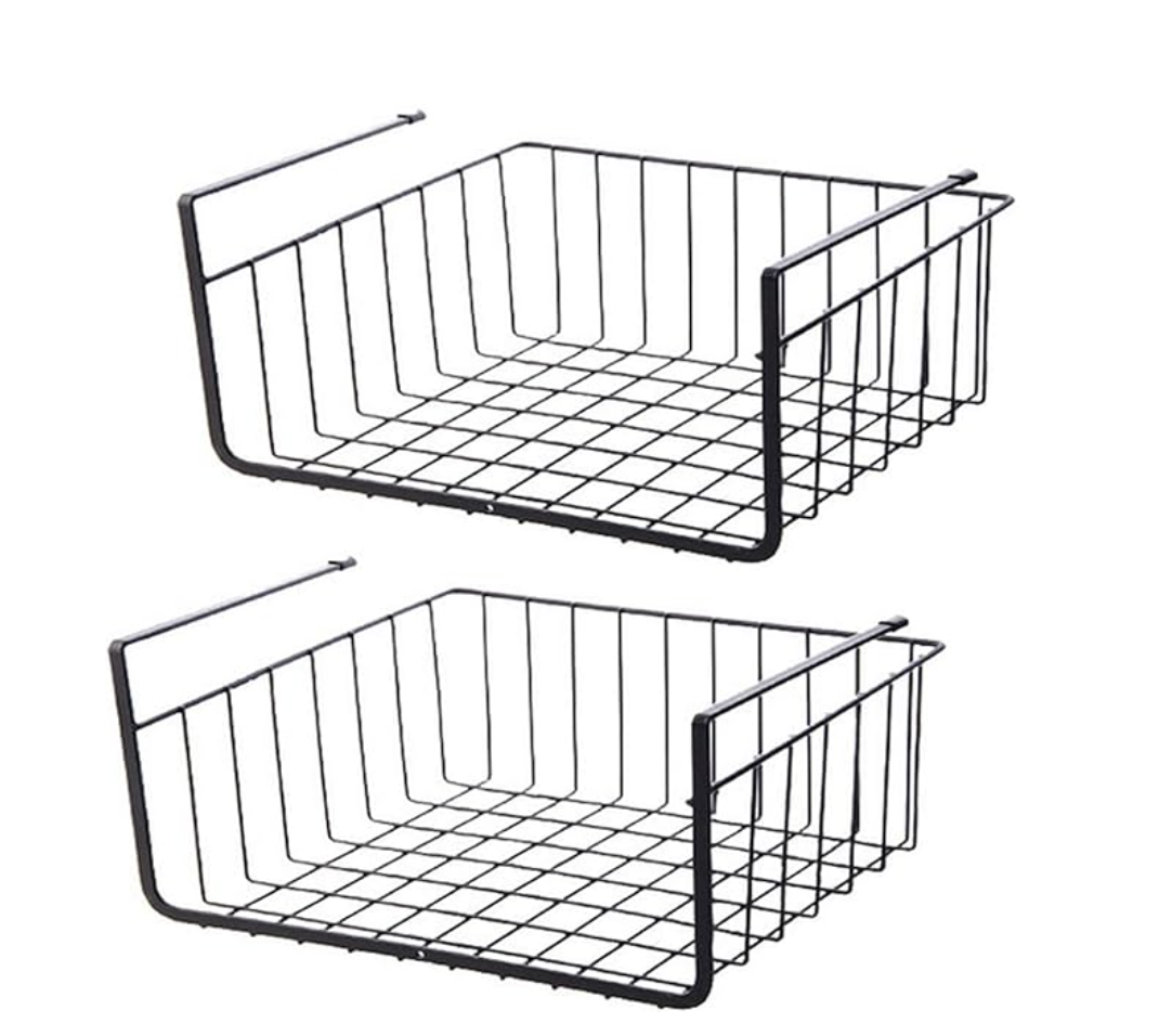
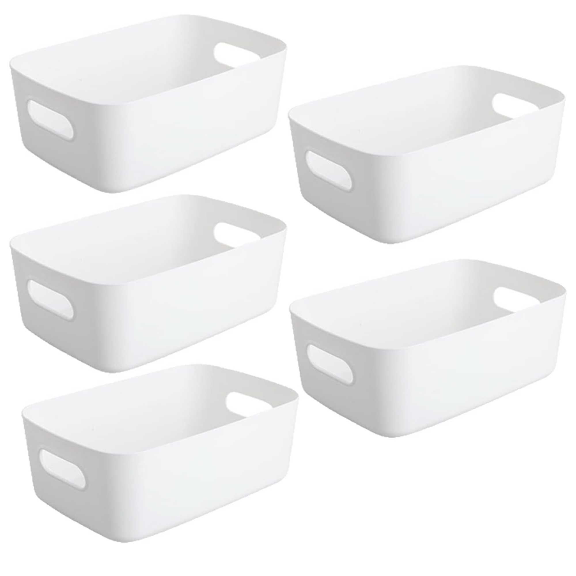
£14.39 | Often, we waste vertical space in kitchen cabinets, so it's worth trying under-shelf baskets like these, which allow you to use all the available space for storing food or cleaning supplies.

Sophie Clemson is the co-founder of The Living House, an affordable online interior design company that helps busy families transform their homes easily, online and within their budget.
What’s the best flooring to make a small kitchen look bigger?
"For a small kitchen, it’s best to keep the flooring consistent with the rest of the home. One trick for wooden flooring is to run it lengthways to exaggerate the length of the space rather than running it cross grain," says kitchen designer Looeeze Grossman.
"If you can run the flooring out to the adjacent garden, the outdoors becomes part of the kitchen creating an additional outdoor space that the inside may be lacking. When using wooden flooring, use the same plank size and colour on the outside to open the space up and continue the lines the whole way through the space."
How can I make a kitchen feel bigger when renovating?
"Go for integral appliances, as this will make your kitchen feel more spacious and expensive. This is exactly what I did in my small navy galley kitchen," says interior designer Sophie Clemson. "Having your appliances seamlessly blend into the kitchen cupboards creates a more luxe and modern feel."
Sophie says this works particularly well when you’re opting for a painted kitchen, such as navy or green. If the fridge, freezer, or washing machine are on display, it will deflect from the beautiful colours you’ve incorporated within your kitchen, and they will be the first things you see. So if your budget allows, always go for integrated appliances.
"I also recommend going light on the worktops, such as quartz or marble. If you opt for dark worktops, it can make the space feel quite heavy, resulting in it feeling smaller. If you’re on a budget, some great laminate alternatives for marble work just as well," Sophie says.
It's worth remembering that it's all relative: if we look at the tiny kitchens that are commonplace across the globe – think compact and space-savvy apartments in Manhattan and Paris to homes in Japan – we soon realise we don't need as much space as we think. And generally, we don't need more space, we simply need less stuff.

Millie Hurst is a freelance writer and interior designer based in Sheffield, helping clients create homes that are characterful, curated, and highly functional. Interior design inspirations include Jake Arnold, Beata Heuman and Abigail Ahern. Her personal style is a 'liveable maximalism' with boho, nature-inspired designs.
She has seven years of experience in the world of digital journalism, most recently working as Head of Solved at Homes & Gardens, where she wrote and edited countless features on home organisation, decluttering and interior design. Before that, she was Senior Content Editor at Ideal Home.
-
 Lynsey Crombie reveals the surprising laundry mistake leaving your clothes smelling 'stale and nasty'
Do your clothes smell unpleasant even after you've washed them? It could be your fabric conditioner
By Emily Smith Published
-
 Only have time to exercise at the weekend? Here's why that's no bad thing
You might think that you have to exercise multiple times a week to reap the benefits, but new studies on weekend exercise show that's far from the case
By Grace Walsh Published
