How to decorate a rectangular living room: 5 ways to make the most of a narrow space
Interior design tips to stop you from getting tunnel vision in a narrow, awkwardly shaped living room
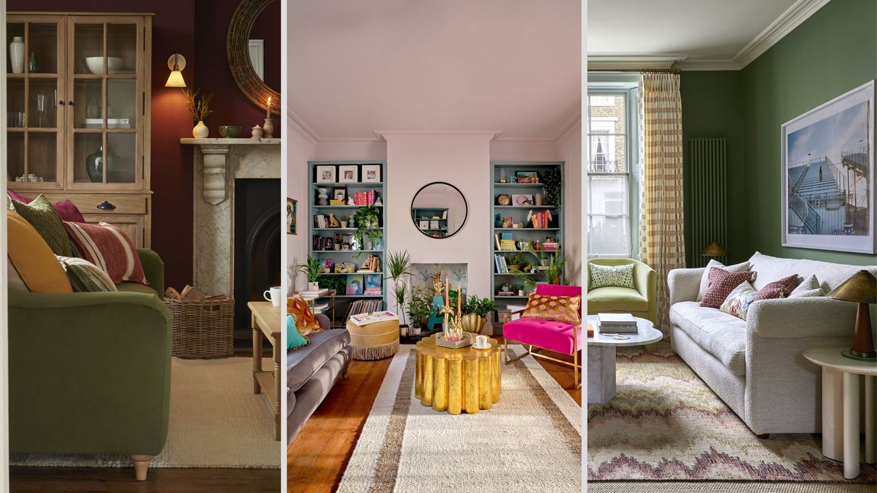

Decorating a rectangular living room can pose several design dilemmas. Despite the fact you have more space to play with, you've got to avoid the 'corridor' effect and work out the best place to put the TV and make the layout feel inclusive.
It's a common question interior designers are asked, so we have gathered the best ways to decorate your living room in a way that makes the most of that extra square footage.
Often, this means dividing it into two zones, but more on that below. It's worth remembering that having extra space is a good problem to have – all too often we're trying to make a small living room look bigger.
Every room needs a focal point, so it's a good idea to work out what this will be as a first port of call. Then you might want to think about changing up your colour scheme with the best colour combination for a living room.
How to decorate a rectangular living room
Working out the right layout and avoiding interior design mistakes will give make your living room look expensive and well designed. Here are five tips for making your living room work for you.
1. Bring furniture away from the walls
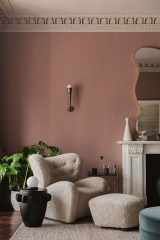
When arranging furniture in an empty living room, we instinctively put the sofa, TV stand and armchairs up against the walls. But unless you're going to be using the space for yoga, you can 100% afford to bring the furniture into the room, even if you're working with a small living room layout.
"One thing I see all the time are the sofas pushed up right against the wall! Bring them further in, you want a cosy space, not a waiting room!" says interior designer Amanda Lucas. "Bring them off the wall at least 200mm so there is a gap." This will give your furniture some breathing space and it actually makes the room feel more square.
Sign up for the woman&home newsletter
Sign up to our free daily email for the latest royal and entertainment news, interesting opinion, expert advice on styling and beauty trends, and no-nonsense guides to the health and wellness questions you want answered.
A furniture rejig is one of the best, easiest ways to transform your living room on a budget, making things feel totally different without spending a penny.

Amanda Lucas is an interior designer and the founder of Rooted Fig interior design studio. She has worked in interiors for eight years, designing kitchens and homes clients love to come home to.
2. Create a room of two halves
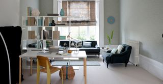
This living room features a bookcase 'wall' to divide the room
Interior designer Sophie Clemson from online interior design company The Living House says that they are often asked for help when it comes to decorating narrow living rooms, which are common in new builds.
"On a recent living room project, we created two distinct zones, with a TV area at one end and a reading/coffee area at the other, with a nice view out the window," she says. They created a cosy TV space with two sofas and an armchair, a large rug to zone it and artwork above one of the sofas.
Over on the other side of the room, they put two swivel armchairs by a window, creating a lovely area for a quick catch-up with a friend or a cosy reading nook. "Armchairs that are on a swivel give you much more flexibility with your layout, so we always recommend those."
A good way to create two distinct areas is to have a sofa in the middle of the room and place a console table behind it, with plants, lamps and coffee table books on it. This helps to separate the spaces visually and creates a sense of depth.

Sophie Clemson is an interior designer at The Living House, an affordable online interior design company that helps busy families transform their homes easily, online and within their budget. Sophie has worked in interior design for eight years and aside from designing, she loves to find a good bargain or Facebook marketplace find.
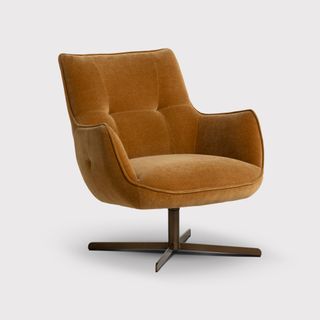
RRP: £499 Now £375 | This sophisticated swivel chair feels luxurious thanks to the velvet material upholstery. While the seat shape feels traditional, the sleek legs lend a more contemporary edge to the design. Place two together with a side table for a sociable coffee corner.
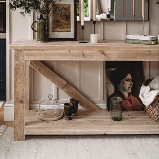
RRP: £375.50 | This handmade V-back console in reclaimed wood is available in 3 gorgeous finishes and can be made to a custom size if required. Place behind your sofa for extra storage and a way to delineate two separate spaces.

RRP: £155 | Some beautiful foliage can help to break up a space and add depth. A tall bird of paradise houseplant, like this one from John Lewis is a great way to do that. This one comes with a woven basket in black and natural tones.
3. Think about where the TV should go

Despite the fact that most of us like to watch the TV, having it in a too-prominent spot is generally considered to be a living room design mistake to avoid. So it's worth thinking about where it can comfortably go while being open-minded about different options.
"I would always avoid it being in the corner because you direct the furniture based on the TV position," Amanda begins. "Can you put the TV on the chimney breast? The Samsung Frame TV is amazing as it feels like a picture frame, rather than a big black box taking up all the space."
If your only option is to have the TV in the corner, consider having it in a lovely alcove unit or a cabinet so you can close the door on it when it's not in use. Wherever the TV is, Amanda recommends positioning the furniture towards each other rather than towards the TV.
4. Use rugs
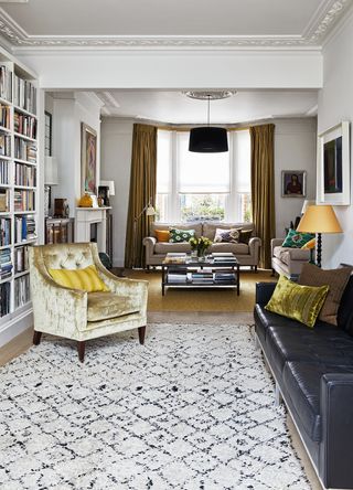
Rugs and lighting are a great way to zone spaces within a larger room and they always help to make your home cosy. In a rectangular space, you can position your furniture around two different rugs, and they will instantly feel like two separate spaces. When choosing rugs, Amanda Lucas recommends keeping the rug tones similar.
"They can be different fabrics and colours, but with similar tones so they tie in together," she says. "Make sure you use the right size rug – I've seen so many living room with rugs that are too small, so if in doubt, go bigger! Having a lovely styled space and furniture planning done perfectly but with a small rug in the middle throws everything off and looks odd."
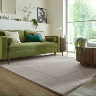
RRP: £129 | This 200 x 200cm rug is handmade from 100% wool. It feels warm underfoot and can improve sound insulation for a quieter and comfier room. It's versatile and hardwearing, so it can withstand high traffic areas in your home.
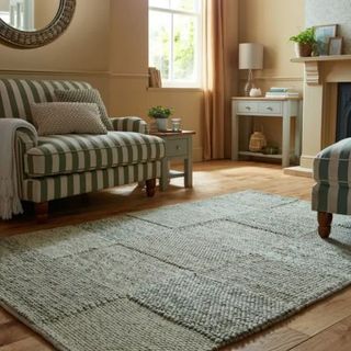
RRP: £299 | This 200 x 290cm rug will add some lovely texture, pattern, and cosiness to your living room and help to anchor a space within a larger living room. To keep your rug looking fresh and even rotate regularly to balance out wear.
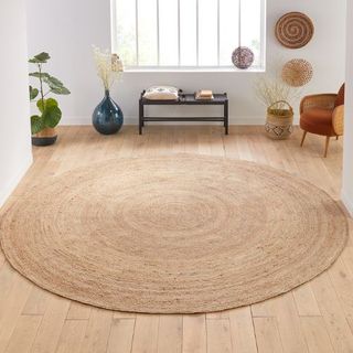
RRP: £243.75 | I've taken this rug with me on multiple house moves and would recommend it for creating a warm and cosy vibe. The circular shape helps to offset the many harsh angles in living rooms. Available in a range of sizes, but if you have space, go for the 300cm diameter.
5. Make it conversational
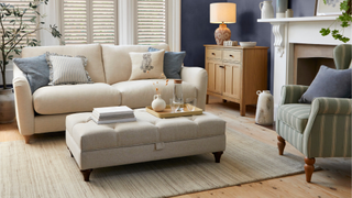
Our living rooms should be a place for gathering together with friends and family. Think about how you'd ideally be using the space, and how you can arrange the furniture to make it conducive to conversation.
"Sociable living rooms where two sofas are facing each other with a table in between, the fireplace in the centre is just lovely, it's so inviting and welcoming!" says Amanda Lucas. Other ways to make things conversational are to create a window seat for extra seating that faces into the room, and to arrange sofas and armchairs to face each other. Add artwork or photos for conversation starters that give your home personality.
FAQs
How do I make the most out of a rectangular living room?
Be realistic about the function of the room day-to-day, and arrange the furniture to make those daily activities easier. If there's an armchair that you never actually use, consider selling it to free up space and improve the flow of the room. Decluttering your living room will make things feel refreshed and create space for furniture that works for your lifestyle now.
Don't forget to decorate empty corners – dead space and blank walls are always an opportunity to create a beautiful vignette.

Millie Hurst is a freelance writer and interior designer based in Sheffield, helping clients create homes that are characterful, curated, and highly functional. Interior design inspirations include Jake Arnold, Beata Heuman and Abigail Ahern. Her personal style is a 'liveable maximalism' with boho, nature-inspired designs.
She has seven years of experience in the world of digital journalism, most recently working as Head of Solved at Homes & Gardens, where she wrote and edited countless features on home organisation, decluttering and interior design. Before that, she was Senior Content Editor at Ideal Home.
-
 Chocolate brown is everywhere but Ranvir Singh's Reiss sale dress stands out from the crowd
Ranvir Singh has made us fall in love with deep cocoa brown all over again and her Reiss midi dress is more than 50% off
By Emma Shacklock Published
-
 As a beauty editor who's tried hundreds of makeup brushes, these are the only five you need
Don’t waste money on unnecessary tools; from my decade of experience, these are the ones to own
By Victoria Jowett Published