How to combine traditional heirlooms with contemporary style – 5 essential interior design tips
Holding onto old-fashioned items is kinder to the planet and stops your interiors from feeling too 'perfect' – here's how to make them work in your home
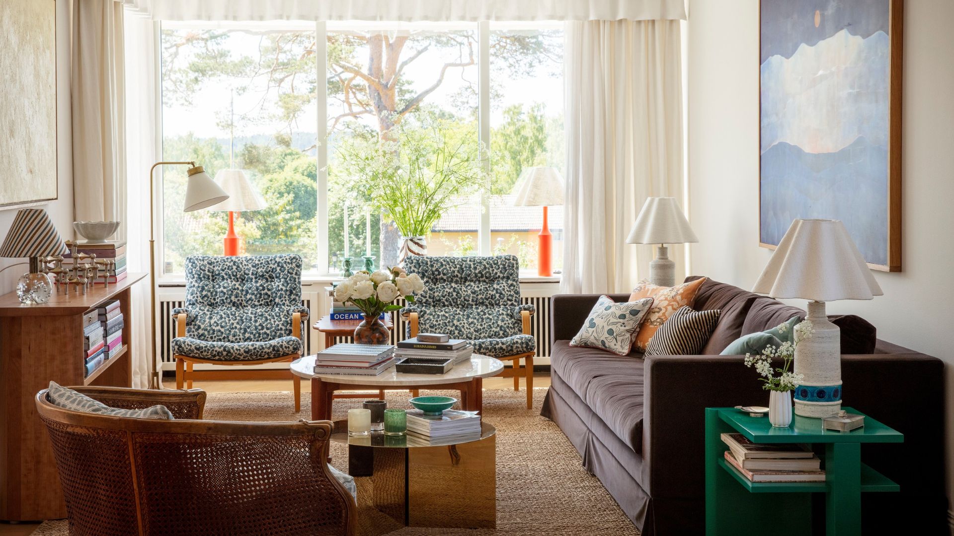

We all have a couple of older pieces of furniture that have been passed down to us. And while we love the people who gave them to us, our hearts might not swell with love for the items themselves because combining traditional heirlooms with a more contemporary style can feel jarring.
So, how do you make a dark wooden TV unit work in an otherwise modern, Scandi living room? Or make a mid-century display cabinet look like it totally belongs in your open-plan kitchen?
Decorating our homes always involves making purchases, so holding onto inherited pieces or buying second-hand is the key to decorating our homes in a more eco-friendly way and living more sustainably.
Don't stress over how to make heirlooms 'go' with your scheme, and definitely don't throw out the G Plan. Because as interior designer Sophie Clemson points out, mixing old with the new is a popular interior design trend known as 'transitional' style. "I think using older pieces in our homes should be embraced, not only is it great for the environment, but it also makes our homes unique."
5 ways to combine heirlooms with contemporary style
Sophie Clemson says using pieces that you have inherited in your home is a great way to give your home more personality and it can also make a home look more expensive on a budget. "They often tell a story and have great meaning behind them, which can add something really special to a room," says Sophie.
1. Reupholster
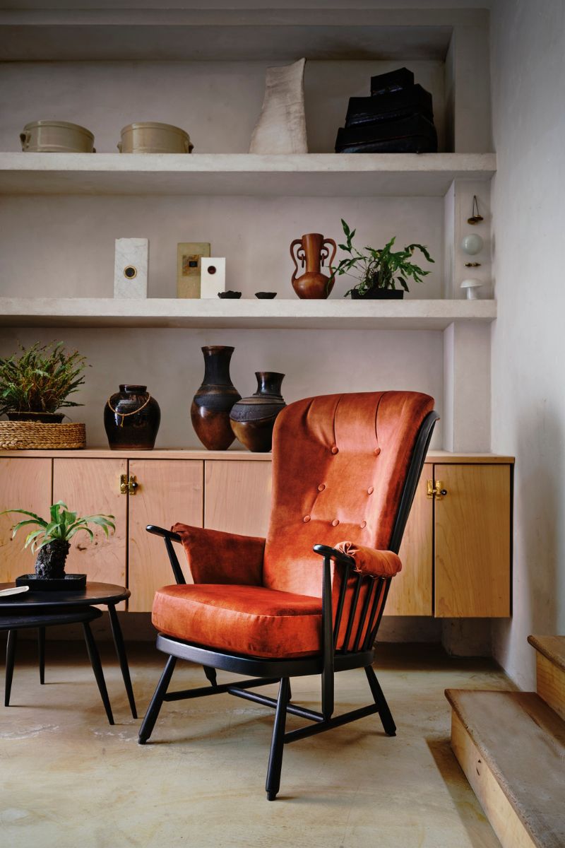
Reupholster grandma's chair in a gorgeous velvet fabric or a fun, contemporary print. It's a fabulous way to transform a living room on a budget, and the chances are it's got a really sturdy frame with a lot of life left in it.
"We've worked with clients who have inherited an armchair that we have woven into contemporary design schemes by having them reupholstered," echoes Sophie Clemson. Upcycling is a brilliant way to go because it means you can keep the traditional shape and quality frame of an inherited piece, modernising it so it feels in keeping with the rest of your space.
Sign up for the woman&home newsletter
Sign up to our free daily email for the latest royal and entertainment news, interesting opinion, expert advice on styling and beauty trends, and no-nonsense guides to the health and wellness questions you want answered.
Whether you do it yourself or have it done professionally, reupholstering gives you something unique, making your home more interesting and personal as you adopt a 'make do and mend' attitude.
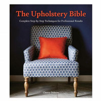
The Upholstery Bible: Complete Step-by-Step Techniques for Professional Results, £12.97 at Amazon
If you have always wanted to learn how to upholster, take on a project like reupholstering a footstool or dining chair, and build towards more complex tasks like stripping and upholstering entire chairs. This guide by Cherry Dobson has easy-to-follow, illustrated instructions for all abilities.

Sophie Clemson is the co-founder of The Living House, an affordable online interior design company that helps busy families transform their homes easily, online and within their budget.
2. Reframe old prints
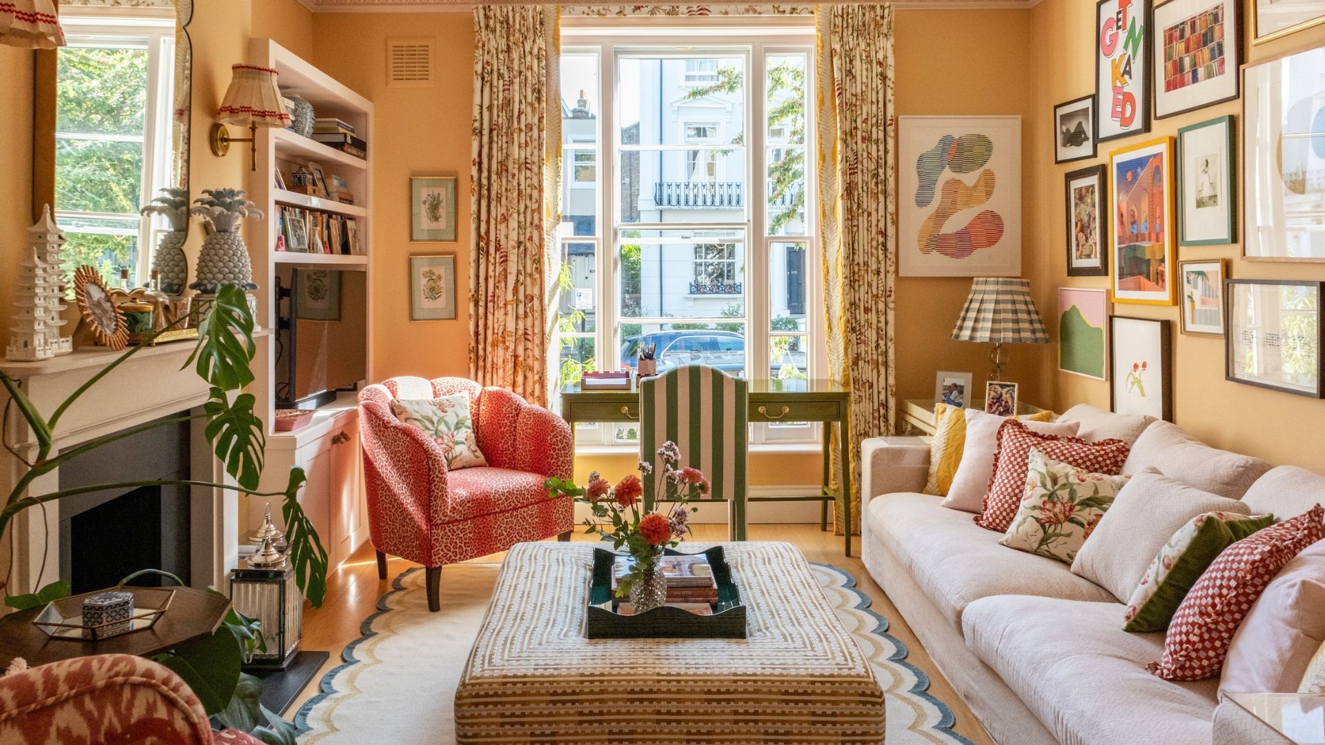
Those old prints in the attic are great additions to gallery walls, especially if you take them out of their existing frame and mount them in something a little more contemporary.
Don't let go of old artwork as some more old-fashioned water colours, landscapes and still-lifes will look super characterful alongside modern artwork and typographical prints, bringing a sense of history and a lived-in feel.
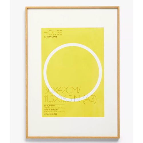
Sophie Clemson recommends reframing pieces of art you have inherited into something more modern (some great options below). Having artwork in the same frames, or at least frames of the same colour, can make things look more uniform, but it depends if you'd like an eclectic or orderly arrangement.
Think about sight lines when working out where to hang artwork so that you can really enjoy looking at it. A couple of old oil paintings of fruit or landscapes work great in the kitchen, making a kitchen look more expensive and homely. Rest them on the counter or mount on walls and tile with Command Strips, at Amazon.
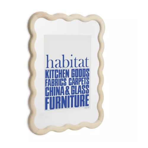
RRP: £50 | Old cityscapes and portraits will look great in this wavy frame from Habitat, made of responsibly sourced ash. Suspend from a coloured cord for a dash of vibrancy or use the wall fixings for a simple flush look. It measures 65x48cm and with the mount, it fits an A3 picture.
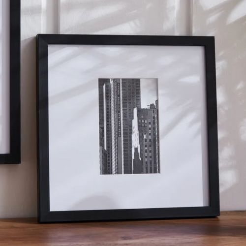
RRP: £4.50 | We love this square, modern frame with an oversized mount, as it makes art pieces feel special. Try displaying four or five in a row or creating a grid of four. The frame is available at a really affordable price and has a black frame and glass front.
3. Choose your colour palette
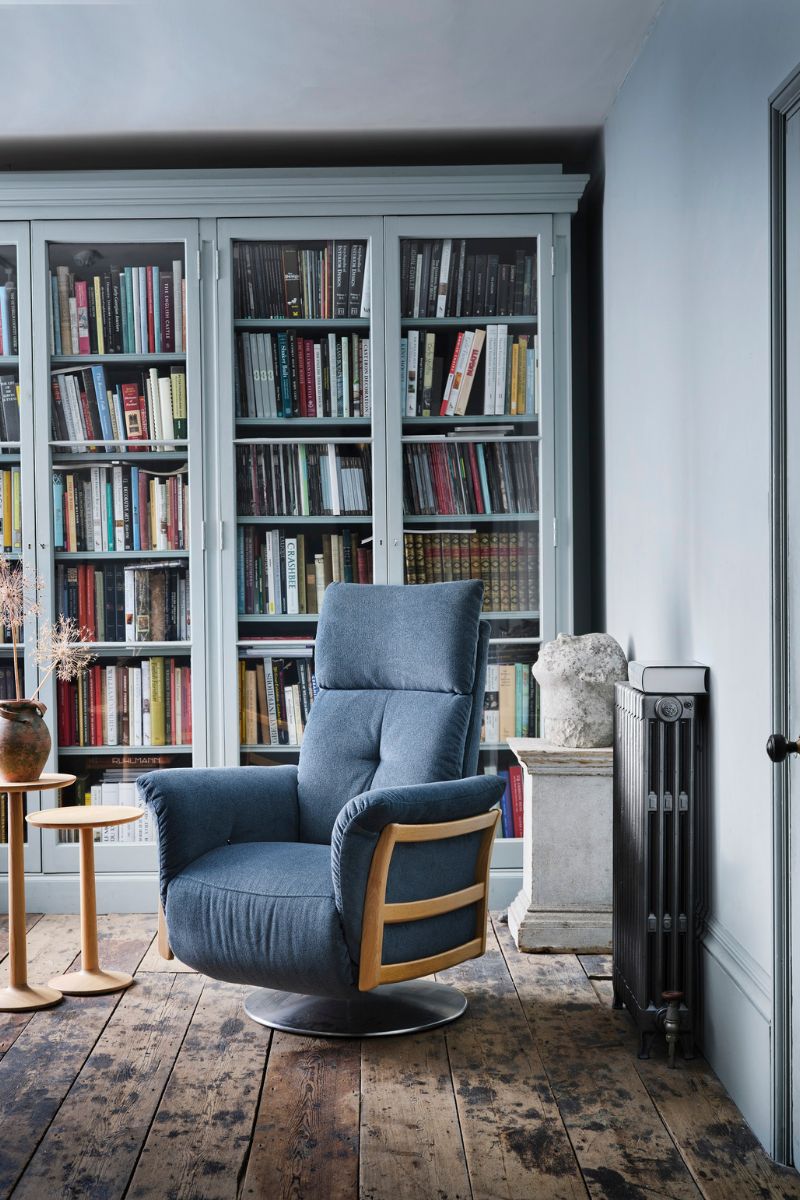
Decorating with antiques can make things feel 'busy' so Sophie Clemson recommends sticking to a chosen colour palette. This might mean you choose three colours to guide purchases and avoid introducing any more. Think of your interior paint colour trends and how they sit with the furniture materials.
Sophie says this will help you to achieve a cohesive look when you’re mixing traditional and modern design together, creating a common link between the pieces in order to create flow and a well-designed room.
Interior designer Courtney Cole agrees that a cohesive colour scheme helps tie together modern and traditional elements, creating a harmonious look without any elements that don't seem to fit in.
That said, we do love a disruptor colour, also known as the 'unexpected red' theory, so don't be afraid of throwing in something a little bit rogue, like one cushion, footstool, or vase in a citrus yellow or cobalt blue to liven up your magnolia decorating scheme.

Courtney Cole is an interior designer at the Australian kitchen and bathroom company TileCloud, which manufactures and distributes tiles, hardware, and other renovation necessities. Courtney has been working in interior design for a several years, and has heaps of experience in home design.
4. Add smaller pieces first
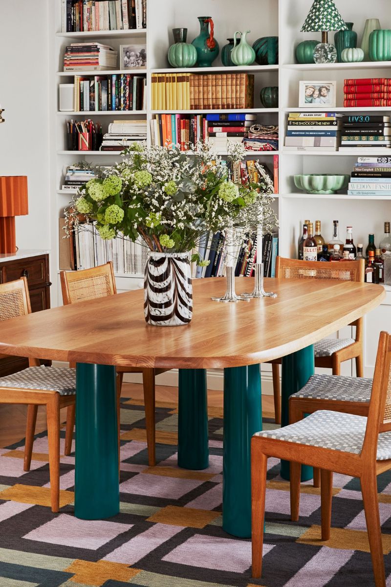
If in doubt, you can always start by introducing smaller, retro decorative pieces gradually. Perhaps you can display a few pieces of glassware, clocks, ornaments, or artwork first before including any larger items of furniture. This means you can get used to having more vintage pieces in your space without feeling like your space is becoming too retro.
"I always think a good way to incorporate vintage pieces is through accessories," agrees Sophie Clemson. "This could be an antique urn vase or an old print. Try starting with smaller pieces to become confident when it comes to using vintage and antique pieces to style your home."
Embracing the bookshelf wealth trend is a great way to curate accessories with purpose.
5. Go for a neutral backdrop

There's nothing wrong with having neutral walls – sometimes you just want one of the best white paint colours for a fresh and easy base.
Neutral paint can help tone things down when you are mixing furniture of different eras: "Using a neutral color palette can help to unify different design styles without adding more visual interest to the mix," says interior designer Courtney Cole.
"By using neutral whites, greys, or beiges for walls, and a complementary neutral for the floor, you are giving the room a calm backdrop that allows both modern and traditional pieces to shine."
FAQs
How do you make an old fashioned room look modern?
First, you might want to consider decluttering your home. Getting rid of excess knicknacks, and items that are broken or no longer used will make the space feel much more airy. This costs nothing and can totally transform a space, making you appreciate the items that are left. Then, consider rearranging the furniture, and introducing one new item, such as a colourful, modern footstool, like this storage footstool at Dunelm that can double up as a coffee table.
I would also recommend replacing window treatments and rugs as these cover large swathes of surface area, especially in the evening when curtains are drawn. So swapping out fabrics that feel tired and dated will freshen up the space. Go as big as possible when choosing rugs, and take curtains down to the floor. Houseplants, extra mirrors and if possible, a fresh lick of paint, will all start to bring the room into the 21st century.

Millie Hurst is a freelance writer and interior designer based in Sheffield, helping clients create homes that are characterful, curated, and highly functional. Interior design inspirations include Jake Arnold, Beata Heuman and Abigail Ahern. Her personal style is a 'liveable maximalism' with boho, nature-inspired designs.
She has seven years of experience in the world of digital journalism, most recently working as Head of Solved at Homes & Gardens, where she wrote and edited countless features on home organisation, decluttering and interior design. Before that, she was Senior Content Editor at Ideal Home.
-
 Need spring style inspiration? Jennifer Aniston proves a shirt dress is the most versatile item you can invest in
If you only buy one piece this weekend, make it a shirt dress
By Matilda Stanley Published
-
 Celebrities you never knew got their start as models, from Angelina Jolie's 'terrible' experience to A-listers who started as pageant queens
Whether it was just for a short time or it's how they got discovered for something else, these stars owe it all to striking a pose
By Jack Slater Published
