

The best things in life are buttery: toast, shortbread, pastry, cakes. Now, adding to that delicious list is KitchenAid's 2025 Colour of the Year. Interior designers are calling butter yellow the "new neutral", and I think you'll want to spread some in your home.
KitchenAid is perhaps most famous for making some of the best stand mixers on the market. With 100 years of craftsmanship and expertise baked into the brand, how do they tap into the moment and keep things fresh? I think a lot of it lies in their annual colour of the year event.
KitchenAid's 2024 Colour Of The Year was a delicate pastel 'blue salt'. Now, with thirty-six other colours in the bank, you'd think they'd have run out of ideas, but this year, things just got butter. Their creamy yellow hue is reminiscent of chic, European kitchens with a brightness and cosiness that I think every home could do with a splash of. It took KitchenAid three years to decide on 'butter' as the colour of 2025, so what does that say about us?
KitchenAid Colour Of The Year 2025

Butter is the seventh special colour launched in KitchenAid's Colour of the Year Celebration. When I first heard about it, I imagined seeing the KitchenAid Artisan in a burnt butter along the lines of taupe and mocha (which seem to be everywhere at the moment), but this creamy colour is much brighter than a classic neutral.
Becca Stern, Co-Founder and Creative Director of Mustard Made, assures me that "butter is the new neutral. Bolder than beige, with a European edge and versatility at its core, 'butter' blends as seamlessly with cosy pastels as it does with an unexpected pop of red."
I don't know whether it's KitchenAid's smooth satin finish or the creaminess of the yellow, but there's something deliciously soft and unctuous about this colour of the year too. It's here to add a classy splash of colour to your kitchens. And, from everyone's reactions, it's clear we're all smitten.

Butter will be available in the Artisan 4.8-litre stand mixer, which I think is the best model made by KitchenAid. It will come with a stainless steel bowl (you can buy a spare, different style if you would like), as well as a flex edge beater, dough hook, wire whisk, pastry beater and extra 3L stainless-steel bowl.

The KitchenAid team recommends pairing this with the KitchenAid Bread Bowl attachment ー "they go together like bread and butter (pun intended)!"

KitchenAid makes lots of different bowls that you can use to customise the style of your stand mixer and this is my top pick. The soft sage ceramic complements the bright, but still neutral, bowl. It's a classy look.
Landing on 'butter' as the colour of 2025 started with a workshop three years ago that analyzed worldwide socio-cultural trends. Brittni Pertijs, Colour Materials Designer at KitchenAid, says "our team saw yellow continually pop up, and knowing we wanted to tap into comfort and nostalgia, this soft, energizing butter yellow felt like the perfect marriage of all those elements."
Pertijs, added, “we know that butter yellow evokes feelings of warmth and joy, rather like a warm embrace. In the colour development phase, we wanted to ensure that Butter captured these emotions while also feeling fresh and modern in the home."
They've done it perfectly. I've had a sneak peak at this butter yellow stand mixer (stay tuned for my review and styling tips) and the stand mixer looks beautiful. It reminds me of flowers and spring, so will certainly add freshness and brightness to your home without becoming dominant.
What does KitchenAid's Colour of the Year mean?

To work out what 'butter' says about the state of the world in 2025 (big task, I know), it's important to take a look at where it all started. Brittni Pertijs, the woman in charge of creating the butter finish says "our team first began tracking yellow when we saw mustard emerge as a popular colour in 2019."
KitchenAid's butter is much creamier and fresher than the warm, rich tones of mustard, but it shares some important characteristics. The sunny yellow colour is inherently cheerful. 2025 is the year of the snake, which is supposed to symbolise new beginnings and fresh starts. Nothing says fresh and bright like a splash of sunny yellow in the kitchen. It's full of hopefulness for the new year and for spring.
One of the main reasons that KitchenAid picked butter, suggests Brittni Pertijs, is that it has a "slightly vintage, nostalgic tone that's reminiscent of the 1950s and 1960s." They've struck a delicious balance of offering a warm vintage yellow, but it's still fresh enough to sneak into the category of "modern neutral". It's homely without being twee. It's warm without being rich. It's a neutral, but it's not boring in the slightest.
How can I style KitchenAid's Colour of the Year?

I can't believe that I've never welcomed any butter or yellow into my home. I've always opted for greys, whites, and blacks, thinking that yellow was reserved for the bold and beautiful homes. However, Becca Stern, Co-Founder and Creative Director of Mustard Made, promises that the "golden, sunny, creamy and delicious, tones of this mellow yellow give a modern update to a retro shade. Butter is here to stay, and she’s no side-dish! She’s a main meal."
She recommends pairing it with woods, satins, matte counters, and natural materials. I've found that it looks really classy. It ticks a lot of luxury-style boxes, including its timelessness.
Brittni Pertijs, the creator of butter says "I made this to work well in any home, from eclectic and traditional styles to clean and contemporary spaces. The Stand Mixer also pairs well with various shades of blue, including a periwinkle, or if you are looking to mix and match with other appliances, it looks great with the KitchenAid Blue Velvet colourway or muted tones like a sage green."
Other ways to add yellow into your kitchen
KitchenAid aren't the only ones offering up some yellow in the kitchen. If you're feeling inspired by the bright sunny tones, here are some other ways to bring yellow into your kitchen.

These candles are worth every penny. The hand-glazed ceramic vessel will remain a a special feature in your home long after the scent of the candle disappears.

The easiest way to make a yewllow statement in your kitchen is with a fruit bowl. This is practical and pretty. It's easy.

This fun ceramic vase will add some bright yellow to your kitchen. It's vintage , but with a modern twist.

I love adding colour to a kitchen with some salt and pepper grinders. These bobbins are on-trend and wonderfully bright.

You can't go wrong with a colourful toaster. Dunelm's ochre is vintage style at its very finest. I'm in love.

It's KitchenAid's Colour of the Year, so why not bring the buttery yellow into your kitchen with an actual butter dish? Le Creuset's stoneware is the best quality you can buy.
There's a lot to be said for adding a splash of yellow to your kitchen. KitchenAid's colour of the year has, once again, inspired me to move out of my comfort zone, opting for something a little brighter and butter.
-
 Comfy, chic and the perfect spring shade - Kate Garraway's vintage blue Sezane jumper dress ticks all the right boxes
Kate Garraway's blue Sezane jumper dress has you covered if chicness, comfort and gorgeous spring tones are at the top of your style checklist this season.
-
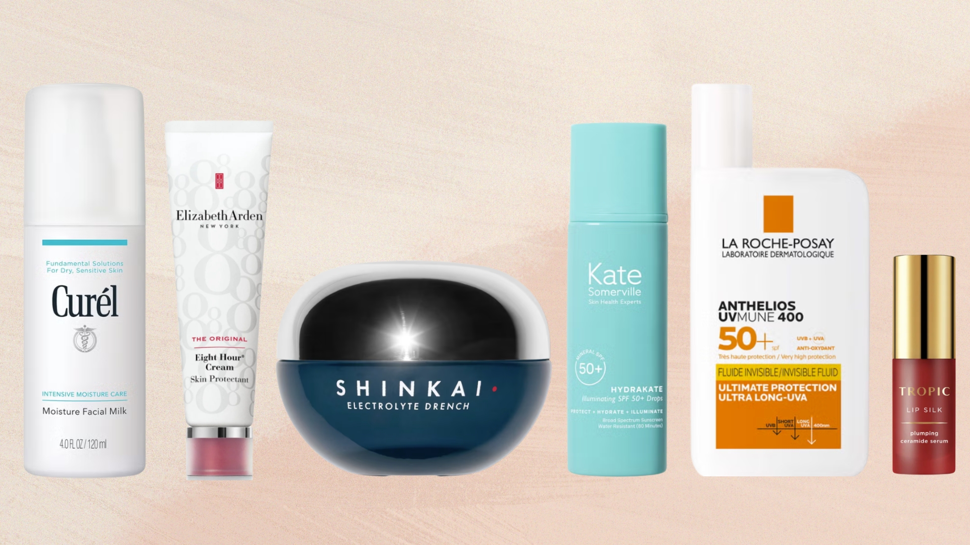 Charlize Theron says SPF, moisturiser and lip balm are all you need on a desert island - so, here are the ones we would bring
We couldn't help but wonder: What are our beauty team's desert island picks?

