5 essential design rules to stop your home from looking like a Show Home
Planning a decorating project? Interior designers share how to make things look styled but never sterile
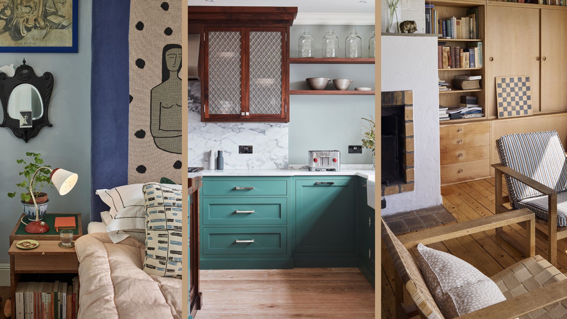

When we're taking on a redecorating project and enlisting the help of an interior designer, we often worry that we'll end up with something that looks too perfect and not enough like us. Like how your hair feels after the hairdresser's before you've run your hands through it.
No one wants a home that resembles an IKEA showroom – we want a well-designed, "happening" house with shoes by the front door and the promise of something tasty wafting through from the kitchen. So how do you achieve that stylish foundation that's a little rough around the edges?
The designers at online interior design company The Living House say this is one of the most common concerns clients have on their discovery calls and power hours. Below, they have shared their favourite ways to give your home more personality and avoid the dreaded "show home effect."
Decorating rules to stop your home from looking like a show home
Creating a characterful space that feels like home often means bending conventional living room design rules and being guided by what makes you do a happy dance. We also previously shared the best decorating timeline to follow, which will help you to make a space you love being in.
1. Don't be led by trends
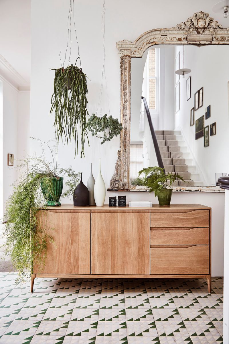
We love taking inspiration from the latest interior design trends – a little quiet luxury here and some biophilic design there, a Noguchi paper lantern to add some on-trend mood lighting, or a bouclé accent chair for some cosy texture. Trends are always a fun way to incorporate something new, but we don't recommend following them religiously.
Sophie Clemson says that when we follow trends too closely, it can make a room feel a little one-note. "It's great to add some burgundy because it's in right now, but only if you really love it as a colour," she says. "Mix and match old with new to create a stylish space, and remember that if it's something you love, that expresses your style, it will never go out of fashion."
If you're decorating a new build, you can totally bring in some vintage items, be it an upcycled sideboard or a second-hand dining table. For tips on combining heirlooms with a more contemporary style, you can head to our guide.
Sign up for the woman&home newsletter
Sign up to our free daily email for the latest royal and entertainment news, interesting opinion, expert advice on styling and beauty trends, and no-nonsense guides to the health and wellness questions you want answered.

Sophie Clemson is an interior designer at The Living House, an affordable online interior design company that helps busy families transform their homes easily, online and within their budget. Sophie has worked in interior design for eight years and aside from designing, she loves to find a good bargain or Facebook marketplace find.
2. Avoid stark white paint
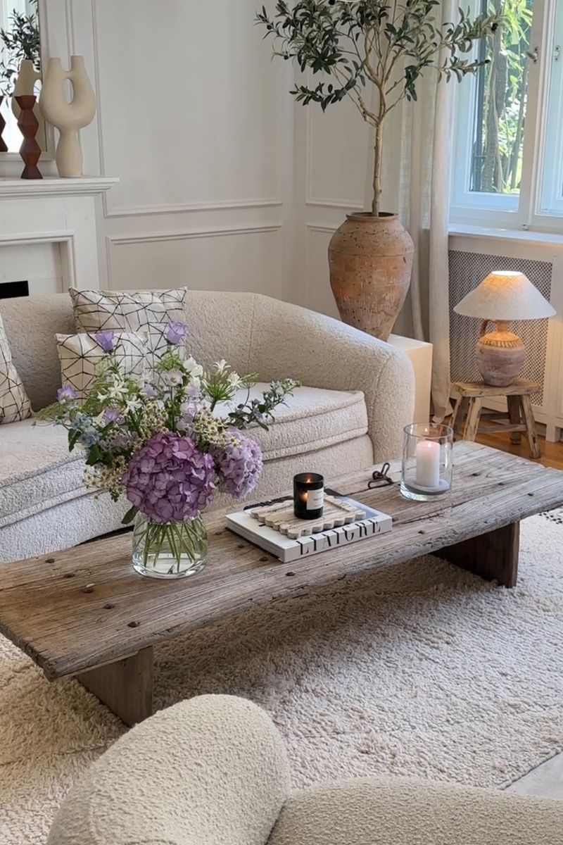
Paint is a good way to transform a living room on a budget, although the cost of paint has certainly risen over the last few years. Generally, interior designers will tell you to avoid brilliant white on the walls and to go for a warm white in a matt finish. This also softens the overall appearance and stops things from feeling clinical.
A warm neutral with a red undertone, such as Pointing by Farrow and Ball and Dimity by Farrow & Ball will look much more welcoming than a bright white. The difference might be subtle when you're perusing paint charts for the best white paint for your space, but once the paint is on the walls, you can really tell.
"But what if it just ends up looking like a magnolia?!" we hear you cry. It won't, because decorating with magnolia paints introduces a yellow or peach undertone.

RRP: £5.50 for a sample | One of F&B's red-based neutrals, this pale and subdued taupe has lots of warmth and an unmatchable depth, making it perfect for elegant and understated hallways. It combines well with All White and Pointing to read pinker, or with the darker Oxford Stone on woodwork for a slightly aged look and relaxed feel.

RRP: £2 for peel and stick tester | This warm white by Lick has a delicate drop of pink in its undertones. It's also eco-friendly with no harmful chemicals and is durable, multi-surface and wipeable.

RRP: £5.50 for a sample | This fresh and uncomplicated white is named after the colour of lime pointing used in traditional brickwork. This red-based neutral has a warm undertone to it which creates the prettiest of spaces when used on walls and softens the feel of a room alongside strong, traditional colours.
3. Use natural materials
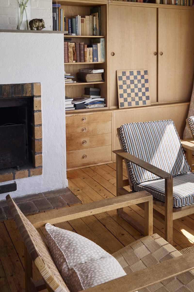
Natural materials are one of the worst-kept interior design secrets for a reason – furniture and decor in natural materials such as wood, rattan, ceramics and jute will always add warmth, texture and a relaxed feel.
In contrast, show homes often tend to be decorated in a more "Hollywood glam" style with lots of glass surfaces, metallic accents and shiny, plush materials. Glass dining tables and coffee tables can help to make a small room look bigger, but they aren't always practical, especially with children around.
You can also layer in textiles to make things feel homely with linen curtains, velvet and silk cushion covers, rugs and wall hangings. Adding more soft materials will also help with the acoustics in echoey spaces, and make the space feel more cocooning – perfect for resetting your home for autumn.
4. Hang personal artwork
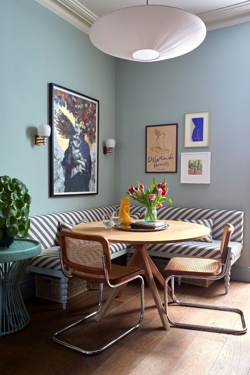
Whether it's a framed postcard from a holiday or a print from an affordable online art store, personal artwork stops things from feeling sterile. "Artwork doesn't need to be expensive," says Sophie Clemson. "We recommend looking on Desenio, FY or Poster Studio for budget-friendly artwork that means something to you. Wall plates in the kitchen can look great, too.
"Just try and avoid having a pair of abstract paintings above your sofa that tie in with your colour scheme, as that's a classic feature of show homes," says Sophie.
A few colourful prints are also a brilliant way to decorate empty corners. Try hanging artwork in unexpected places – a small print tucked in a corner or above a doorway can add intrigue and playfulness.
5. Layer your lighting
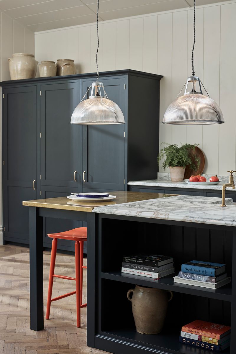
Layered light is key. Too many overhead lights and cool-toned bulbs can make a room feel cold and sterile, so go for warm bulbs or use ones that are colour-changeable so you can set the right mood depending on what you're doing. Pay attention to how high you're hanging your ceiling pendants too and bring them down a little for a more intimate and cosy look.
Wicker, rattan and linen pendants will create soft, atmospheric light that's easy on the eye. "Layer your lighting with lots of different options to create a cosy and welcoming atmosphere," says Sophie. Consider the different light colour temperatures too to make more of an impact.
"A mixture of wall lights, floor lamps and table lamps will add cosy light, depth and intrigue to your space." Right now, we're loving this modern, globular floor lamp, at B&Q and this Nina Campbell table lamp at Next.
FAQs
How can I make my home feel cosy and inviting on a budget?
"There are so many budget-friendly ways to make your home feel cosy," says interior designer Sophie Clemson. "Plants are always a winner. I'd recommend picking up three houseplants that are easy to keep alive and putting them in terracotta pots or woven baskets.
"A new table lamp and floor lamp will cosy things up and there are lots of affordable options at B&Q. You can also pick up some new cushion covers from Dunelm and H&M Home. Always go for a feather-filled insert as it looks more expensive, although we think the 'karate chop' can make things look a little bit like a show home."

Millie Hurst is a freelance writer and interior designer based in Sheffield, helping clients create homes that are characterful, curated, and highly functional. Interior design inspirations include Jake Arnold, Beata Heuman and Abigail Ahern. Her personal style is a 'liveable maximalism' with boho, nature-inspired designs.
She has seven years of experience in the world of digital journalism, most recently working as Head of Solved at Homes & Gardens, where she wrote and edited countless features on home organisation, decluttering and interior design. Before that, she was Senior Content Editor at Ideal Home.
-
 I hate getting my feet out in summer but Katie Holmes' love affair with black Birkenstocks has me inspired
Katie's Birkenstocks are a versatile staple that we've seen her wear on so many summer days
-
 After years of wearing jeans on repeat, I've embraced striped trousers - I only wish I'd tried this flattering trend sooner
Stripes never go out of style and are even more wearable than I had expected