5 conventional design rules worth breaking for a characterful living room
'Paint a small room white' – and other pearls of wisdom you don't necessarily need to listen to, according to designers
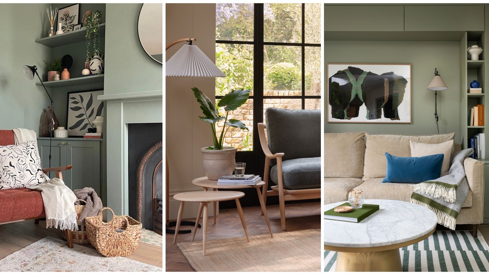

If the kitchen is the heart, the living room is certainly the soul of the home. It's the backdrop to a lot of activity, which means we often face challenges when working out the best furniture layout, colour scheme and so on.
There are lots of notions and dos and don'ts out there that we hear repeated over and over by seasoned home decorators, but should we really be listening to them? Some small living room layout rules make sense in theory, but might not apply to your space.
Below, we have rounded up some common ideas around how we 'should' be decorating our living rooms, and what the professionals actually suggest.
These pearls of wisdom will give you the confidence and tools to transform your living room on a budget and even make your living room look expensive on a budget.
Living room design rules worth breaking for a more characterful home
Whilst you want to avoid common living room design mistakes you also want to be able to 'bend' the rules to make your space feel like your own.
From painting skirting boards the same colour as walls to choosing oversized furniture, these are the design rules worth breaking to make your living room more characterful.
1. Keep your floor space clear
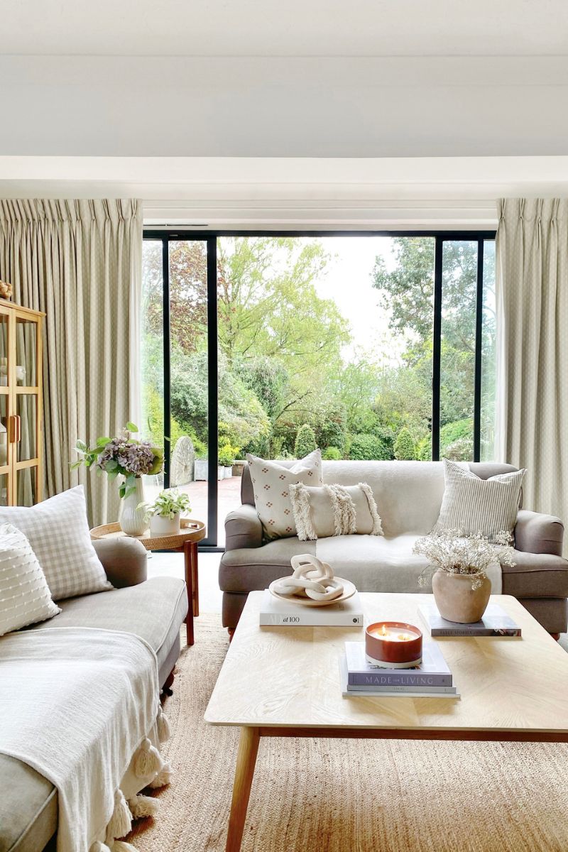
Amanda Lucas, interior designer and founder of Rooted Fig tells us that when she speaks to clients and family members about their living rooms, they are often overly concerned with keeping the floor space as clear as possible. Plenty of visible carpet might make your living room appear bigger, but it also limits the usability of your space day to day.
Sign up for the woman&home newsletter
Sign up to our free daily email for the latest royal and entertainment news, interesting opinion, expert advice on styling and beauty trends, and no-nonsense guides to the health and wellness questions you want answered.
Instead of having sofas against the wall and empty space in the middle (great when hosting a big birthday party, less great on a Tuesday evening watching Love Is Blind), Amanda recommends shuffling the sofas in. "Bring the sofa away from the wall, even by just 200mm, and it will make such a difference, giving you a space that looks considered and put-together, rather than a waiting area!"
If space allows, Amanda recommends having two sofas facing each other to create a conversation area, with a coffee table in the middle. This brings people together, and you always need somewhere to put down your drink.
"Side tables are also essential!" she adds. Other ways to make things more convivial is to create a window seat or add an armchair angled towards the sofa.
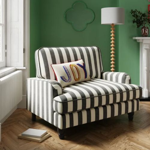
RRP: £399, now £349 | This striped snuggle chair adds instant personality, and while we love the black and white, it's also available in some other stylish colourways. With its fixed back, square arms, and stylish slub cotton blend fabric, it's a statement piece that's both comfortable and eye-catching.
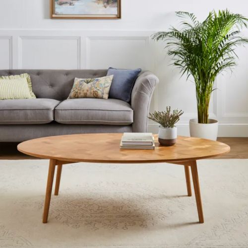
RRP: £249, now £199.20 | This coffee table has lovely detailing on its surface and gives plenty of space for beverages, books, or decorative items, adding both practicality and visual appeal. The natural wood tones give a warm and inviting ambience.
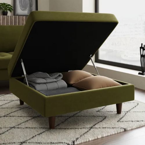
RRP: £199 | The retro tufted design brings a hint of traditional style to your living room while providing lots of practical storage for spare blankets, cushions and remotes, and somewhere to rest trays and coffee table books. It's made of a soft touch velvet fabric and has tapered wooden legs.

Amanda Lucas is an interior designer and the founder of Rooted Fig interior design studio. She has worked in interiors for eight years, designing kitchens and homes clients love to come home to.
2. Paint the ceiling and woodwork white
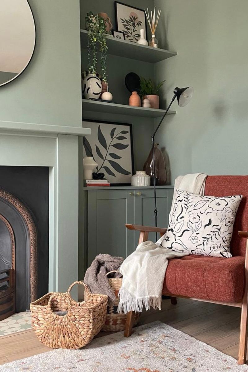
If you're going for a crisp, modern, all-white scheme, then white skirting boards, picture rails and door frames will help to deliver that look. But these often-overlooked architectural details don't have to be white by default – they can be colour-drenched or used as a way to bring fun pops of colour.
Many modern homes are already bending traditional design rules by painting doors the same colour as the walls. The same goes for painted ceilings, one of the big interior design trends we have seen this year.
Sophie Clemson, interior designer at The Living House, says paint can completely transform a room and the paint colours you choose can add character and depth. "To make your paint scheme more interesting, go for complementary colours with the woodwork and ceiling. You don’t need to paint the ceiling and woodwork white. Instead, paint the ceiling the same colours as the walls or paint your woodwork contrasting or complementary."
A quick note on paint finishes – if you're after a modern look, you don't need a super durable eggshell. Instead, consider going for matt paint. Provided it's not a very high-traffic area with little ones around, you can get away with a matt finish.

Sophie Clemson is the co-founder of The Living House, an affordable online interior design company that helps busy families transform their homes easily, online and within their budget.
3. Keep colours light and airy
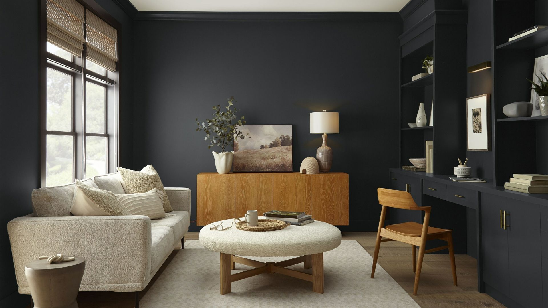
It's often said that painting a small room a light colour will make it feel bigger and brighter, and painting it a dark colour will make it feel smaller and darker. This is true because the best white paint colours have a much higher LRV (light reflectance value) than black, so will reflect more light into the room – an ideal way to make a dark room brighter.
But what about embracing your living room's smaller proportions and creating a more intimate, jewel box of a room? There is something very cosy and comforting about a living room that envelops us, which can't be achieved so easily with whites and creams.
Neutrals are great, safe options, but remember that they aren't the only living room paint colours at your disposal, especially if you want things to feel cosy. If colour isn't your comfort zone, try going for one of our favourite colour combinations for living rooms, which include blue, brown and neutrals, allowing you to dip your toe into a more colourful palette.
"Painting your living room a darker colour will give it an elevated, cocooning, and luxurious feel," agrees Amanda Lucas. "Embrace the darker side of things! Go bold with colour, bring in greenery and colour with plants, furniture and paint."
4. Don't mix old with new
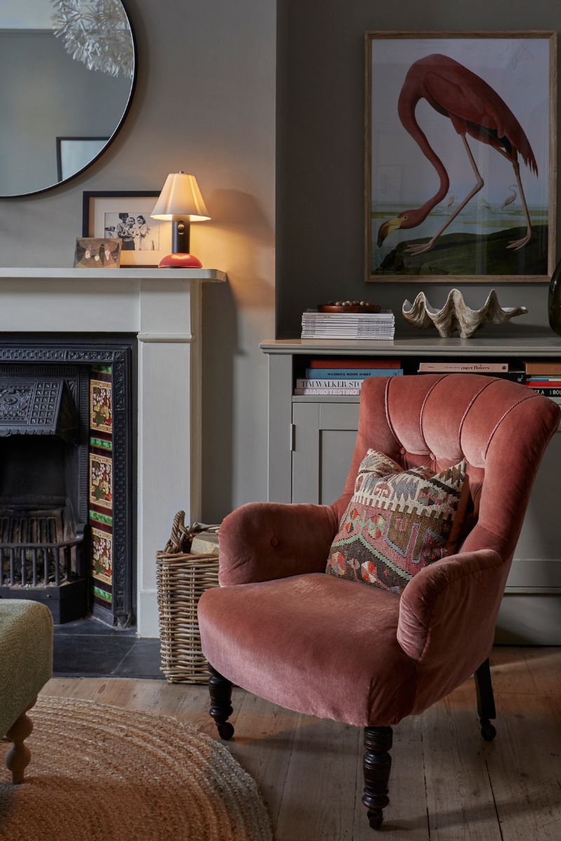
Mixing old with new takes a little more confidence, but brings more stylish and memorable results. It also prevents our homes from looking like a time capsule of the 2020s because there's a blend of design styles. When we combine heirlooms with a contemporary style, we are also able to create a space with more character. Granny's nursing chair reupholstered in a modern striped fabric? Divine.
"Using a mix of old and new pieces is also known as transitional interior style, which I love," says interior designer Sophie Clemson. "It's all about mixing vintage style pieces with modern. For instance, you could style your shelves with an antique vase, or you could bring in some vintage furniture, such as a sideboard.
Amanda Lucas also recommends throwing out the rulebook when choosing rugs, furniture and cushions, which don't all need to match. "You can also get a mix of sofas, not a matching suite, which can look very dated quite quickly!"
5. Avoid large furniture
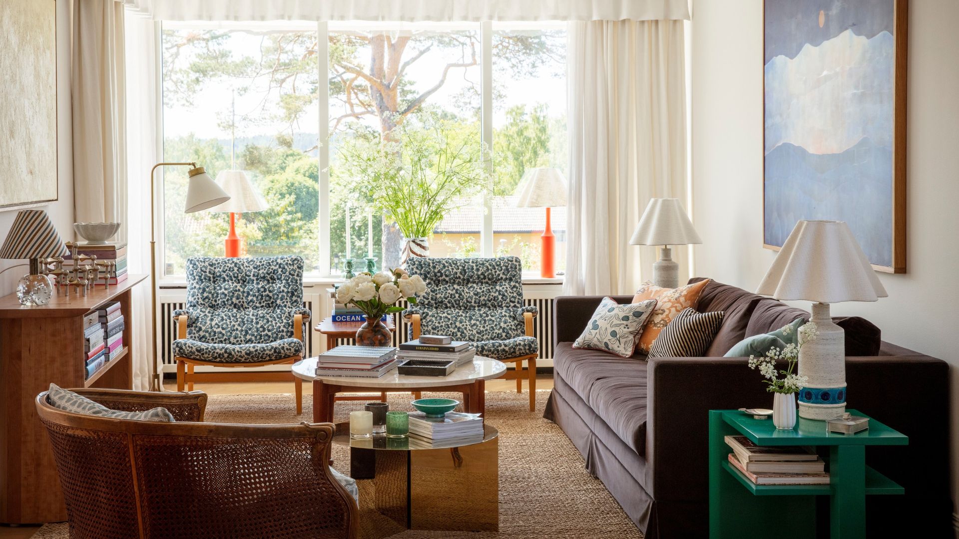
When we're decorating a small space, we shy away from large-scale furniture because obviously, we don't want to clutter it up. We need walkways and negative space, and we don't want to spend our lives bumping into things. So we opt for small sofas and snuggle chairs, and this is where we go wrong.
From my experience, going for a big, comfy L-shaped sofa, like this sofa from John Lewis, against the wall works so much better than a small two-seater. Because it instantly gives you more square footage you can actually use, and by use, I mean lounge around on.
Plus, a big sofa taking up lots of room (perhaps with one large piece of artwork above it) tends to trick the eye into seeing it as a bigger space.
And don't forget that a quick living room decluttering session can make a huge difference to make the limited remaining space more mindful.
FAQs
How can I give my living room instant character?
"Artwork is a great way to not only add colour but to bring personality and character into a living room," says interior designer Sophie Clemson. "Choose artwork that tells a story, it might be a connection to your favourite travels or a piece of art that you truly love."

Millie Hurst is a freelance writer and interior designer based in Sheffield, helping clients create homes that are characterful, curated, and highly functional. Interior design inspirations include Jake Arnold, Beata Heuman and Abigail Ahern. Her personal style is a 'liveable maximalism' with boho, nature-inspired designs.
She has seven years of experience in the world of digital journalism, most recently working as Head of Solved at Homes & Gardens, where she wrote and edited countless features on home organisation, decluttering and interior design. Before that, she was Senior Content Editor at Ideal Home.
-
 Lip contouring sounds a bit much, but this modern makeup technique is the 'soft' way to cheat a fuller pout
Think about how you use your favourite bronzer, then apply the same principle to your lips - easy!
By Naomi Jamieson
-
 Kate Middleton declares baker boy hats back for 2025 in new Love, Actually-esque outfit
The Princess of Wales’s signature style is all about timelessness but that doesn’t mean that she never gets on board with trends.
By Emma Shacklock