5 bedroom layout rules I always follow, as an interior designer
Some rules of thumb for a bedroom that feels balanced, calm and clutter-free
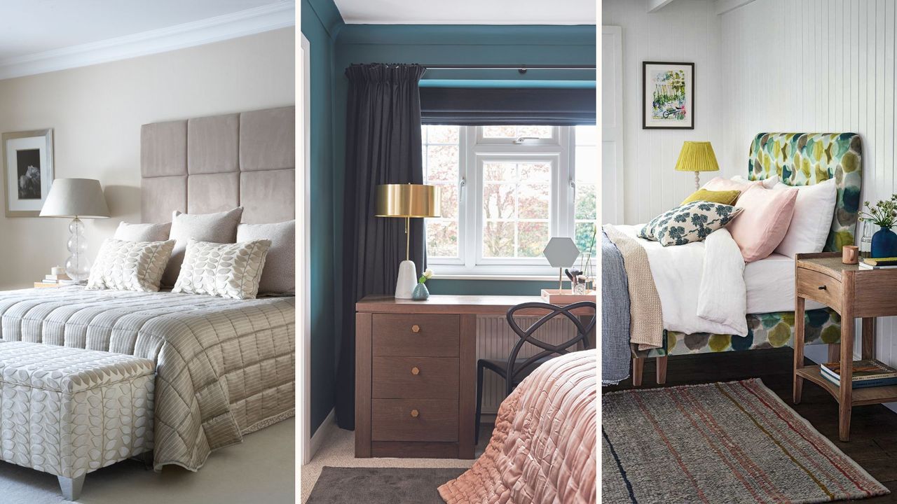

Our bedrooms should be comfortable, cosy, and enveloping spaces – creating the impression of being hugged. When designing a bedroom from scratch, there are many elements to consider.
We tend to spend a lot of time mulling over bedroom paint colours and perhaps not enough time thinking about the best possible layout.
Layout and floorplans can feel a little intimidating, and to be honest, in smaller spaces there usually seems to be only one possible place for your bed, wardrobe, and chest of drawers to go.
Playing around with your layout and avoiding bedroom layout mistakes will help you to maximise the space you have, and it can even make a small bedroom look bigger.
Bedroom layout rules recommended by interior designers
Below, I'm sharing five bedroom layout rules I always recommend clients follow – for a better layout and bedroom that helps them to sleep better, too.
1. Create balance and symmetry
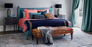
We need our bedrooms to feel calming and cocooning; this is easier when we have created a sense of balance or symmetry. This is because a symmetrical layout makes the room more restful to the eye.
So, look at your room and decide whether the visual weight in your bedroom is balanced or off-kilter. Perhaps you have a cluttered corner, or the bed isn't placed centrally.
Sign up for the woman&home newsletter
Sign up to our free daily email for the latest royal and entertainment news, interesting opinion, expert advice on styling and beauty trends, and no-nonsense guides to the health and wellness questions you want answered.
Create balance by having two bedside tables, even if you live alone, after all, you can never have too much storage. Go for a bedside lamp or sconce on either side of the bed for a more 'finished' and 'hotel bedroom' vibe. When you step back, the room will look much more put-together and balanced and I think this symmetry can also make a bedroom look more expensive.
You can also hang two fairly large, portrait pieces of artwork above the bed. In the bedroom, I love using artwork with horizontal lines, such as landscapes or line drawings, because they create a restful feel by mirroring our position when lying down when we go to sleep, almost inviting us to stretch out and lie down.
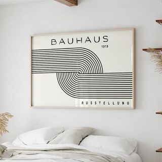
RRP: £9.86 | Introduce horizontal lines and a mid-century feel with printable Bauhaus artwork from Etsy.
2.Choose the right-sized bed
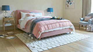
Bigger isn't always better when it comes to buying a bed frame, so measure your space thoroughly and think about walkways before going for the biggest possible size.
This is something I've learned the hard way – I sized down my mattress from a king size to a double but went for a contemporary, black four-poster bed. I love how it looks, but having lived with it, I think a simple, low bedframe with a rattan headboard, like this bed at Dunelm, or a simple upholstered design, like this headboard at Loaf, would have been more practical in terms of moving around the space easily.
"As tempting as it is to get the largest bed for comfort, it can compromise the space, and you may be left with just a bed in the room and hardly any space to actually walk around the bedroom," agrees Sophie Clemson from interior design company The Living House.
"If you choose a king size or super king bed, opt for wider bedside tables or even a low chest of drawers. If the bedside tables are a standard size or too small, they will look lost next to the large bed."
Downsizing is not such a bad thing because not only is a smaller mattress cheaper, from the best cooling mattresses to a luxury Simba mattress, so will your best sheets.

Sophie Clemson is the co-founder of The Living House, an affordable online interior design company that helps busy families transform their homes easily, online and within their budget.
3. Make the bed your focal point
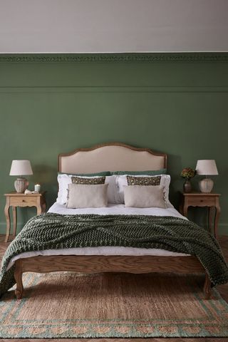
Our bedrooms are hardworking spaces, as they are where we sleep, get ready for the day, store our clothes, and sometimes they also double up as workspaces. However, the prime function of the bedroom should be for sleep, meaning the bedroom should be the focal point that draws the eye.
Ensure the bed is the centre of attention by anchoring it with a rug or displaying art, and don't skimp on the cushions and throws as this will add interest and make your bedroom cosy. "We love to see a rug used in a bedroom, it can really complete the look and bring the room together," says Sophie.
Sophie's top tip is to go large with the rug to make an impact and balance the room. She advises placing a rug at the end of the bed while making sure that it is large enough to cover the width of the bedside tables. Explore how to choose the right-sized rug for any room.
"For a welcoming and inviting feel, place the bed so that it is facing the door to create a focal point and feature in the bedroom. Consider how you could decorate the wall behind the bed, this could be with panelling, a popular choice right now, a large piece of artwork, or wallpaper. If you’re going for wallpaper, don’t be afraid to paper every wall for maximum impact," Sophie recommends.
4. Add plenty of storage
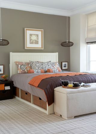
A common bedroom storage mistake to avoid is not making the most of dead space, especially the space under the bed. Under-bed storage is key whether you are organising a small bedroom or having a bigger space, as it gives you much more room for stowing things out of sight.
Having out-of-season clothes stored away makes it easier to keep your closet organised, with regularly worn items easier to see. Invest in storage boxes on wheels, available at Amazon, to make items easily accessible, and declutter your bedroom periodically to avoid a build-up of excess stuff.
5. Use the walls
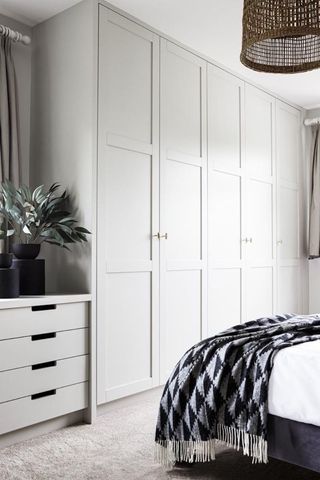
Make the most of your vertical space by hanging up rows of shelving (you can either use them to arrange decor, small lamps, and trinkets or use opaque baskets to store day-to-day essentials without the visual clutter).
Built-in cabinetry is also a brilliant option because it will work with the architecture of your bedroom and maximise the available space. By using the walls, you'll end up with more floor space, reducing the need for bulky chests of drawers which can feel oppressive and disrupt the flow of your bedroom.
We recommend trying one of the latest IKEA Billy bookcase hacks or a creative IKEA closet hack to achieve a bespoke finish on a budget.
A chair or two can be added to create another bedroom zone for hanging out or having a coffee, but be strict about not ending up with a bedroom 'clothes chair' as this just looks cluttered.
FAQs
What's the first thing you should see when you walk into a bedroom?
Interior designer Sophie Clemson says the bed should be the first thing you see when you walk into a bedroom, as it creates a welcoming and cosy feel, especially when you dress it with plenty of cushions and a throw for an inviting look.
If the layout of your bedroom doesn't allow it, Sophie has a great alternative solution: "Perhaps you have a wardrobe that can’t fit anywhere else, go for a mirror door option to bounce the light around the room and reflect the view of the bed. This will help trick the eye and make the space look bigger."

Millie Hurst is a freelance writer and interior designer based in Sheffield, helping clients create homes that are characterful, curated, and highly functional. Interior design inspirations include Jake Arnold, Beata Heuman and Abigail Ahern. Her personal style is a 'liveable maximalism' with boho, nature-inspired designs.
She has seven years of experience in the world of digital journalism, most recently working as Head of Solved at Homes & Gardens, where she wrote and edited countless features on home organisation, decluttering and interior design. Before that, she was Senior Content Editor at Ideal Home.
-
 Goodbye premium prices - these M&S slippers have become my new indoor go-to
For £19.50, these are a wardrobe must-have that you'll reach for daily
By Molly Smith Published
-
 Zara Tindall and Princess Eugenie twin in maroon at Cheltenham as they show how occasionwear styling is done
Royal cousins Zara Tindall and Princess Eugenie were on the same page with their Cheltenham outfits and their approach is worth following
By Emma Shacklock Published